Apple RIP Logo design(jmak.tumblr.com)
jmak.tumblr.com
Apple RIP Logo design
http://jmak.tumblr.com/post/9377189056
29 comments
My tribute of Steve Jobs' beautiful world:
http://www.servicestack.net/thankyou_steve.png

I know normally this (an image) wouldn't fit here, but I thought it was poignant and relevant considering the front page.
Thanks. I am using it as my wallpaper at work.
really awesome logo, thanks for posting
It's an excellent design, and a fine tribute.
Posted on Aug 26th, 2011?
When he stepped down. Notice the post itself doesn't actually say anything about his death.
The post tags include "death" and "RIP". probably a server misconfiguration tho.
More likely those tags were added afterwards.
Considering he stepped down on the 25th, this post is on the 26th, and it is titled "Thanks", I'm inclined to believe it is not an accidental misconfiguration.
Definitely appropriate, for this community even more so. Steve was an inspiration, an icon, a legend.
Wow...love the intelligence in this interpretation.
I suspect this will likely become apart of the imagery associated with our loss, like the Shepherd's Hope poster became associated with Obama's campaign.
I suspect this will likely become apart of the imagery associated with our loss, like the Shepherd's Hope poster became associated with Obama's campaign.
That is really, really lovely.
I made a few wallpapers [1] with this in case anyone wants one (sorry for the poor vectorization, I'm working and I had to make this fast).
Imgur seems to compress jpegs a bit hard, so please feel free to ask me for less compressed images.
The different images are for the different resolutions & styles.
(I am not the creator of the original image, credits go to Jonathan Mak)
[1]: http://imgur.com/a/ASm7b
The different images are for the different resolutions & styles.
(I am not the creator of the original image, credits go to Jonathan Mak)
[1]: http://imgur.com/a/ASm7b
That's a lovely form factor. Kern the numbers more evenly, the distance between the "1" and "9" is far more than the distance between the "9" and "5", and the "2" in "2011" is far closer to the "0" than the "1".
Thanks, I must admit I was rushing so much that I didn't even work on the kerning. I'll check this later today.
Subtle, striking, and minimalistic. Just like Steve's design ethic.
Cool tribute. I've used one of the variations for my Facebook Cover
Apparently news sites are using this logo. I hope he gets paid for this.
You hope he gets paid?! I hope he doesn't get sued by Apple.
Why? He can always claim it's meant to be a parody, and thus should be safe. Or not?
I tried an Apple logo variation back when Steve's illness was first announced. It's not as subtle as Mak's, but this seems to be the time for this sort of thing:
http://www.flickr.com/photos/imark/3210793896/
http://www.flickr.com/photos/imark/3210793896/
This is also very, very nice.
Apple's missing piece.
Apple should use this logo.
It's silly, but I made my tribute too: http://fusi0n.org/wp-content/uploads/2011/10/apple-half-mast...

For some reason, this reminds me a bit of the Dreamworks logo.
Apologies in advance for questioning an Apple aesthetic at a time like this. Perhaps SJ would have appreciated the design critique.
But someone pointed out to me the similarity with, um, POW*MIA YOU ARE NOT FORGOTTEN http://en.wikipedia.org/wiki/File:United_States_POW-MIA_flag... and it's kinda stuck in my head now. :-P
But someone pointed out to me the similarity with, um, POW*MIA YOU ARE NOT FORGOTTEN http://en.wikipedia.org/wiki/File:United_States_POW-MIA_flag... and it's kinda stuck in my head now. :-P

What? How are the two even remotely similar?
The downward tilted silhouette of a face? I think the similarity is pretty apparent and thought the same thing when I saw it.
Reminded me more of the Jane Eyre 'silhouette' book cover: http://www.goodreads.com/book/photo/4722840-jane-eyre
fyi, that link redirects users to a signup page unless they're already logged into goodreads. (which I'm not, since I have no account there.)
I think this is what he meant: http://bookcoverarchive.com/images/books/jane_eyre.large.jpg

I put it up at www.bitkeeper.com, if you need a copyright stuck on there or whatever, let me know. Very nice logo, I like to think that Steve would also have liked it.
It is perfect.
I just saw this in a (German) newspaper. Apparently Reuters picked it up.
I don't think it is the same: http://ow.ly/i/iHzx
(I don't know if they wanted to be funny or what but it's very crude and inappropriate to open with "iDeath" and that image).
(I don't know if they wanted to be funny or what but it's very crude and inappropriate to open with "iDeath" and that image).
I guess there are several versions. I saw it here: http://www.taz.de/Kritischer-Nachruf-auf-Steve-Jobs/!79461/
[deleted]
GREAT. More than worth to share.
The cover of Chicago Tribune's Thursday edition of the Red Eye was strikingly similar to your design: http://www.poynter.org/wp-content/uploads/2011/10/redeye.gif
I can't imagine that they independently arrived at that cover without having seen this here first.
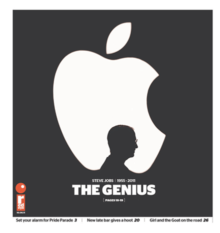
I can't imagine that they independently arrived at that cover without having seen this here first.
I love the design. I took the liberty of using it in an iMovie project called "In Memory of Steve Jobs" that I wanted to post to the guys on HN, who I hope will appreciate it.
Check it out: http://www.youtube.com/watch?v=edaQyINe5oQ?1
Check it out: http://www.youtube.com/watch?v=edaQyINe5oQ?1
Channel 4 News (UK) closed the story with this logo last night. They also closed by calling him the "insanely great Steve Jobs" which was nice.
http://www.nytimes.com/2011/10/09/business/steve-jobs-and-th...
That's awesome. Would love to know how that worked out for you.