The decline of BlackBerry in one chart(washingtonpost.com)
washingtonpost.com
The decline of BlackBerry in one chart
http://www.washingtonpost.com/blogs/the-switch/wp/2013/09/20/the-demise-of-blackberry-in-one-chart/
47 comments
Ask and you shall receive... I was curious about same, and compiled some data from Gartner and IDC.
http://exceltactics.com/wp-content/uploads/2013/09/Smartphon...
The kicker here is just how much the market for smartphones grew in the past 3 years. Back when BlackBerry had that impressive market share in 2009, the entire size of the smartphone market was miniscule (171m units shipped) compared with the end of 2012 (701m). Shipments are up even more (47% year/year) in 2013.
In fact, BlackBerry shipped as many units in 2012 as in 2009. It just so happens that Android shipped 13x that (and Apple managed near 4x)...
http://exceltactics.com/wp-content/uploads/2013/09/Smartphon...

The kicker here is just how much the market for smartphones grew in the past 3 years. Back when BlackBerry had that impressive market share in 2009, the entire size of the smartphone market was miniscule (171m units shipped) compared with the end of 2012 (701m). Shipments are up even more (47% year/year) in 2013.
In fact, BlackBerry shipped as many units in 2012 as in 2009. It just so happens that Android shipped 13x that (and Apple managed near 4x)...
I couldn't stop there... I "fixed" the original ComScore chart by making the width proportional to the total market size per year. This is the legitimately apples-to-apples comparison of the market share over the years. Enjoy...
http://exceltactics.com/wp-content/uploads/2013/09/ComscoreC...
http://exceltactics.com/wp-content/uploads/2013/09/ComscoreC...

This is excellent, how on earth did you manage it?
Thanks! Glad you like it!
I already had the data from the first area chart, so I built a line graph on the same timeline that just had market size as a % of 2012. Imported that as a mask in Photoshop and squished everything down to match.
And because I seem to be incapable of explaining without images, here ya go: http://exceltactics.com/wp-content/uploads/2013/09/HowItWasD...
I already had the data from the first area chart, so I built a line graph on the same timeline that just had market size as a % of 2012. Imported that as a mask in Photoshop and squished everything down to match.
And because I seem to be incapable of explaining without images, here ya go: http://exceltactics.com/wp-content/uploads/2013/09/HowItWasD...

Huh! That's awesome. I had no idea Photoshop masks could be used to distort images in that way. Good job!
That's a great point -- this graph is entirely relative to market share. I'm almost certain the market share of either iOS or Android is several times larger than Symbian, Palm, Blackberry, and WinMo combined.
It's a misleading chart - it's definitely not a zero-sum game.
It's only this past ~2 years that pretty much all new phones being sold are "smartphones" (for some definition of that word). The overwhelming majority has always been dumb "feature phones" - Android and iOS managed to get everyone to want a smartphone in their pocket and that's where the biggest gains were made - not as that graph would seem to imply, by simply cannibalizing the pre-existing smartphone markets.
It's only this past ~2 years that pretty much all new phones being sold are "smartphones" (for some definition of that word). The overwhelming majority has always been dumb "feature phones" - Android and iOS managed to get everyone to want a smartphone in their pocket and that's where the biggest gains were made - not as that graph would seem to imply, by simply cannibalizing the pre-existing smartphone markets.
Looks like this chart is just the US. I'd like to see other regional charts, and a global one as well.
Interesting how Blackberry continued to grow until mid-2010 even after iOS/Android had made their debut. They had a chance then but not anymore.
This really fascinating article from 2010 predicted and explained Blackberry's imminent demise:
http://mobileopportunity.blogspot.com/2010/10/whats-really-w...
It's super long, but scroll down to the graphs where he shows the declining growth and margins, and predicts that Blackberry sales are going to suddenly fall off a cliff two years later, which is exactly what happened.
I'm going to be paying a lot of attention to what this guy says in future.
(For bonus points, compare these graphs to Apple's current figures -- Apple needs to add a new adjacent category soon, or they are toast. TV/iWatch to the rescue?)
http://mobileopportunity.blogspot.com/2010/10/whats-really-w...
It's super long, but scroll down to the graphs where he shows the declining growth and margins, and predicts that Blackberry sales are going to suddenly fall off a cliff two years later, which is exactly what happened.
I'm going to be paying a lot of attention to what this guy says in future.
(For bonus points, compare these graphs to Apple's current figures -- Apple needs to add a new adjacent category soon, or they are toast. TV/iWatch to the rescue?)
Wow, outstanding read. Considering this guy worked for Apple, Apple may hopefully (for the sake of their stockholders) already know this.
Nevertheless, this is quite an intuitive research trend this guy has put together, and makes a lot of sense.
Nevertheless, this is quite an intuitive research trend this guy has put together, and makes a lot of sense.
Agreed. That's just staggering. It's been quite a while since I saw an industrial firm go into such an abrupt and severe decline.
Looks like much of the share was actually taken from Android
I don't about that but one reasonable guess is that large firms that were contracted with RIM may have been hesitant to end their contract when the iPhone/Android initially came out and after it was a bit proved actually switched away causing massive drop-offs. This may especially be true since most RIM customers likely were businesses.
Yes, very few people I know of would buy a Blackberry for their personal device. Also, back then people that needed to be in business contact carried a business-provided device -- very seldom would they use a personal device (and many cases wouldn't even have a personal device). Now it has become almost universal that everyone has family plans, and has their own device -- and not wanting to carry two devices, they use their personal (non-Blackberry) device for work (and get reimbursed). This was almost unthinkable in at least the jobs I used to work at (large fortune 50 companies, financial, etc).
It's funny I've been considering a blackberry for myself for the past few weeks - solely because they're one of the few current-phones that have hardware keyboards.
I've been waiting to see how things would turn out for them and deciding if I pull the trigger, or wait for a new android device to come out.
I guess I wait now. (I used to own a palm-pre, were they still current I'd take one in a shot.)
I've been waiting to see how things would turn out for them and deciding if I pull the trigger, or wait for a new android device to come out.
I guess I wait now. (I used to own a palm-pre, were they still current I'd take one in a shot.)
The whole market grew though.
Also seems to explain the overall strategy they took a bit.
I imagine the size of the overall market grew.
The graph seems to point to Android, not iOS eating RIM's pie. I wonder how much Google search results played in that demise.
I wonder how much Google search results played in that demise.
Err.. Roughly none? I suspect you are trying to make some deep point, or maybe imply some conspiracy but I think you are going to need to be a little more clear.
Err.. Roughly none? I suspect you are trying to make some deep point, or maybe imply some conspiracy but I think you are going to need to be a little more clear.
I think it's quite clear what I'm suggesting and if you think that it's above Google to take part of some tech conspiracy, well bless your little soul.
If you are implying that Google used its search results to push Android somehow to consumers I'd love to hear some kind of explanation as to how exactly you think that occurs.
What would consumers be searching for where that would even be an issue?
How did Google's search results influence CEOs to demand that corporate IT departments let them use their iPhones against the corporate email systems? Because that's how BB lost its corporate stranglehold, and only later did Android come in a clean up what was left.
I don't think Google is above some tech conspiracy - I just think they didn't need to bother. BB produced uncompetitive products and the market punished them for it.
What would consumers be searching for where that would even be an issue?
How did Google's search results influence CEOs to demand that corporate IT departments let them use their iPhones against the corporate email systems? Because that's how BB lost its corporate stranglehold, and only later did Android come in a clean up what was left.
I don't think Google is above some tech conspiracy - I just think they didn't need to bother. BB produced uncompetitive products and the market punished them for it.
I didn't realize that Windows Mobile had such large market share at one point.
It's probably largely down to the definition of what a smartphone was back then. The same graph scaled by market size or including dumbphones would be more interesting.
Yeah, I was confused by Windows' apparently-large share as well, and I figured it was a definition thing as well, but if you look at these sales figures:
http://en.wikipedia.org/wiki/Smartphone#Historical_sales_fig...
Microsoft sold 14 million smartphones (or rather, their device partners, probably mostly HTC back then) in 2007, but according to this article from 2007, RIM was running at about 9.6 million devices a year, which matches what wikipedia says:
http://www.computing.co.uk/ctg/news/1830466/blackberry-sales...
So at some point in 2007 Microsoft some crazy how had something like a third of the smartphone market.
http://en.wikipedia.org/wiki/Smartphone#Historical_sales_fig...
Microsoft sold 14 million smartphones (or rather, their device partners, probably mostly HTC back then) in 2007, but according to this article from 2007, RIM was running at about 9.6 million devices a year, which matches what wikipedia says:
http://www.computing.co.uk/ctg/news/1830466/blackberry-sales...
So at some point in 2007 Microsoft some crazy how had something like a third of the smartphone market.
To this day, when I sign for packages or get my ticket scanned at events, I occasionally see Windows Mobile 6 phones powering those systems.
I suspect fleet deployments were a big part of their sales.
I suspect fleet deployments were a big part of their sales.
This graph is kinda confusing to read, but I'm parsing it correctly then it looks like Blackberry had a pretty massive surge around 2009-2010 - well after the release of the iPhone. That is actually surprising to me.
I suppose that might be due to the market growing - in which case Apple looks like it's relatively flat starting around 2010 but in reality the number of users were increasing along with the market.
I suppose that might be due to the market growing - in which case Apple looks like it's relatively flat starting around 2010 but in reality the number of users were increasing along with the market.
For an article titled “The decline of BlackBerry in one chart” you’d think that it’d be a well-designed intuitive chart that emphasizes the decline of Blackberry. Instead what’s presented is accurate but unintuitive and could easily be titled “The decline of Palm in one chart” or “The decline of Windows Mobile in one chart” or even Symbian. There’s no visual hierarchy—the main idea isn’t leaping out of this graph. (And sometimes design is as much about what you don’t show.) And if you’re really bent on showing all the big players at once there are more compelling ways to do it than this. I normally wouldn’t feel compelled to comment on something so small but it’s... It’s the TITLE OF THE ARTICLE!
Author makes a pretty infographic that doesn't actually convey what she was aiming for (BB lost market share? Palm devices are still in use? Windows mobile lost out and never recovered? )
Between that, and the opening line, "BlackBerry stocks plunged 22 points this afternoon... "[1] I almost stopped reading.
The conclusion makes me wish that I had: "every major smartphone platform from early 2007 has become a practical non-entity since the rise of Android and iOS."
Is it just my imagination, or do the other platforms have a combined total of 15% of the market at the end of that graphic ? Individually it doesn't break down well, but collectively non-entity doesn't seem a good fit.
[1] http://www.investopedia.com/ask/answers/04/043004.asp
Between that, and the opening line, "BlackBerry stocks plunged 22 points this afternoon... "[1] I almost stopped reading.
The conclusion makes me wish that I had: "every major smartphone platform from early 2007 has become a practical non-entity since the rise of Android and iOS."
Is it just my imagination, or do the other platforms have a combined total of 15% of the market at the end of that graphic ? Individually it doesn't break down well, but collectively non-entity doesn't seem a good fit.
[1] http://www.investopedia.com/ask/answers/04/043004.asp
Looks like Android is the biggest beneficiary, in terms of market share, of the change triggered by iPhone. Of course it is an obvious fact, but this graph makes it visually clear.
Wow. It looks like RIM and Apple both peaked around January 2010 (though Apple starts climbing again towards the end). I never would have guessed that.
Percentage wise, perhaps. But Apple's phone sales continue to grow, it's just that Android (and smartphones in general) are growing faster.
I'd say the percentage scale on this graph does a disservice, considering the huge magnitude of difference between 2005 and 2012 market size.
I'd say the percentage scale on this graph does a disservice, considering the huge magnitude of difference between 2005 and 2012 market size.
I am probably reading the chart a little wrong, but I am curious about that slump in between January 2005 and January 2006 for all mobile OSes (or maybe all but Symbian).
Remember this is a percentage market share chart, so it always adds up to 100%. The "slump" you see is a spike in Symbian share.
Related: it's important to realize when reading this chart that the absolute number of phone shipped in this period was exploding from year to year: it's quite possible that every single manufacturer on the chart (except maybe Palm) shipped more devices every single year; Android and Apple just grew faster than the others.
Related: it's important to realize when reading this chart that the absolute number of phone shipped in this period was exploding from year to year: it's quite possible that every single manufacturer on the chart (except maybe Palm) shipped more devices every single year; Android and Apple just grew faster than the others.
Yes, you're reading it wrong. Every vertical slice of that graph is the market share % at that point in time.
What happened in that period is that Symbian grew in market share over that period, and by chance, Symbian is at the top of that graph, so it looks at first glance that things dipped. If Symbian had been at the bottom of that graph, representing the exact same data, you'd have thought everything went up at that point.
Imagine this, the graph is perfectly valid and representing the same data if you flip it upside down. It's all about their size relative to eachother, not their vertical position.
What happened in that period is that Symbian grew in market share over that period, and by chance, Symbian is at the top of that graph, so it looks at first glance that things dipped. If Symbian had been at the bottom of that graph, representing the exact same data, you'd have thought everything went up at that point.
Imagine this, the graph is perfectly valid and representing the same data if you flip it upside down. It's all about their size relative to eachother, not their vertical position.
As others have noted, it's not slump in the market but a big spike in Symbian sales.
2005 was when the first Nokia N series was released.
2005 was when the first Nokia N series was released.
Funny how the URL states "the demise of blackberry in one chart". Note the subtle yet impacting difference between "demise" and "decline"
there are still people using palmOS?
How the hell do I read that chart?
Left-to-right.
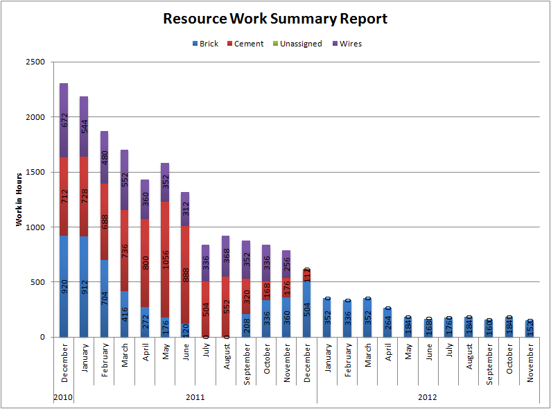
It's like a series of staggered bars one next to another - http://epmxperts.files.wordpress.com/2011/01/monthly-graph.p... - with two differences:
1) It's continuous, rather than a series of discrete bars. (The linked bar chart could also be continuous, especially if they had that granularity of data. But you could try visually faking it by just connecting the bars into a similar effect.)
2) It represents market share, not absolute volume, so always adds up to 100%. Each point along the X axis contains the same information as a pie chart would at that date, showing current market share.
Overall the effect is that you can track the 'shape' of the componnets as you read left-to-right. This is similar to the effect of this famous chart, http://en.wikipedia.org/wiki/Charles_Joseph_Minard#Informati... - where you can see the 'width' of Napoleon's army as it marched geographically.
In this case the "the size of the army - providing a strong visual representation of human suffering" is the size of RIM's market share (along with everyone else's, but this is the component the title draws our attention to), providing a strong visual representation of its suffering.
And you can actually read left-to-right over time instead of having to look at it embedded in geography, as with the Napoleon campaign chart.
It's like a series of staggered bars one next to another - http://epmxperts.files.wordpress.com/2011/01/monthly-graph.p... - with two differences:
1) It's continuous, rather than a series of discrete bars. (The linked bar chart could also be continuous, especially if they had that granularity of data. But you could try visually faking it by just connecting the bars into a similar effect.)
2) It represents market share, not absolute volume, so always adds up to 100%. Each point along the X axis contains the same information as a pie chart would at that date, showing current market share.
Overall the effect is that you can track the 'shape' of the componnets as you read left-to-right. This is similar to the effect of this famous chart, http://en.wikipedia.org/wiki/Charles_Joseph_Minard#Informati... - where you can see the 'width' of Napoleon's army as it marched geographically.
In this case the "the size of the army - providing a strong visual representation of human suffering" is the size of RIM's market share (along with everyone else's, but this is the component the title draws our attention to), providing a strong visual representation of its suffering.
And you can actually read left-to-right over time instead of having to look at it embedded in geography, as with the Napoleon campaign chart.
[deleted]
Their y axis is wrong and they should feel bad.
I am more curious just how much bigger the market became post-iPhone.