Antarctic sea-ice at 'mind-blowing' low alarms experts(bbc.com)
bbc.com
Antarctic sea-ice at 'mind-blowing' low alarms experts
https://www.bbc.com/news/science-environment-66724246
9 comments
I strongly disagree. Some people have come to understand “outlier” as “temporary noise in the data”. That is very bad.
This chart shows that 2023 is clearly multiple standard deviations lower than the historical mean, and much lower than any point in the last few decades.
If your latest datapoint is a huge outlier and you have nothing to explain it you should consider feeling alarm that this is significant and perhaps a step change from historical norms.
This chart shows that 2023 is clearly multiple standard deviations lower than the historical mean, and much lower than any point in the last few decades.
If your latest datapoint is a huge outlier and you have nothing to explain it you should consider feeling alarm that this is significant and perhaps a step change from historical norms.
This is a very good point but different from my gripe with the article. If a person collapses in front of me in the street and I cannot feel a pulse I don't need a trend to take action.
My issue with the article is that if there is a trend (which I suspect) they could have easily shown it. If there is no trend they should have been clear about it and they could have made an argument similar to the one you made above - if they wanted to.
My issue with the article is that if there is a trend (which I suspect) they could have easily shown it. If there is no trend they should have been clear about it and they could have made an argument similar to the one you made above - if they wanted to.
Eh. The inflection point that makes 2023 noteworthy is in May 2023. It seems unlikely to me that you would find a meaningful trend looking further back. If there was one, it was small. The advantage of this chart is you can see it IS a big outlier.
The one in https://climatereanalyzer.org/clim/seaice/ (make sure you are watching the right hemisphere) is more interactive and you can see clearly year by year how for 40 years things were not so different, except this one, of course.
I think the diagram given is pretty telling, but I agree that the words "mind-blowing" tell me that the article is not suitable for the HN crowd.
The article isn't about showing a trend, but that's my interpretation, of course. It seems to be about why antarctic ice is important and why would be worrying if this becomes a trend.
That being said, the antarctic ice coverage was remarkably steady this past years:
https://nsidc.org/data/seaice_index/images/s_plot_hires.png
compared with arctic ice:
https://nsidc.org/data/seaice_index/images/n_plot_hires.png
That being said, the antarctic ice coverage was remarkably steady this past years:
https://nsidc.org/data/seaice_index/images/s_plot_hires.png
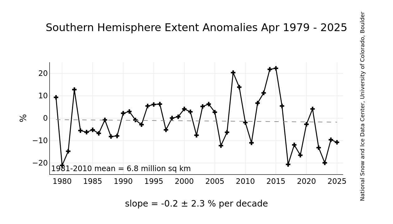
compared with arctic ice:
https://nsidc.org/data/seaice_index/images/n_plot_hires.png
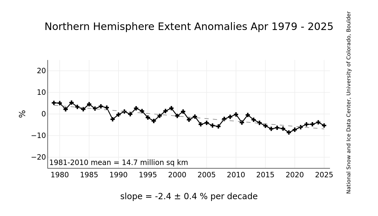
That's a pretty damn high-sigma deviation, and considering deviations in similar graphs out there (surface temperature, ocean temperature, etc.) it paints a pretty devestating picture. Though if you're not familiar with the other studies and graphs it may just seem to a layperson as "so what that could be anything".
They did give a chart showing monthly sea ice levels for each year, but I think they didn’t want to highlight that the data is only from 1979-present.
Saying this is an “all time low” over only 44 years of measurements isn’t quite as impressive.
Saying this is an “all time low” over only 44 years of measurements isn’t quite as impressive.
Is there no way for scientists to estimate these levels over the past ~500 million years in order to get a broader context?
I think this is the most useful kind of data so we can put this into context, but I’m curious how they would estimate something like this.
Use sea floor core samples to estimate sea ice coverage over a specific location over time?
Use sea floor core samples to estimate sea ice coverage over a specific location over time?
I don’t know the specifics, but often scientists are able to infer a great many things from limited data. We of course have to accept that the uncertainty will be far greater that an actual year-over-year measurement as we do now.
What would be the point of saying the ice today is similar to the ice 500 million years ago?
Because 100 years is nothing in geological time obviously. The only reason not to do it is to choose to not understand the problem as completely as possible.
If 100 years is nothing, then the Antarctic ice levels shouldn’t change at all since we’ve been monitoring them. Which makes this even more alarming!
I said that 100 years of data is nothing in the context of billions of years - which is obviously true. You are conflating this with rate of change which is not the same thing.
How you can say that while also saying
> Because 100 years is nothing in geological time obviously. The only reason not to do it is to choose to not understand the problem as completely as possible.
Which is it? Are you concerned with geologic time scale changes? Or are you just saying it would be nice to have more datapoints in which case the reference to geologic time is irrelevant.
The ice levels “billions of years” ago are utterly irrelevant.
> Because 100 years is nothing in geological time obviously. The only reason not to do it is to choose to not understand the problem as completely as possible.
Which is it? Are you concerned with geologic time scale changes? Or are you just saying it would be nice to have more datapoints in which case the reference to geologic time is irrelevant.
The ice levels “billions of years” ago are utterly irrelevant.
If we had daily, high fidelity data from billions of years ago until today, would this be useful in your estimation or not?
What if we knew this rate of change is commonplace in a historical context or has literally never occurred in the past. I think would be useful information.
Suppose the rate of change 350 million years ago was similar under a vastly different climate and context. Is that useful?
Suppose a similar rate of change in similar conditions happened 10,000 times in the past. Is that useful? Alternately what if we've never seen a rate of change like this in the history of the earth. Is that useful?
It’s not really useful. Anything taking place in a fundamentally different climate and context is basically irrelevant. If you want to suppose that our understanding of sea ice and it’s relationship to temperature is fundamentally wrong to the extent that we are missing a rapid drop in sea ice in the past thousand or so years… sure. But that seems unlikely.
And suppose it were normal. Does that actually help? No not really.
And suppose it were normal. Does that actually help? No not really.
If it were normal, you would have to reject the “alarming” / “mind blowing” statements in the article. If it were abnormal, on the other hand, it would support such claims. This is what the article is about.
No. That’s my whole point. “Normal” on a geological time scale is completely irrelevant to humans, whose society is built on a tiny stable slice of that timeframe. Geological time scale “normal” includes many states that are not survivable for our societies.
What we care about is normal relative to our cozy state that we have now.
What we care about is normal relative to our cozy state that we have now.
So then it is just a regional cosiness thing. If your region benefits from climate change, you should be in support of it and wish to accelerate it.
What would change if you found out there was 100x 350 million years ago and 0 ice 500 million years ago?
> worrying new benchmark for a region that once seemed resistant to global warming.
"once" is doing some heavy lifting here. its susceptibility has been known for a good while.
"once" is doing some heavy lifting here. its susceptibility has been known for a good while.
> "When I started studying the Antarctic 30 years ago, we never thought extreme weather events could happen there," says Prof Siegert.
When I was a child 30 years ago, I thought Antarctica only experienced extreme weather events, like our own Great Red (White?) Spot.
When I was a child 30 years ago, I thought Antarctica only experienced extreme weather events, like our own Great Red (White?) Spot.
This seems like a radical departure from previous years. Am I reading that chart correctly?
If you look at this summer's average sea surface temps (SSTs) for the mid latitudes, you'll see a similar departure in terms of increased temps:
https://www.bbc.com/news/science-environment-66387537
https://www.bbc.com/news/science-environment-66387537
[deleted]
Seems like a complete outlier.
BOE by 2025 here we come!
What is BOE?
No doubt this is an issue that should be taken seriously. But certainly much more concrete proof of declining trends would be needed before declaring such a forgone conclusion. While the extent of sea ice does indeed shift around quite a bit from year to year, actual sea temperatures have more or less remained fairly consistent.
No, they haven't?
https://en.m.wikipedia.org/wiki/Sea_surface_temperature#/med...
https://en.m.wikipedia.org/wiki/Sea_surface_temperature#/med...

That "Climate Change Service" graphic is indeed disturbing. Regardless, the temperature anomaly in the Arctic is in fact currently at or below average (in other words, plus or minus 0°).
The other user provided a source that has been used on wikipedia, whereas neither of your comments state any sources. Could you provide some?
It’s essential to consider the multifaceted effects of our environmental interventions. For instance, the commendable move in 2020 to reduce sulfur dioxide emissions in shipping lanes had an unintended side effect. The decreased emissions meant fewer sulfur dioxide-based clouds in the atmosphere, which previously reflected a significant amount of sunlight and contributed to rain cloud formation. While reducing emissions is a positive change, the absence of these ‘reflective clouds’ might be inadvertently amplifying the heat, especially when combined with the current El Niño. This could partially explain the accelerated ice melt in Antarctica we’re observing just three years after the regulation change. It serves as a reminder that the Earth’s climate system is intricately interconnected, and actions in one area can have cascading effects.
This seems like the classic trick that weather plays on people.
A few years to us seems like a long time and enough to develop a trend and make conclusions, however, it is nothing when looking at weather patterns and climate changes. Those unfold over decades, a lifetime, or longer.
A few years to us seems like a long time and enough to develop a trend and make conclusions, however, it is nothing when looking at weather patterns and climate changes. Those unfold over decades, a lifetime, or longer.
One can equally interpret the diagram from the article as showing a fairly constant level - somewhat varying within a limited range - with 2023 being an outlier. All it tells about is the variance and without at least more year labels there is no way to read anything about the trend from it.
[I'm not saying the article is wrong or right, just that it does a very bad job supporting its thesis.]