So you think you can tell Arial from Helvetica?(ironicsans.com)
ironicsans.com
So you think you can tell Arial from Helvetica?
http://www.ironicsans.com/helvarialquiz/
80 comments
Helvetica is indeed the better font, but this is an unfair example because the Arial alternatives were poorly kerned, whereas the logos were (with few exceptions) expertly kerned.
You're also limited to one weight with web safe Ariel, which I noticed most of those logos had non standard weights.
Maybe it is more elegant, but if you don't want cross browser, cross platform rendering issues you'll stick with Arial.
No, just put sans-serif. Windows users get arial, os x users get helvetica, Linux users get whatever. Everybody wins.
No, this is horrible advice. The difference in the fonts will make your site look completely different to people using different OSes.
As it should! ;)
Lately we've developed this fetish for sites being pixel-perfect across any display.
The web was designed to decouple the way a site was designed from the way it's displayed. To allow it to reflow, and people to use their own designs.
If you really want pixel-perfect layout, why not just use bitmaps and imagemaps ;)
Lately we've developed this fetish for sites being pixel-perfect across any display.
The web was designed to decouple the way a site was designed from the way it's displayed. To allow it to reflow, and people to use their own designs.
If you really want pixel-perfect layout, why not just use bitmaps and imagemaps ;)
Well, as long as the development request isn't for pixel perfect. Many people outside the control of development see the mockup from Photoshop and completely freak out when it doesn't match exactly. You try explaining that in the long run it doesn't matter, that browser incompatibilities prevent this, and that it will take longer to achieve that. The people "who know" what's needed don't care about that stuff.
Although, a common way to get them out of their "I know better" state is to point out the time factor and how much extra it will cost them. Suddenly they will worry over browser incompatibilities all day long.
The worse are the people that point out that the fifth paragraph on the third page ends with three words on the final line in the mockup but the website version has four words in Firefox and two words in Chrome. I just want to so tell them to just let the text flow its own way, dude. In the end I tell them in a nice way they're being silly.
Although, a common way to get them out of their "I know better" state is to point out the time factor and how much extra it will cost them. Suddenly they will worry over browser incompatibilities all day long.
The worse are the people that point out that the fifth paragraph on the third page ends with three words on the final line in the mockup but the website version has four words in Firefox and two words in Chrome. I just want to so tell them to just let the text flow its own way, dude. In the end I tell them in a nice way they're being silly.
When you have the ability to define custom fonts, and there's great fonts out there such as Open Sans which are supported by a whole whack of users, it doesn't make sense not to use that hand have a unified look across browsers and Operating Systems.
Note that I never said that it shouldn't be decoupled, or that people shouldn't use their own designs. But if you want people to see your site as you intended, I'd for sure want them to see it with the exact font I choose, not some close alternative.
Note that I never said that it shouldn't be decoupled, or that people shouldn't use their own designs. But if you want people to see your site as you intended, I'd for sure want them to see it with the exact font I choose, not some close alternative.
THIS IS COMPLETE AGAINST EVERYTHING I WAS TAUGHT AHHH
Funnily enough, it is exactly what I was taught! I'll freely admit that I'm a 'Philistine', when to comes to these matters.
I've always taken the view that you throw the text at an engine and let it do the rendering. If it doesn't look right, the engine needs improving. Manual tweaks fall into the realm of premature optimisation, as chances are the content will change faster than the tweaks can be made.
I can see that beautiful typography is nice to have, but apart from automation, I can't see a way to apply it on a mass scale. Crafted typography is the typographic equivalent of assembly language?
I've always taken the view that you throw the text at an engine and let it do the rendering. If it doesn't look right, the engine needs improving. Manual tweaks fall into the realm of premature optimisation, as chances are the content will change faster than the tweaks can be made.
I can see that beautiful typography is nice to have, but apart from automation, I can't see a way to apply it on a mass scale. Crafted typography is the typographic equivalent of assembly language?
No it won't, the difference between Helvetica and Arial at small sizes is barely noticeable. Furthermore, most Windows users won't have Helvetica anyway, and if they do, it looks totally broken.
The appearance does matter more for display text (logos, headings, etc.), but you're using font-face for those anyway.
The appearance does matter more for display text (logos, headings, etc.), but you're using font-face for those anyway.
Then why not use font-face for everything and have a font which can be viewed across operating systems like OpenSans?
No, you should stick with verdana. It's fully cross-platform, designed from the start to be a screen font, and generally looks better.
Alternatively, @font-face is supported by just about everything at this point, opening up the opportunity to use much better fonts, like open sans
(also, helvetica is a print font. It doesn't work for body copy at the sizes commonly used for screen text.)
Alternatively, @font-face is supported by just about everything at this point, opening up the opportunity to use much better fonts, like open sans
(also, helvetica is a print font. It doesn't work for body copy at the sizes commonly used for screen text.)
Verdana is wide enough that it brings problems trying to fit links within a horizontal nav bar.
Learn something new every day. I've always used Helvetica on all my web pages at the behest of my design co-worker. He's a print designer so it makes sense now.
Well, it really depends on how the digitization of Helvetica that any particular user has installed is hinted. The Helvetica that comes with MacOS is quite nicely hinted, and will make for a pleasant read at most sizes.
On Windows, however, Helvetica isn't (at least from my experience) as nicely hinted, or at least doesn't play quite as well with Microsoft ClearType. And that's if it's installed, which is less likely on Windows. In that case, if your font stack specifies a fallback to Arial, which is ClearType's best friend, you'll probably be fine.
On Windows, however, Helvetica isn't (at least from my experience) as nicely hinted, or at least doesn't play quite as well with Microsoft ClearType. And that's if it's installed, which is less likely on Windows. In that case, if your font stack specifies a fallback to Arial, which is ClearType's best friend, you'll probably be fine.
Suggest he looks at open sans. It's a fantastic screen font that works very well for large headers (especially at a lighter weight), and body copy.
I hope you do test how it looks on windows? I've worked with a webdesigner that often chose fonts that worked perfectly on his mac, but looked really ugly on all windows browsers, since the fonts were unavailable and the substitutes had noticable style/width differences.
I too am a fan of Verdana.
Ruining the game for everyone; two things I love about Helvetica
— Terminals at right angles to the stroke. http://c.jon.gd/image/3Q0y2u323j3C . Arial looks particularly sloppy with jaunty terminals. It is possible to have a similar grotesque sans-serif feel with offset terminals (see Univers & Akzidenz Grotesk) but they're a crucial part of what give Helvetica its character. - The uppercase R. Has a really strong leg compared to Arial's half-assed flaky leg.
— Terminals at right angles to the stroke. http://c.jon.gd/image/3Q0y2u323j3C . Arial looks particularly sloppy with jaunty terminals. It is possible to have a similar grotesque sans-serif feel with offset terminals (see Univers & Akzidenz Grotesk) but they're a crucial part of what give Helvetica its character. - The uppercase R. Has a really strong leg compared to Arial's half-assed flaky leg.
I immediately got 17/20, missing only the ones where there were no lower case characters. How do you distinguish between in these 3 cases? http://imgur.com/a/NOLoI
The "C" (flat terminals) and "R" (straight vs not straight) in the THE NORTH FACE are different.
Kerning. If there's more uniform spacing between all letters in one picture it should be the original: "OTA" in Toyota, "THE" in The North Face and "TEL" in Mattel. But it would be hard without seeing them both at the same time.
A thing that helps me distinguish them is that Helvetica is a bit more decorative with some of the capitals, like G and R. I think the Arial designers were probably trying to make it "even more Helvetica than Helvetica", by simplifying the flourishey/decorative bits, like the bottom thing on a G and the curvy bit at the top of the slanty line of the R. (These are the proper typographical terms, btw.)
In Toyota, the O is the most round one. The R in North Face is the easiest tell there. In Mattel, you can see that the E has more balance with the rest of the letters.
Arial's A has a wider base (seems more "fat") than Helvetica's
Nicely done. I got most of those wrong! Which is why I leave typography to typographers.
Suggestion: wrong response page has a small graphic that emphasises a difference between Arial and Helvetica. e.g. the shape of the top part of the lower case r, &c
Then you have a teaching tool...
Suggestion: wrong response page has a small graphic that emphasises a difference between Arial and Helvetica. e.g. the shape of the top part of the lower case r, &c
Then you have a teaching tool...
I really don't consider myself a typography expert or designer, but I found that easy and got a perfect score.
There are obvious tells in almost all of them -- mostly lowercase "s", "c", etc, in which Helvetica is has perfectly level edges and arial is angled.
The only harder ones are some of the all caps examples like TOYOTA.
There are obvious tells in almost all of them -- mostly lowercase "s", "c", etc, in which Helvetica is has perfectly level edges and arial is angled.
The only harder ones are some of the all caps examples like TOYOTA.
Agree that lower case is trivial due to the level terminal edges in Helvetica.
For uppercase, the tip offs are the following:
* The capital A in Helvetica is narrower (more isoceles and less equilateral)
* The capital G has an extra hatch on the right side (looks like an arrow and not an L)
* The capital R does not have a straight leg in Helvetica
* Conversely, arial chooses a non-straight hatch mark for the Q whereas Helvetica's Q hatch is straight.
This image provides a good overview on the capital (and numeric) differences: http://cdn.ilovetypography.com/img/gqr.gif
In the case of TOYOTA where it seems that kerning might different in two images, the heavier strokes in Helvetica should tip that off.
For uppercase, the tip offs are the following:
* The capital A in Helvetica is narrower (more isoceles and less equilateral)
* The capital G has an extra hatch on the right side (looks like an arrow and not an L)
* The capital R does not have a straight leg in Helvetica
* Conversely, arial chooses a non-straight hatch mark for the Q whereas Helvetica's Q hatch is straight.
This image provides a good overview on the capital (and numeric) differences: http://cdn.ilovetypography.com/img/gqr.gif

In the case of TOYOTA where it seems that kerning might different in two images, the heavier strokes in Helvetica should tip that off.
The perfectly round Os in toyota are the giveaways. I got them all correctly, except for MATTEL for which the only difference is the stroke width; and which I ended up flipping a coin for (incorrectly).
That said, I did get a degree in graphic design, so I may not be typical when it comes to this.
That said, I did get a degree in graphic design, so I may not be typical when it comes to this.
In MATTEL, the crossbar of the E is placed in the exact center.
Here's a nice graphic of Helvetica overlaid with Arial with the same font weight and kerning.
http://snth.net/~rlk/image/helvetica-vs-arial-2.png
In this comparison, the capital E's are identical, so perhaps MATTEL used a different weight Helvetica?
http://snth.net/~rlk/image/helvetica-vs-arial-2.png
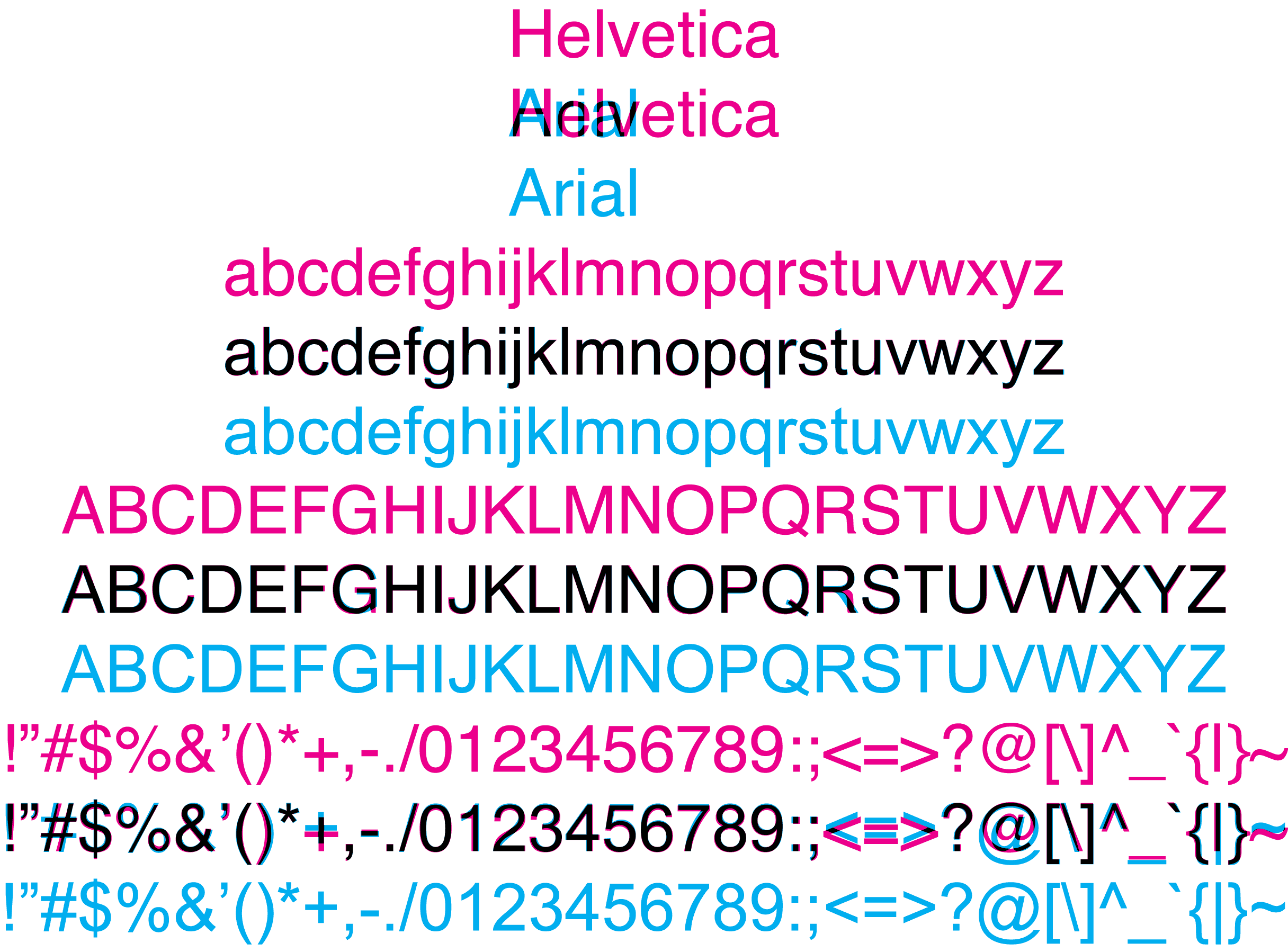
In this comparison, the capital E's are identical, so perhaps MATTEL used a different weight Helvetica?
I picked the one with the longest distance between the T and the E. That was the wrong answer.
This quizz is an excellent training though. I didn't know anything at all about typography prior to taking the test (never bothered to learn the names of the fonts or their shapes), ended up scoring 17/20.
This quizz is an excellent training though. I didn't know anything at all about typography prior to taking the test (never bothered to learn the names of the fonts or their shapes), ended up scoring 17/20.
I have a degree in CS and did the exact same thing
I have three degrees in CS, and I (correctly) answered the titular question with "No", and then proceeded to prove it with 10/20 on the button.
I notice the differences (slanted terminals, narrower "A"s, etc.), but had no clue which was which. Weirdly, I'm super-picky about typefaces, but mostly in a "I like what I like" sense rather than a "I know the precise details about why" sense. I dislike both Helvetica and Arial intensely, and so never bothered to learn much about what made them different. They're both just fonts I don't choose for anything.
I notice the differences (slanted terminals, narrower "A"s, etc.), but had no clue which was which. Weirdly, I'm super-picky about typefaces, but mostly in a "I like what I like" sense rather than a "I know the precise details about why" sense. I dislike both Helvetica and Arial intensely, and so never bothered to learn much about what made them different. They're both just fonts I don't choose for anything.
[deleted]
I noticed the round Os in TOYOTA also -- for MATTEL, the height ratio between the top two and bottom two horizontal bars on the E is more even in Helvetica than Arial.
You don't even have to know anything about typography. Without knowing anything about any typeface, after guessing and comparing the results of first few, I was able to nail 13 of 14.
I guess that anyone who knows anything about typography would answer correctly to all questions.
Clue: I went for bolder font. Also, Helvetica is a bit wider in these logos. After that, I also noticed the clue in C.
I guess that anyone who knows anything about typography would answer correctly to all questions.
Clue: I went for bolder font. Also, Helvetica is a bit wider in these logos. After that, I also noticed the clue in C.
Same here, I had only MATTEL and TOYOTA wrong for that reason.
All the rest I had immediately, on the very first image there was 50% chance I had it right and I did a lucky guess, from then on I knew Helvitica was horizontal, Arial slanted.
All the rest I had immediately, on the very first image there was 50% chance I had it right and I did a lucky guess, from then on I knew Helvitica was horizontal, Arial slanted.
The way to spot MATTEL is to look at the letter widths. Arial tends towards fixed widths, whereas Helvetica's letters have varying widths.
Thanks, this is the key to finally help me spot it.
The Toyota one is actually pretty obvious when you look at the O's - Helvetica O's are perfect circles, where Arial ones are flattened. As a Toyota fan, to me it makes a big difference. Arial is very unacceptable in this case.
Indeed. This was the first time I really compared the two and using this method got me 17/20
the lowercase t is also a giveaway, helvitica has a flat top with arial having a slanted top.
+ compare kerning
In the Mattel example they both look kerned about the same to me (the A tucked under the T). Elsewhere in this thread it is pointed out that Helvetica uses varying letter widths and that's the only giveaway I see now in Mattel, though it's somewhat difficult to see due to the kerning. But the M is clearly wider than the A with Helvetica.
In the cases with capital A's, you can tell by the spacing between the two "legs" of the `A`. Helvetica is more compact. The space inside `O` is more compact for Helvetica as well.
That is almost the exact experience I had. I got 17/20 and the ones I screwed up all had capital letters.
I couldn't see any difference between Mattel and Toyota.
I couldn't see any difference between Mattel and Toyota.
The perfectly round "O" was the giveaway for me. Helvetica just feels more "literal" to me, if that makes any sense, with its perfectly horizontal endings on "C" and "S" and "t", so the round "O" seemed more likely. Mattel nearly tripped me up too, but I noticed that Helvetica was bolder throughout than the Arial equivalent, so it wasn't hard.
O isn't perfectly round in Helvetica. The Toyota logo is modified to use perfect circles for the Os. The real O is a bit rounder than in Arial maybe, but still not a circle. Futura is the one with the perfect circles (for both O and o).
Toyota was the only one I got wrong: it was the round Os that threw me off. I thought Helvetica didn't look like that, and, well, it doesn't.
I used the same rational. Whichever font looked bolder, I choose and got it correct. Also, the Staples Arial version didn't have the "registered" mark so I got that one easily.
But in the Mattel example, Helvetica is the thinner font. Instead notice the varying letter width, the M being wider than the A with Helvetica in the Mattel example.
I think your description of "literalness" relates well to "geometric" typefaces (typefaces constructed on simple geometric shapes).
Fun test!
Mattel was also the one that tripped me up.
As the GP said, the caps on the S, C, T, etc were usually the giveaways.
The flourish at the bottom right (not sure the correct term) of the R in TARGET gave me at moment's pause. But each of the logos was customized to an extent.
Mattel was also the one that tripped me up.
As the GP said, the caps on the S, C, T, etc were usually the giveaways.
The flourish at the bottom right (not sure the correct term) of the R in TARGET gave me at moment's pause. But each of the logos was customized to an extent.
I realised it must be Helvetica because of the "R". I reasoned thus: I am more familiar with Arial than Helvetica, and I'm sure I would have seen that "R" before if I were spending a lot of time with it because it's just so ugly, so since I didn't recognise it, it must be Helvetica. And I was right.
It's funny, because I universally prefer Helvetica over Arial otherwise.
It's funny, because I universally prefer Helvetica over Arial otherwise.
Mattel is the genuinely incredibly close, the 'Y' in Toyota is the obvious tell if you've spent a while looking at Helvetica though.
I answered 18 out of 20 questions correctly. American Apparel and Toyota tripped me.
The first difference I picked up on was lowercase r's.
Lowercase Helvetica characters never end on an angle. They are always flat and either parallel on the bottom or the edge of the screen.
Toyota was a pure guess for me.
Lowercase Helvetica characters never end on an angle. They are always flat and either parallel on the bottom or the edge of the screen.
Toyota was a pure guess for me.
[deleted]
In the ones where you don't have the flat edges to work from, I found Helvectica is the "bolder" one.
[deleted]
actually a was bored after ten right answers or so. It was really easy. At first I only looked for what "looked better" because I generally like Helvetica but find Arial really ugly. After doing the first answers, I started to see the minor differences and now understand why I like Helvetica better.
I found the first few were training me to see the differences, the rest was like playing a matching game.
Now I feel like my time was wasted. And I was proud of 16/20 when I figured that out.
Also Helvetice tends to look sligthly "heavier" (thicker) when put side by side with Arial. That gives away many examples at a glance.
Unfortunately that's not always true, since Helvetica comes in many weights. http://sixrevisions.com/infographics/helvetica-font-weights-...
It should be true if the Arial examples were provided with comparable weights. That is, assuming, that the two fonts were weighted similarly from their base.
The Helvetica is actually slightly thinner in the Mattel example.
I agree- the only one I got wrong was toyota- for the other all caps, I looked for the slightly longer 'A'.
[deleted]
I am a designer (I mean, actually I am a coder that for some freaking bizarre reason got a design degree), and got a 19/20.
For "Mattel" my choice ended being random.
For "Mattel" my choice ended being random.
20/20. Mattel was the only one I was uncertain of, but the correct answer was slightly blurrier, due to it probably being an actual logo copy scaled down or up slightly, as opposed to a "freshly-made" duplicate for the purpose of the test.
Toyota was easy enough, as the capital "O" in Helvetica is more oval than round in Arial, and more round than oval in Helvetica.
I'm not a designer, I'm a developer, but I do enjoy typography.
Toyota was easy enough, as the capital "O" in Helvetica is more oval than round in Arial, and more round than oval in Helvetica.
I'm not a designer, I'm a developer, but I do enjoy typography.
I found all of the correct answers slightly blurry, I got 18/20 without looking at any letters.
> the capital "O" in Helvetica is more oval than round in Arial, and more round than oval in Helvetica.
The Os in the Toyota logo have been modified and made more round, though. This is what "TOYOTA" looks like in plain Helvetica: http://myfonts.us/td-RQ1hNh
The Os in the Arial and Helvetica are practically identical.
The Os in the Toyota logo have been modified and made more round, though. This is what "TOYOTA" looks like in plain Helvetica: http://myfonts.us/td-RQ1hNh
The Os in the Arial and Helvetica are practically identical.
I just picked whichever looked better and got 18/20. Failed on Crate&Barrel and Mattel.
18/20, and I'm no design/typography expert. As others have said, it was on capitals. But the point of the site is clearly to show people can't tell the difference, and I can.
I'm no designer nor typographer and got a 16. I felt that most of the time the Helvetica variant was heavier (as in, more bold) most of the time. I had no idea of the different R and of the right angled stroke.
If you just pick the fuzzier looking image you'll get the majority of them. Very neat idea though.
Yes, the differences are easy to see, as everyone has said.
But the important part is that there's a difference in feel and theme that's not really measurable and identifiable in direct comparison.
The subtle difference is far more important than trying to identify the tiny details that don't really matter. And in that sense, this game (while fun and interesting) misses the point.
But the important part is that there's a difference in feel and theme that's not really measurable and identifiable in direct comparison.
The subtle difference is far more important than trying to identify the tiny details that don't really matter. And in that sense, this game (while fun and interesting) misses the point.
It's entirely measurable. Helvetica has slightly heavier strokes, which are finished at right angles or closer to that than Arial, and prefers verticals and horizontals in general compared to Arial.
Yes, but why would you use one over the other?
Because it gives the text a different character on a macro level.
I believe that is what he's trying to say. You don't use Arial because it terminates at right angles, you use it because it feels different.
You use it because it's the only option you have under Windows.
Actually, you don't use it.
I've always heard the Helvetica snobbery (and haven't used Windows much since the 90s) so I was a little surprised to find that in most cases, I found the Arial logo more attractive. Helvetica has a little more "heavy-handed" feel to it which worked for short words in all-caps, but I thought the lighter look of Arial worked better for the rest.
Horses for courses, but you're in the minority. Helvetica is pretty widely considered a more aesthetically appealing font, especially amongst those who have a lot of points of reference.
It's like art: you develop more sophisticated tastes as you're exposed to better things. It's hard to say this without sounding snobbish, but if all you've seen is Arial, you'll find Arial familiar and comfortable. But the more time you spend looking at good typography, the more Arial will start to hurt your eyes.
It's like art: you develop more sophisticated tastes as you're exposed to better things. It's hard to say this without sounding snobbish, but if all you've seen is Arial, you'll find Arial familiar and comfortable. But the more time you spend looking at good typography, the more Arial will start to hurt your eyes.
What about custom fonts? They work on windows too...
[deleted]
I don't feel this subtle difference. Take a look: http://imgur.com/CWJWvZk
Does this feel different? I can see the slanted Arial terminations but I don't "feel" the different mood.
Does this feel different? I can see the slanted Arial terminations but I don't "feel" the different mood.
Hypothesis: The difference in feeling that some people get from fonts is like the difference in feeling many people get when they pay a lot for the wine they drink. It's subconscious. It feels like a real feeling. It just isn't driven by the actual experience of the product.
In the wine world, it is possible to isolate this effect using blind taste tests. In the font world, there seems to be no robust way to show a font expert Helvetica without letting them recognize that it's Helvetica.
In the wine world, it is possible to isolate this effect using blind taste tests. In the font world, there seems to be no robust way to show a font expert Helvetica without letting them recognize that it's Helvetica.
I don't think that analogy stands. You can tell there's something different between them, specially on a full page of text, without knowing what typeface it is at all. Helvetica is slightly more elegant. That said, it is no surprise that it's hard to tell the difference since one is a rip-off of the other.
Or like Stradivarius in classical music. There have been blind tests when a contemporary violin was mistaken for the Strad. Yet classical musicians still covet the Strad - my theory being that it makes people listen with this subconscious effect you've been talking about. Same sound, but if we believe it comes from a Strad, it seems better.
I didn't even finish the test. They could've picked more ambiguous letters.
Yes - 19/20
Botched Mattel
http://typewar.com/ quizzes you on letters from an increasing number of fonts, and scores you according to how many other people got a particular matchup correct. They also have "quests" that focus on a particular challenge, including Arial vs. Helvetica. http://typewar.com/quests/ I think my favorite part of the site is the statistics on how many people are confused by particular matchups.
It's the "r" that's usually the give away. However, I would have to say that the capital "S" is also a giveaway, and the I'd have to say that the letters with Helvetica are somewhat fatter...
That was easy. I read this article about a year ago and once you've seen it, you can't unsee it :)
http://www.ms-studio.com/articlesarialsid.html
http://www.ms-studio.com/articlesarialsid.html
20/20 - a few hard ones though. Fun quiz :)
This one is fairly easy simply because they show you a comparison. In reality, if they showed you only one type of font and if they had asked you to identify which font it was (Arial or Helvetica), then it would have been a REAL challenge :)
The bad kerning gives it away on more than one occasion (American Apparel for example).
You can clearly see the black brush on the almost black background in the SCOTCH logotype :D
I used the following heuristics (some parts added afterwards):
1. Helvetica has level edges, Arial is angled (as ef4 said). Particularly important were "t", "e" and "a", "S", "G", C".
2a. For capital letters, if there is an "R", the Helvetica one is curved in the bottom right part while Arial uses a straight line.
2b. For a capital "Y", the Arial one has the same length in all directions while the Helvetica one is shorter at the bottom. (Alexx indicated a difference).
2c. The jags/gaps in the capital "M" extend further to the top for Arial. This can be used to figure out MATTEL.
3. Otherwise, the one that looks fatter is Helvetica.
1. Helvetica has level edges, Arial is angled (as ef4 said). Particularly important were "t", "e" and "a", "S", "G", C".
2a. For capital letters, if there is an "R", the Helvetica one is curved in the bottom right part while Arial uses a straight line.
2b. For a capital "Y", the Arial one has the same length in all directions while the Helvetica one is shorter at the bottom. (Alexx indicated a difference).
2c. The jags/gaps in the capital "M" extend further to the top for Arial. This can be used to figure out MATTEL.
3. Otherwise, the one that looks fatter is Helvetica.
Haha, fun test, got 14 of 20 right!
I noticed that I can do pretty good just by quickly detecting which one is the most unfamiliar font, as I am and always have been on Windows.
The MATTEL one was hard, but I just assumed the one with crappy kerning was Arial, and sure enough...
The thing that gave away the Mattel logo was the E. Apparently, the middle bar of the capital E in Arial is not equidistant from the outer bars, whereas the E in Helvetica has equally-spaced bars. (Or legs, or whatever the hell they are.)
This was just something I noticed for the first time while going through.
This was just something I noticed for the first time while going through.
I got about 50/50 but got bored and gave up after 16 so I don't know my score. I don't stare at small details on fonts normally like people here do, so I mostly tried to pick which one looked "right".
I got 17 out of 20. I just picked the ones that looked better to me.
Fun test. Also if anyone's interested in Helvetica or typesetting in general just watched a pretty good documentary recently that got me more interested in the topic: http://www.helveticafilm.com/, also available on netflix: https://movies.netflix.com/WiMovie/Helvetica/70076125
Sorta similar to the 'Objectified' doc that was recommended by HackDesign but I actually liked this one better.
Sorta similar to the 'Objectified' doc that was recommended by HackDesign but I actually liked this one better.
19/20 Mattel was impossible!
As a programmer I got 11/20, so juuuust slightly better than random guessing. And I was trying so hard too!
10/20 - I'm a complete failure.
I got through about 15 questions, had flash backs to the documentary "Helvetica" where it's just never ending stream of examples for 1 1/2 hours and couldn't take anymore. I'll take your word for it.
Ha, I remember taking this test quite a while back when I was obsessed with typography.
Took it again and got a 18. In terms of the actual font design, Helvetica always felt more "natural" and "composed," whereas Arial always felt much more focused on pure readability.
Took it again and got a 18. In terms of the actual font design, Helvetica always felt more "natural" and "composed," whereas Arial always felt much more focused on pure readability.
I got 15/20. What I learned from this quiz is I actually prefer the lowercase S in Arial.
"You answered 18 out of 20 questions correctly." I didn't even know the difference between the two until today (can't be bothered with fonts and suchlike).
Missed American Airlines. But I think it actually looks more balanced with Arial, the original feels a bit squeezed.
I played a different game called 'which one appeals to me more on first glance'. I ended up with a perfect 10/10 split.
Could it be that different fonts will be more aesthetically pleasing for different uses? Even if they're typographically similar??
Could it be that different fonts will be more aesthetically pleasing for different uses? Even if they're typographically similar??
I picked the one the "looked" better and got 5 out of 20 right. Guess I just prefer Arial.
I only missed one, which was do to negligence and not ignorance. Moreover, I'm not even cursorily trained in design or typography.
This doesn't seem that hard. Any perceptive person can determine the differences immediately through deduction and use them to differentiate throughout the test.
This doesn't seem that hard. Any perceptive person can determine the differences immediately through deduction and use them to differentiate throughout the test.
I knew nothing about typography, guessed the first one with a lowercase r right, used that to get the rest of the lowercase ones. I only failed the uppercase ones. 16/20
A much more interesting question than "Arial or Helvetica" would be: "Which one looks better?" Then you could ask how well the answer correlated with Helvetica vs Arial.
This question is good for seeing whether people know what they're looking at, but the point of using one font over the other isn't to show you prefer the 'correct' font, but to be invisibly better than other choices in one way or another.
This question is good for seeing whether people know what they're looking at, but the point of using one font over the other isn't to show you prefer the 'correct' font, but to be invisibly better than other choices in one way or another.
The problem is that there was a lot more effort put into the originals than their knockoffs in Arial. The originals were produced with a designed typeface - and typefaces are tweeked for size. The Arial knockoffs obviously used scaled up versions in several cases. The knockoffs didn't get the same attention to kerning either.
I know nothing about design and typography. I went through the quiz and simply asked myself, "which logo do I like better?".
I got 17/20 correct with that method.
I got 17/20 correct with that method.
It would be interesting to see how purportedly "design-conscious" people performed without the immediate feedback and the juxtapositions. Also, since these are logos, aimed at gut feelings, the test should be timed, e.g. you must answer within 1 sec or so.
can you tell a green field..
If you know what you're looking for, the test is fairly easy. It get's tricky in case of ALL CAPPS that don't include the letter 'R'. I got MATTEL wrong.
Fun short game. Enjoyed it!
I got 19/20. Messed up on "STAPLES" because I got over-confident and started selecting too quickly by the end.
The easiest way to distinguish the two, in my opinion, is that Helvetica uses horizontal cuts to letter strokes. So I should have seen that the capital 'S' in STAPLES had slightly off-axis cuts in my selection. Perhaps what tricked me is that the STAPLES logo itself is off-axis.
I got 19/20. Messed up on "STAPLES" because I got over-confident and started selecting too quickly by the end.
The easiest way to distinguish the two, in my opinion, is that Helvetica uses horizontal cuts to letter strokes. So I should have seen that the capital 'S' in STAPLES had slightly off-axis cuts in my selection. Perhaps what tricked me is that the STAPLES logo itself is off-axis.
One service that I like from this site is the shorter thesaurus [0]. You enter a long word and receive shorter synonyms.
[0] http://www.ironicsans.com/thsrs/
[0] http://www.ironicsans.com/thsrs/
Terrible test. I got 19/20 based entirely on knowing what the original logos looked like on a few of them (Agfa and DEC, mostly). I thought I'd fail because I've never paid attention to those fonts.
If it was done with novel text, the results would have been different.
If it was done with novel text, the results would have been different.
Too bad this test isn't a higer DPI. It's easier to tell the differences, and see the subtleness of Helvetica at higher DPIs. Helvetica is a font designed for print, but it also looks good on HiDPI/Retina displays.
On my Retina MacBook Pro this whole test is a blurry mess. I had to bring it over to my non-Retina display to take it. But the differences between Arial and Helvetica pop a lot more on a better display.
On my Retina MacBook Pro this whole test is a blurry mess. I had to bring it over to my non-Retina display to take it. But the differences between Arial and Helvetica pop a lot more on a better display.
I found the giveaway is in lowercase t, s, c and uppercase R. Helvetia tries to snap most terminating edges horizontally.
This is a question that's close to my heart. As a developer I've spent inordinate amounts of time getting Helvetica working properly in websites.
I can tell the difference between them, it's obvious when you know what to look for. Is it so much better that it's worth the effort required? Definitely not in my opinion.
I have a special place reserved in Hell for that font.
I can tell the difference between them, it's obvious when you know what to look for. Is it so much better that it's worth the effort required? Definitely not in my opinion.
I have a special place reserved in Hell for that font.
I didn't initially know all the obvious differences, but I picked the one that looked "right" or "better" and still got 16/20.
After reading tip offs here I got 19/20 (all except Toyota)
After reading tip offs here I got 19/20 (all except Toyota)
No typographer nor designer here either, but _subjectively_ speaking:
* This test quickly 'clued me in' that a logo should give a "commanding", "authoritative", "brooks no argument" look. Helvetica, yes; Ariel, no: Ariel made some logos look downright self-satirical.
* An email client I use has Ariel as its default font. In that (two-way communication) context, where accidental antagonisms can arise, Ariel seems to "look less antagonistic"
* So this test speaks to me about appropriate fonts for two different contexts, and personal point-of-view.
* Got 20/20, but might not on a 2nd run. I'm only human.
* This test quickly 'clued me in' that a logo should give a "commanding", "authoritative", "brooks no argument" look. Helvetica, yes; Ariel, no: Ariel made some logos look downright self-satirical.
* An email client I use has Ariel as its default font. In that (two-way communication) context, where accidental antagonisms can arise, Ariel seems to "look less antagonistic"
* So this test speaks to me about appropriate fonts for two different contexts, and personal point-of-view.
* Got 20/20, but might not on a 2nd run. I'm only human.
Not a criticism, but I'm genuinely confused about the persistent misspelling of 'Arial' as 'Ariel'. Is there anyone knowledgeable about this sort of thing who can explain why it's so prevalent?
If you opened a clothing altering retail shop called "Taylor Shop" WRT your HN name, you'd have to expect a large fraction of the population to write your establishments name as "Tailor Shop"
Likewise there's only one Arial font but tens of thousands of girls named Ariel, so odds are your font is going to get spelled Ariel an awful lot by people who think Ariel first as either a human girl or a movie character.
Likewise there's only one Arial font but tens of thousands of girls named Ariel, so odds are your font is going to get spelled Ariel an awful lot by people who think Ariel first as either a human girl or a movie character.
Prevalent pop icon: Disney's "The Little Mermaid" was Ariel.
Got 19 out of 20. I missed the Panasonic one.
What I like most about Helvetica is the top of the t is flat rather than sharp and there is less stylizing overall. Arial, for me, breaks the philosophy of stylizing for stylizing sake. Helvetica, IMHO, was already perfect.
This makes me remember the Essay by Adolf Loos' Ornament and Crime (1929) (http://technical-english.wikidot.com/text-1-2). Albeit bordering on racist propaganda contains very valid points on ornamentation being wasteful which I believe was a hallmark of Dieter Rams philosophy, "Good design is as little design as possible" which highly influences Apple's industrial designer Jonathan Ive.
What I like most about Helvetica is the top of the t is flat rather than sharp and there is less stylizing overall. Arial, for me, breaks the philosophy of stylizing for stylizing sake. Helvetica, IMHO, was already perfect.
This makes me remember the Essay by Adolf Loos' Ornament and Crime (1929) (http://technical-english.wikidot.com/text-1-2). Albeit bordering on racist propaganda contains very valid points on ornamentation being wasteful which I believe was a hallmark of Dieter Rams philosophy, "Good design is as little design as possible" which highly influences Apple's industrial designer Jonathan Ive.
Here's something interesting to do with the same test. Instead of guessing which one you think is Helvetica, choose the one you like better. Then see if Helvetica shows up more times than Arial (or vice versa).
Great idea! Personally I had no bias towards either font, but now discovered that I do in fact like Helvetica a bit more (12 out of 20 times). Would be interesting to be able to see a test like that with statistics on how many chose each font for each logo.
Yeah, going into it I didn't know much about the differences between the fonts but was curious anyway. After getting a few wrong I switched to choosing which ones I thought looked nicer and started getting Helvetica more times. That reminds me I need to finish watching the Helvetica documentary.
Dangit, I did that and discovered that I prefer Arial! I think it is (slightly) easier to read; it also seems more relaxed and fluid, less unnecessarily squared-up.
I guessed that, given that Arial was probably a Helvetica clone, its designers probably added superfluous flourishes to differentiate it. That led me to notice the weirdly angled edges in Arial, which gave away most of them. So, yeah, proof of why Arial is dumb.
20/20, although MATTEL was tricky. That pesky capital 'A'.
I got 3 out of twenty, 2 of which I was lucky to see the capital R. I guess I can tell the difference, though I'd be careful to reverse all my answers in the future.
I like it.
I couldn't tell at the start and so I guessed based on which logos looked best composed, then I noticed the uniqueness particularly in r and t letter forms.
This actually gave me a new respect Helvetica.
I couldn't tell at the start and so I guessed based on which logos looked best composed, then I noticed the uniqueness particularly in r and t letter forms.
This actually gave me a new respect Helvetica.
This is silly. I know nothing about the difference between Arial and Helvetica. If anything thought that Helvetica was slightly lighter, so in the first question I guessed at the lighter of the two fonts, which it turns out was Arial. Every question after that I guessed the heavier of the two fonts, and I got a 19/20 score.
I'm not really good with the fonts and their differences, but after the first one which I failed I got 18/20 and the other I failed which was TOYOTA.
I got one wrong. I attribute that not to my genius but to having seen the excellent documentary "Helvetica".
Turns out that's an excellent home date movie.
Turns out that's an excellent home date movie.
I'm a lowly developer and have never even heard the debate about Helvetica. I couldn't have told you the first thing about it. It took me two slides to figure out that "the one I like" is Arial, and pick the opposite. I missed three more, but they were incredibly similar (TOYOTA, MATTEL).
Anyway, this difference is quite obvious in general, I'm not sure what the author is on about.
Anyway, this difference is quite obvious in general, I'm not sure what the author is on about.
Here's a handy reference that shows the distinguishing differences between the two typefaces: http://en.wikipedia.org/wiki/Helvetica#Similar_typefaces
Didn't anyone judge them by how good they looked ? Not "pixel peeping" but the general outlook.
Arial looks vertically uneven somehow - the tops of the letters of a word seem to form a more solid straight line with Helvetica.
Arial looks vertically uneven somehow - the tops of the letters of a word seem to form a more solid straight line with Helvetica.
I'd never bothered comparing them before, never used Helvetica that I can remember, and I got 17/20. 2 at the start till I noticed the obvious lower case differences. The only other one was MATELL which difficult, didn't notice the difference in the As.
It's very easy - all I did was think "Which one looks better?" and I got it right every time.
I got 90%...what is the point of this?
Very easy for all but MATTEL. For MATTEL I went with the one which was kerned better, and no surprise, it was Helvetica!
...wow, this turn my mind into believing Arial looks better than Helvetica most of the time! Blasphemy!!!
Apparently, the answer is "Easily, unless it's all caps."
Got a 18 out of 20. To me Arial looks a bit informal when compared to Helvetica. While Helvetica has level edges, Arial feels more loose and forgiving. I use both fonts in Applications but never really looked at them up close until now. Thank your or this test.
Shame that Arial doesn't come in light & medium weight (as windows alternative to Mac)
I used to think that this doesn't matter, as both fonts in text seemed good to me - but now in these logos, all cases where I was able to distinguish them, the Arial version was butt ugly and the original far better looking even to my non-designer eye.
Fun spoiler: do NOT look at the image SRC. I liked the game, but I did what any idiot would when they see such pages - Inspect Element. Damn!
20/20 BUT it was almost 19 because of Mattel.
Fun game, loved it, though G, lowercase edges can solve most cases. It comes down to kerning in the more difficult ones, Helvetica is a perfect Geometric Sans, and that should help in most cases
I flew right through them. The MATTEL logo gave me a slight pause, picking the prettier, more symmetrical choice made it easier to identify the remainder.
There are (at least) three "bugs" in this quiz (i.e. artifacts from the alteration). The person who made them must have a crappy monitor if the differences weren't noticeable. That, or they were just sloppy. Still, fun quiz though.
Here are the bugs:
http://imgur.com/a/S2aDO
Here are the bugs:
http://imgur.com/a/S2aDO
Apparently, judging from my perfect score, I can easily tell them apart.
Before this test I considered the differences negligible, without really knowing what the differences are. Now I consider Helvetica much more elegant and incisive.