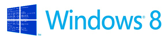
The new Windows logo is out of perspective. Here's how it should look.(blog.tarng.com)
blog.tarng.com
The new Windows logo is out of perspective. Here's how it should look.
http://blog.tarng.com/post/17775576898/the-new-windows-logo-is-out-of-perspective
11 comments
I agree. I feel people are arguing just for the sake of proving they understand perspective better than the design team at Windows. I highly doubt Microsoft only did one version of the logo, there were probably many variations, including some that were perspectively perfect. It looks like Microsoft went with what more people thought was aesthetically pleasing, which is a nice sign from the Windows design team.
The square perspective design just looks out of proportions. Purely on an first impression basis, given a choice to choose between the two, I would choose the one by the MS team. Maybe they tested , and found that people liked the rectangle one better.
Again, why is this nit pick important anyway?
A much better take on the lack of perspective in the Windows logo: http://imjustcreative.com/windows-8-logo-design/2012/02/18/
That was the first thing I noticed. It's constantly bugging me when looking at it. Makes it feel half 3D and half 2D, like one of those impossible stairs.
if you look at the pentagram design documents [1], the 'bars' aren't meant to be drawn wide enough for the perspective on them to be noticeable. the designer's drawings have all the bars at 1px regardless of the scale of the logo.
[1] http://pentagram.com/en/new/2012/02/new-work-microsoft.php
[1] http://pentagram.com/en/new/2012/02/new-work-microsoft.php
I can not understand why, in Microsoft's blog post, they posted a Quality 20% JPEG of their new logo (http://windowsteamblog.com/cfs-filesystemfile.ashx/__key/Com...). It's compressed so much that there's a slight green hue around the blue borders.

Or perhaps it was intentional. Most people don't have square monitors...
Maybe Microsof prefers the modernist horizontal "square": you could put hundreds of those slightly stretched windows side to side to form a horizontal band of windows throughout the whole floor of a building. That is probably the way Microsoft wants to vision Windows' style of adoption.
Microsoft's logo makes sense. The logo matches with the windows (see the screenshot). It completes the pattern. http://www.underconsideration.com/brandnew/archives/windows_...

i guess microsoft has enough money to buy the best designers around. maybe they have an idea or two about perspective and also a couple of ideas about when to break those rules in exchange to something that simply looks better, and this is the case.
So, MS don't know shit because windows are square.
I would say that perfectly square windows are just as rare as windows that are wider than they are tall. This is silly.