New Samuel: a font derived from Morse code(2ality.com)
2ality.com
New Samuel: a font derived from Morse code
http://www.2ality.com/2012/12/new-samuel.html
5 comments
Interesting font, but as an radio operator, no one actually writes nor reads code in it's "visual" (dit/dah) form. Messages are written or typed directly to or from English. Also after a while you don't hear individual characters as much as words and phases similar to a "real" spoken language. (Except for call signs and such...)
Interesting and a clever system, but kind of nasty to read. They probably had fun developing it, though :)
Au contraire, I quite liked the font's look and feel. It would definitely look lovely on poster titles and the like.
As much as I liked the font, I also liked the approach behind building the font. Algorithm is not the first word one associates with fonts (aesthetics is the word that comes to mind first) and I was pleasantly surprised to read the algorithmic approach behind the design too. :-)
Thanks for sharing it with us.
As much as I liked the font, I also liked the approach behind building the font. Algorithm is not the first word one associates with fonts (aesthetics is the word that comes to mind first) and I was pleasantly surprised to read the algorithmic approach behind the design too. :-)
Thanks for sharing it with us.
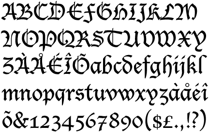
Most of the letters are readable. However, 'P' looks exactly like what I'd expect 'E' to look like.
This presents a problem.
This presents a problem.
K, T, X, and Y are also tough at a glance. But I must admit, I do love the notion. There just has to be a better implementation.
I suspect so too.
But all this said, millions coped with "blackletter" for hundreds of years. Check out the caps: http://www.identifont.com/samples/monotype-imaging/LucidaBla... (especially N, P, Y and G - and T and C look almost identical).
But all this said, millions coped with "blackletter" for hundreds of years. Check out the caps: http://www.identifont.com/samples/monotype-imaging/LucidaBla... (especially N, P, Y and G - and T and C look almost identical).
> This presents a problem.
Especially if you're a Pepper.
F doesn't look like E ?