Russia in color, a century ago(archive.boston.com)
archive.boston.com
Russia in color, a century ago
http://archive.boston.com/bigpicture/2010/08/comments_russia_in_color_a_century_ago.html
29 comments
Note that those shown are all heavily restored (also cropped) versions of the originals. They are all from the Library of Congress collection (~1900 of the ~3500 he made). An example of an unrestored version for comparison is at http://www.loc.gov/pictures/collection/prok/item/prk20000025....
Honestly, even those in the link are impressive to me. Just think of where technology was at that point in time, and what ingenuity it took to create pictures of this quality.
Yes. I'm also really impressed with the pictures. We have come a lone way in only three to four generations. My personal contribution to humanity so far: zero.
Standing on the shoulders of giants...
I wouldn't call it "technology". It's more of a successful experiment than technology, to me.
Color separation cameras came two decades after, and this was really a technology : making one camera capture at the same time 3 pictures on negative. (Where those very impressive pictures shown in the link are taken using the color separation process but without a color separation camera, and not on negative.)
Color separation cameras came two decades after, and this was really a technology : making one camera capture at the same time 3 pictures on negative. (Where those very impressive pictures shown in the link are taken using the color separation process but without a color separation camera, and not on negative.)
I don't think the distinction you have made is valid.
Experiments are a kind of technology by any common definition. Just because this never rolled out into mass production doesn't mean that it wasn't a systematic application of scientific/engineering principles.
Experiments are a kind of technology by any common definition. Just because this never rolled out into mass production doesn't mean that it wasn't a systematic application of scientific/engineering principles.
Au Contraire. Its not clear <you> are able to distinguish technique from technology. And even if so, how much proportional impact is technique vs. technology. And even then, and in this case in particular, ex-post-facto how much technology and/or technique have been applied to put these images online.
This is indeed technology. http://www.merriam-webster.com/dictionary/technology
Anybody know an easy place to download the entire batch? The LoC page makes getting them in bulk a bit of a pain.
I think a bash script and wget will be your best bet there. I looked too and couldn't find a way. If I end up getting some shell script working I'll post it here for you.
I notice they have a picture of Tblisi (http://inapcache.boston.com/universal/site_graphics/blogs/bi...) , which is now in Georgia (not Russia). Tblisi is a rather beautiful looking place, here is a recent picture from almost the same place http://www.experience.hk/wp-content/uploads/Tbilisi-4.jpg
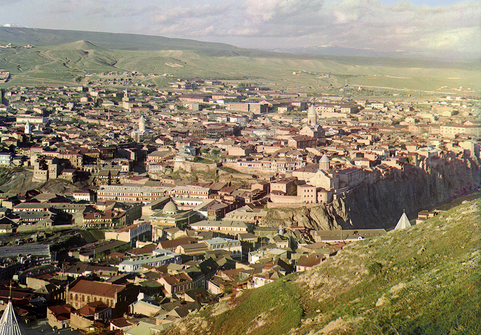

These are so amazing. The world wasn't sepia toned a hundred years ago! As silly as that statement is, my brain is actually having a hard time really believing these photos are from 100 years ago. I'm in awe.
So goes the joke:
  "Dad, why are there only black-and-white photos from before the early 1900s?"

  "Because you see, son, the world actually was black-and-white back then."

  "Then why were there colour portraits?"

"Because you see, son, artists were insane."Original, slightly longer: http://www.cooperativeindividualism.org/calvin-father-on-bla...

these photos are from 100 years ago.
This is the work of 21st century photoshop.[1,2,3]
_____________
Notes:
[1] "Each photograph takes days of painstaking Photoshop work, adjusting the color levels, removing the blemishes, adding contrast, etc."
[2] A psd has 3 RGB monochrome channels, that are blended together to create a full colour image. The analogues of which were created here using RGB filters to create meta-images on glass plate. Digitized, they become colour separations. The "contemporary look" is a result of the final post-processing.
[3] http://www.cs.brown.edu/courses/cs129/asgn/proj1/
This is the work of 21st century photoshop.[1,2,3]
_____________
Notes:
[1] "Each photograph takes days of painstaking Photoshop work, adjusting the color levels, removing the blemishes, adding contrast, etc."
[2] A psd has 3 RGB monochrome channels, that are blended together to create a full colour image. The analogues of which were created here using RGB filters to create meta-images on glass plate. Digitized, they become colour separations. The "contemporary look" is a result of the final post-processing.
[3] http://www.cs.brown.edu/courses/cs129/asgn/proj1/
It's not 'just' the work of Photoshop tho. There is a link to ones closer to the original in this discussion thread, and those are still extremely impressive.
All in all, I stand by my statement. These are accurate depictions of the color at that time, and as ludicrous as it seems - my brain is blown away that there was so much color. I know obviously there was - but years and years of my visual representation of that time period tries to tell me differently.
All in all, I stand by my statement. These are accurate depictions of the color at that time, and as ludicrous as it seems - my brain is blown away that there was so much color. I know obviously there was - but years and years of my visual representation of that time period tries to tell me differently.
my brain is blown away that there was so much color
-These image captures are 3 layer BW stills, the color is from a secondary process. Its a logic thing. The colour you are seeing is from photoshop[1,2,3]. Its about as 'real' as the latest issue of XYZ magazine's cover art.[4] That's not to in any way disparage it, but the reason they look "contemporary" is because of the way the images have been post-processed in photoshop. It would be trivial, for example, to make them look like they came out of instagram. Just a tech-point. Its slightly odd nobody else pointed this out, that's all. The guy was ahead of his time in thinking through the RGB seperation process, that's what is really brilliant...no doubt about that.
[Edit: Obviously, the presence of measurable electromagnetic radiation on the Earth's atmosphere, and/or its reflectivity, is the same now as it ever was. BW light sensitive emulsions have been very good for a long time. Viz, Ansel Adams, Ed Weston, etc.]
_________________
Notes:
[1] http://en.wikipedia.org/wiki/Gamut
[2] http://en.wikipedia.org/wiki/Color_space
[3] http://en.wikipedia.org/wiki/Adobe_RGB_color_space
[4] Literally. Digital sensor = BW. They are filtered into RGB monoochrome images, just like this guy pioneered. Then, they are reconstructed using SW. So, to the end user, it does not matter if you are starting from digital and/or analogue base images. The end images are literally the function of the SW and the Display (ie, all modern). If they were prints, they would be constrained by the tech of the print medium, etc.
-These image captures are 3 layer BW stills, the color is from a secondary process. Its a logic thing. The colour you are seeing is from photoshop[1,2,3]. Its about as 'real' as the latest issue of XYZ magazine's cover art.[4] That's not to in any way disparage it, but the reason they look "contemporary" is because of the way the images have been post-processed in photoshop. It would be trivial, for example, to make them look like they came out of instagram. Just a tech-point. Its slightly odd nobody else pointed this out, that's all. The guy was ahead of his time in thinking through the RGB seperation process, that's what is really brilliant...no doubt about that.
[Edit: Obviously, the presence of measurable electromagnetic radiation on the Earth's atmosphere, and/or its reflectivity, is the same now as it ever was. BW light sensitive emulsions have been very good for a long time. Viz, Ansel Adams, Ed Weston, etc.]
_________________
Notes:
[1] http://en.wikipedia.org/wiki/Gamut
[2] http://en.wikipedia.org/wiki/Color_space
[3] http://en.wikipedia.org/wiki/Adobe_RGB_color_space
[4] Literally. Digital sensor = BW. They are filtered into RGB monoochrome images, just like this guy pioneered. Then, they are reconstructed using SW. So, to the end user, it does not matter if you are starting from digital and/or analogue base images. The end images are literally the function of the SW and the Display (ie, all modern). If they were prints, they would be constrained by the tech of the print medium, etc.
I'm not really sure what the point of your assertions is. I think that everyone here understands that they did not have the technology 100 years ago to produce prints, transparencies, or projections that look this good. A seeming insinuation of what you are claiming is that we are looking at is a fabrication, rather than an accurate representation of a prior reality. That insinuation, if present, would seem to be groundless. What's amazing is that they had the technology and wherewithal 100 years ago to preserve the data that would let us accurately see today through a window looking 100 years into the past. Or at least as much so as any typical camera today gives us an accurate window into the recent past.
[I'm not really sure] [the point of your assertions is]. [I think that] [A seeming insinuation of what you are claiming is...] [That insinuation, if present, would seem to be groundless].
Rejecting a false assertion might be clever if it were not falsely asserted [in the first place]. But anyone can play this game. Its almost as good as the false [false dichotomy] that follows. This is pure [classic] trolling. And as HN readers will see...it continues in this thread ad infinitum from here.
Rejecting a false assertion might be clever if it were not falsely asserted [in the first place]. But anyone can play this game. Its almost as good as the false [false dichotomy] that follows. This is pure [classic] trolling. And as HN readers will see...it continues in this thread ad infinitum from here.
> This is pure [classic] trolling.
If anyone here is a troll, it is you. Only you haven't been coherent enough to be trolling in the traditional fashion. It seems perhaps that you have invented a new style of trolling: State things with an affected air of authority, but never make it exactly clear just what your thesis is. Instead, just kind of ramble on, juxtaposing incontrovertible facts -- such as, "The images are monochromes, set with chemistry. 100yrs ago" -- with enigmatic and dismissive assertions such as "Its "cool". Its just different than what you think it is." Then when anyone tries to pin you down by providing a paraphrasing of what they think your claims are, start whining about straw men and false dichotomies and how your expertise should not be questioned.
Very clever! I think we've discovered your true genius.
Or maybe you are just bipolar [fnord]. I cannot say.
If anyone here is a troll, it is you. Only you haven't been coherent enough to be trolling in the traditional fashion. It seems perhaps that you have invented a new style of trolling: State things with an affected air of authority, but never make it exactly clear just what your thesis is. Instead, just kind of ramble on, juxtaposing incontrovertible facts -- such as, "The images are monochromes, set with chemistry. 100yrs ago" -- with enigmatic and dismissive assertions such as "Its "cool". Its just different than what you think it is." Then when anyone tries to pin you down by providing a paraphrasing of what they think your claims are, start whining about straw men and false dichotomies and how your expertise should not be questioned.
Very clever! I think we've discovered your true genius.
Or maybe you are just bipolar [fnord]. I cannot say.
nessus42: I got my SB from MIT in Philosophy. MIT's Philosophy program is considered to be in the top few in the country, as is its Linguistics. I was taught creative writing by Joe Haldeman, photography in dark rooms that had been built by Minor White, psychology by Susan Carey, etc.
I normally don't call people out. But You're a MIT Philosophy Major spouting off. You know how bad these arguments are. This is my problem. With this type of background there is no excuse. I'm happy to give the benefit of the doubt to a normal HN reader who may be lacking in technicals or experience. English as a second language. But these argument forms are rhetorical garbage.
I'm not sure in what decade you were at MIT. Maybe that is the problem. Maybe these simple-by-modern-standard ideas, techniques, and technologies are beyond than your training in photography? You owe more to the HN community than that. You owe everybody here some intellectual honesty.
This is the 21st century. We are deconstructing perception and re-constructing it image by image, pixel by pixel. And tools and techniques that have been field tested for two decades. With cognitive psychology in mind. Its a long way from Minor White's Darkroom. These are now the tools of the Documentary photographer.[1]
I happen to have first-hand experience with this. Years worth of training. In school and in the field.
I don't need to "argue" a point when demonstrating or illustrating a standard technique, it's superflous. You confuse actual experience with an "affected air of authority."
The point of my contribution on this thread is to share some experience. So, if nothing else, people can talk more precisely. About what they are looking <at>. I'm not hear to rain on a parade about what people do or don't <see>. Images are ultimately viewed for there enjoyment regardless of provenence.
Time for more enjoying.
______________
[1] A Rigorous and interdiscilinary book, written by a Philosopher: The Objective Eye: Color, Form, and Reality in the Theory of Art (Oxford, 2006)
http://www.amazon.com/The-Objective-Eye-Reality-Theory/dp/02...
I normally don't call people out. But You're a MIT Philosophy Major spouting off. You know how bad these arguments are. This is my problem. With this type of background there is no excuse. I'm happy to give the benefit of the doubt to a normal HN reader who may be lacking in technicals or experience. English as a second language. But these argument forms are rhetorical garbage.
I'm not sure in what decade you were at MIT. Maybe that is the problem. Maybe these simple-by-modern-standard ideas, techniques, and technologies are beyond than your training in photography? You owe more to the HN community than that. You owe everybody here some intellectual honesty.
This is the 21st century. We are deconstructing perception and re-constructing it image by image, pixel by pixel. And tools and techniques that have been field tested for two decades. With cognitive psychology in mind. Its a long way from Minor White's Darkroom. These are now the tools of the Documentary photographer.[1]
I happen to have first-hand experience with this. Years worth of training. In school and in the field.
I don't need to "argue" a point when demonstrating or illustrating a standard technique, it's superflous. You confuse actual experience with an "affected air of authority."
The point of my contribution on this thread is to share some experience. So, if nothing else, people can talk more precisely. About what they are looking <at>. I'm not hear to rain on a parade about what people do or don't <see>. Images are ultimately viewed for there enjoyment regardless of provenence.
Time for more enjoying.
______________
[1] A Rigorous and interdiscilinary book, written by a Philosopher: The Objective Eye: Color, Form, and Reality in the Theory of Art (Oxford, 2006)
http://www.amazon.com/The-Objective-Eye-Reality-Theory/dp/02...
Thanks for the book recommendation. It actually looks fascinating. I think I best avoid it for now, however, or no doubt I'll become too distracted from my programming duties.
In the meantime, I'll take one more stab at horribly distorting your position in a trollish and intellectually dishonest fashion. What you seem to be saying is as follows:
With the advent of digital image manipulation tools such as Photoshop, we've discovered the visual equivalent of glutimates, the previously unrecognized fifth "taste", which does not have its own distinct flavor, and yet somehow manages to make everything that is combined with it taste ever so much better. Editorial photographers now use Photoshop to dump glutimates into the images that we routinely see by the bucketful, and these visual glutimates were also liberally sprinkled into the restored Proudin-Gorsky images. Anyone who experiences any particular feeling of "wow" from seeing these restored images, is really just enjoying those glutimates. The original data, sans artificial glutimate enhancement, would never wow the modern eye.
I have no doubt that you are correct about the visual glutimates that are routinely added to our modern visual diet. But I should also think that this is actually nothing new. This has been routinely done long before the invention of Photoshop, just as it was routinely done in cooking before the scientific confirmation a decade or so ago of a fifth kind of taste bud. E.g., Modern French cuisine, as codified in the late 19th century, is largely based on getting plenty of glutimates into food through the use of veal stock and deglazing, etc. There's a similar story for Japanese food, which led to the patenting of monosodium glutimate in 1908.
For a famous editorial photo ladened with darkroom MSG, rather than Photoshop created MSG, we need look no further than the famous photo of RFK after he was shot:
http://www.the1968exhibit.org/sites/the1968exhibit.org/files...
Should I somehow feel cheated that too much MSG has gotten into the meat of what was supposed to be reality? Maybe I should. But I don't. And surely what moves me about this photo is not merely the darkroom. You have stated previously that people who are in awe of the Proudin-Gorsky restorations are really in awe of nothing more than Photoshop. In that case, what moves me in the RFK photo, is nothing more than the darkroom. That, of course, is absurd.
Also, I'm not convinced that this visual MSG in the Proudin-Gorsky photos has quite the immense effect that you seem to imply that it does.
Compare this Proudin-Gorsky image:
http://inapcache.boston.com/universal/site_graphics/blogs/bi...
side-by-side with this scanned Kodachrome slide from 1941:
http://lcweb2.loc.gov/service/pnp/fsac/1a33000/1a33900/1a339...
Yes, the Proudin-Gorsky image looks more modern. But the Kodachrome image from 1941 is as equally impressive in its own way--those girls look like they could step right out of that slide and into my living room. And this is presumably without the addition of any MSG. Or at least not any that is not inherent in the Kodachrome process.
In the meantime, I'll take one more stab at horribly distorting your position in a trollish and intellectually dishonest fashion. What you seem to be saying is as follows:
With the advent of digital image manipulation tools such as Photoshop, we've discovered the visual equivalent of glutimates, the previously unrecognized fifth "taste", which does not have its own distinct flavor, and yet somehow manages to make everything that is combined with it taste ever so much better. Editorial photographers now use Photoshop to dump glutimates into the images that we routinely see by the bucketful, and these visual glutimates were also liberally sprinkled into the restored Proudin-Gorsky images. Anyone who experiences any particular feeling of "wow" from seeing these restored images, is really just enjoying those glutimates. The original data, sans artificial glutimate enhancement, would never wow the modern eye.
I have no doubt that you are correct about the visual glutimates that are routinely added to our modern visual diet. But I should also think that this is actually nothing new. This has been routinely done long before the invention of Photoshop, just as it was routinely done in cooking before the scientific confirmation a decade or so ago of a fifth kind of taste bud. E.g., Modern French cuisine, as codified in the late 19th century, is largely based on getting plenty of glutimates into food through the use of veal stock and deglazing, etc. There's a similar story for Japanese food, which led to the patenting of monosodium glutimate in 1908.
For a famous editorial photo ladened with darkroom MSG, rather than Photoshop created MSG, we need look no further than the famous photo of RFK after he was shot:
http://www.the1968exhibit.org/sites/the1968exhibit.org/files...

Should I somehow feel cheated that too much MSG has gotten into the meat of what was supposed to be reality? Maybe I should. But I don't. And surely what moves me about this photo is not merely the darkroom. You have stated previously that people who are in awe of the Proudin-Gorsky restorations are really in awe of nothing more than Photoshop. In that case, what moves me in the RFK photo, is nothing more than the darkroom. That, of course, is absurd.
Also, I'm not convinced that this visual MSG in the Proudin-Gorsky photos has quite the immense effect that you seem to imply that it does.
Compare this Proudin-Gorsky image:
http://inapcache.boston.com/universal/site_graphics/blogs/bi...
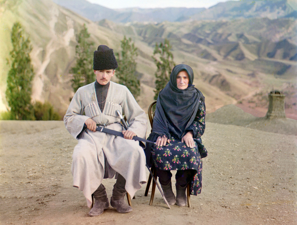
side-by-side with this scanned Kodachrome slide from 1941:
http://lcweb2.loc.gov/service/pnp/fsac/1a33000/1a33900/1a339...

Yes, the Proudin-Gorsky image looks more modern. But the Kodachrome image from 1941 is as equally impressive in its own way--those girls look like they could step right out of that slide and into my living room. And this is presumably without the addition of any MSG. Or at least not any that is not inherent in the Kodachrome process.
Understood, I really don't think you know what you are talking about. I am not "asserting," I am describing how black and white images are represented as color. These images are BLACK AND WHITE until they go into PS. Get it? The color of a landscape today or 100 years ago is no different. The fact that you could record monochromatic images in 1912 is not news. In fact, the larger formats favoured in the era (viz, weston, adams, etc) blow away a 16 megapixel digital sensor. The REPRESENTATIONS of colour look contemporary because they ARE they are litereally using 16bit colour spaces and colour gamuts (adobe 1998, prophotoRGB, etc) that are less than 20 years old. The images are not airbrushed but the Colour, saturation, contrast, sharpening (localized contrast) that give these images their "look" are about as "Real" as instagram on your iPhone. In fact, you could put instagram image filters on top of these files, pretty easily. To get that "Retro" look? Ironic, Eh? There is no secret to it. Its just odd that a with so many computer-literate people here there are so many comments that beg-the-question if people understand what they are looking at. There is a simple, genius technique at work here: shoot a BW image with a colour filter. That is not at all high tech, was not even in 1912 (see y/b sky filters, eg). Its very interesting to do some legwork on digital colour if you are unfamiliar with it. The images are, for all intents and purposes, similar to what we are looking at from MARS. Hope this helps. Your tone is slightly misplaced.
http://en.wikipedia.org/wiki/Bayer_filter
http://en.wikipedia.org/wiki/Bayer_filter
I understand how this type of color photography works, as does anyone who read the article, since the article explained it. It's basically the same as Technicolor, which was invented only a few years after these photos were taken. Though Technicolor was only shot using two colors rather than three until the early '30s. But all color photography has typically worked by effectively taking three monochromatic images and then combining them into one "full color" image.
As to the purpose of your post, no I still don't get it. You're either "describing" what anyone who knows anything about photography already knows, or it's a criticism of these photographs as being much less an accurate representation of color reality than modern photography is. If your "description" is supposed to entail that, then that putative entailment seems false to me. All color photography is just a gross approximation of reality, but with the aim of the approximations not being overly noticeable to the human eye. Kind of like how MP3's are only a gross approximation of the actual sound, but for which the aim is to be psycho-acoustically accurate.
As to anyone asserting that the original photographer was using some space-aged technology, where did anyone ever state such a thing? All I've seen is amazement over seeing photographs from the time that preserved information such that it could be later rendered in a way that we're not used to experiencing in photographs from that time period. Don't take the joy out of life.
Or maybe you wish to assert that the process used here to make the contemporary rendering of these photos is little different than it would be to take the original negatives for old technicolor films from the '30s and use them to produce more modern and psycho-visually accurate color images. Or to do the same for photography from any time period and use the data contained in it to make more accurate renderings. Well, those might also be interesting projects!
As to the purpose of your post, no I still don't get it. You're either "describing" what anyone who knows anything about photography already knows, or it's a criticism of these photographs as being much less an accurate representation of color reality than modern photography is. If your "description" is supposed to entail that, then that putative entailment seems false to me. All color photography is just a gross approximation of reality, but with the aim of the approximations not being overly noticeable to the human eye. Kind of like how MP3's are only a gross approximation of the actual sound, but for which the aim is to be psycho-acoustically accurate.
As to anyone asserting that the original photographer was using some space-aged technology, where did anyone ever state such a thing? All I've seen is amazement over seeing photographs from the time that preserved information such that it could be later rendered in a way that we're not used to experiencing in photographs from that time period. Don't take the joy out of life.
Or maybe you wish to assert that the process used here to make the contemporary rendering of these photos is little different than it would be to take the original negatives for old technicolor films from the '30s and use them to produce more modern and psycho-visually accurate color images. Or to do the same for photography from any time period and use the data contained in it to make more accurate renderings. Well, those might also be interesting projects!
I understand how this type of color photography works, as does anyone who read the article, since the article explained it. It's basically the same as Technicolor
That sentence says, no you don't understand.
The images are monochromes, set with chemistry. 100yrs ago.
Then they are scanned into a computer.
Imported into photoshop.
The color is from photoshop.
The working color space is from photoshop.
The output color space is from photoshop.
Ergo, they look like photoshop.
PJ's use photshop all the time, there is nothing nefarious.
But the "look" is a function of the post-processing.
Provided a somewhat reasonable monochrome scan quality.
In fact, images are shot on overcast days to maximize the post-processing range of the output images.
Thats how you max tonal seperability and ability to punch the color without blowing the dynamic range.
Its counterintuitive, but true.
A modern look is a dull image input + aggressive tonal controls.
This is exactly what NASA does from the digital files from Mars.
Or what the NY times does on its news stories, etc.
Its "cool". Its just different than what you think it is.
That sentence says, no you don't understand.
The images are monochromes, set with chemistry. 100yrs ago.
Then they are scanned into a computer.
Imported into photoshop.
The color is from photoshop.
The working color space is from photoshop.
The output color space is from photoshop.
Ergo, they look like photoshop.
PJ's use photshop all the time, there is nothing nefarious.
But the "look" is a function of the post-processing.
Provided a somewhat reasonable monochrome scan quality.
In fact, images are shot on overcast days to maximize the post-processing range of the output images.
Thats how you max tonal seperability and ability to punch the color without blowing the dynamic range.
Its counterintuitive, but true.
A modern look is a dull image input + aggressive tonal controls.
This is exactly what NASA does from the digital files from Mars.
Or what the NY times does on its news stories, etc.
Its "cool". Its just different than what you think it is.
I understand all of that, and none of that contradicts anything I've said.
Technicolor starts with three monochrome images on black and white silver negative film, just as these images started.
So once we have the negatives, Technicolor uses a chemical process to do dye transfer, while these images were creating using scanning and computers to achieve the same goal. So what? We already knew this, of course.
Or are you asserting that Technicolor and/or modern SLR produce images that are vastly more accurate in their color rendering than these images are? And do you think that people here would be any less impressed if they'd been rendered using a "filmic" or classic Technicolor look, rather than a "Photoshop look"?
I've done a fair amount of photography, so I know first hand that the colors and contrast you get on your final print are often vastly different from what you saw in reality while taking the photo, and yet we still typically think that results are "good enough".
And no, the process you've described is not particular different from what occurs with any photography. It's still precisely
Technicolor starts with three monochrome images on black and white silver negative film, just as these images started.
So once we have the negatives, Technicolor uses a chemical process to do dye transfer, while these images were creating using scanning and computers to achieve the same goal. So what? We already knew this, of course.
Or are you asserting that Technicolor and/or modern SLR produce images that are vastly more accurate in their color rendering than these images are? And do you think that people here would be any less impressed if they'd been rendered using a "filmic" or classic Technicolor look, rather than a "Photoshop look"?
I've done a fair amount of photography, so I know first hand that the colors and contrast you get on your final print are often vastly different from what you saw in reality while taking the photo, and yet we still typically think that results are "good enough".
And no, the process you've described is not particular different from what occurs with any photography. It's still precisely
   reality --> series of dubious technological steps
--> not-terribly-accurate but good enough representation of realityAt the risk of being pedantic, I'll explain it too you in another level of detail. First, lets backup though.
shawnc 19 hours ago | link | parent | flag
These are so amazing. The world wasn't sepia toned a hundred years ago! As silly as that statement is, my brain is actually having a hard time really believing these photos are from 100 years ago. I'm in awe.
OK. This was the original statement. The somewhat minor but technical point I was making is as follows. There is a simple explanation. The world then looked like it does today. And the image itself is modern, so it looks modern. Thats it. The Awe of this? Its called the "uncanney valley". Its kinda-almost-sorta-perfect-but-off-a-bit.
How did they do this then? Easy, the colorwork is done in photoshop, using contemporary techniques. PS allows them to exploit the latent image data, and map it onto one of many "style" outputs. [1]
You can debate this or not. But its cited in the footnotes above. If you havent read them, take a look.
I understand all of that you say?
Ok. You so, you are now in "awe of photoshop".
The technical reasons for this are not hard.
I'll stop here, because I think any more technical is not going to help you.
I've done a fair amount of photography...
Again, I would encourage you to do research on colour theory. If you do your own work, it will help you immensely, to make the most of your images. And if you really are an expert in this already, you know how trivial it is to produce "contemporary" style images from these formats, given the datasets you have to play with.
____________
Edit: For the general reader
[1] Style. In the sense i'm using it here is a mix of overall color, texture, tone, sharpness, saturation, hue, tint, noise, and other basic image editing techniques. Without getting into a discussion about "color" (ie, not "accuracy" but more correctly temp, tint, gamut, etc), its important to understand that the "look" has a lot of potential. Think about instagram. All of those filters are just "style" presets. But they don't look alike. Some are contemporary, some are retro, etc. It only requires a certain base image quaity to "take" the style (ie, good enough to not be ruined at the pixel level). So you might have an image which out of iphone looks "OK" and then in instagram is "Cool" or whatever. But the look of the "instagram" is independent of the landscape (which always looks the same, sepia toned on your phone or not). Now, the question is, what limits the "style"? And thats where the color technicals come in. If your input is messed up, your gamut and balance and tint will not let your image "take" a style. Because the transitions (ie, curves, etc) will destroy your pixel base. The size of your gamut, will determin the range you can execute. Now, with film, the color-setting step is a one-shot deal. There are no 12 instagram settings - you get just one - film/chemistry setting. You gett a little bit of flex at the print (color mix, etc) but not much. If you scan the film, then you are opening up to 12 syles (or whatever). So, now we get to the point. None of the film emulsions (prior to NC portra) really give you a contemporary look. To get that, you have to bring the image into digital. The temp/tint/contrast levels are just not there. Thats why its "odd" seing an old image looking like NC portra film or like a 2000+ PJ photoshop. And you can double check by looking at the details, if your an expert. The monochrome seperations have good tonal information, which is a credit to the guys back 100 years ago. But the modernists of that era were some of the best photogs ever, and among the most technically brilliant in monochrom image capture.
shawnc 19 hours ago | link | parent | flag
These are so amazing. The world wasn't sepia toned a hundred years ago! As silly as that statement is, my brain is actually having a hard time really believing these photos are from 100 years ago. I'm in awe.
OK. This was the original statement. The somewhat minor but technical point I was making is as follows. There is a simple explanation. The world then looked like it does today. And the image itself is modern, so it looks modern. Thats it. The Awe of this? Its called the "uncanney valley". Its kinda-almost-sorta-perfect-but-off-a-bit.
How did they do this then? Easy, the colorwork is done in photoshop, using contemporary techniques. PS allows them to exploit the latent image data, and map it onto one of many "style" outputs. [1]
You can debate this or not. But its cited in the footnotes above. If you havent read them, take a look.
I understand all of that you say?
Ok. You so, you are now in "awe of photoshop".
The technical reasons for this are not hard.
I'll stop here, because I think any more technical is not going to help you.
I've done a fair amount of photography...
Again, I would encourage you to do research on colour theory. If you do your own work, it will help you immensely, to make the most of your images. And if you really are an expert in this already, you know how trivial it is to produce "contemporary" style images from these formats, given the datasets you have to play with.
____________
Edit: For the general reader
[1] Style. In the sense i'm using it here is a mix of overall color, texture, tone, sharpness, saturation, hue, tint, noise, and other basic image editing techniques. Without getting into a discussion about "color" (ie, not "accuracy" but more correctly temp, tint, gamut, etc), its important to understand that the "look" has a lot of potential. Think about instagram. All of those filters are just "style" presets. But they don't look alike. Some are contemporary, some are retro, etc. It only requires a certain base image quaity to "take" the style (ie, good enough to not be ruined at the pixel level). So you might have an image which out of iphone looks "OK" and then in instagram is "Cool" or whatever. But the look of the "instagram" is independent of the landscape (which always looks the same, sepia toned on your phone or not). Now, the question is, what limits the "style"? And thats where the color technicals come in. If your input is messed up, your gamut and balance and tint will not let your image "take" a style. Because the transitions (ie, curves, etc) will destroy your pixel base. The size of your gamut, will determin the range you can execute. Now, with film, the color-setting step is a one-shot deal. There are no 12 instagram settings - you get just one - film/chemistry setting. You gett a little bit of flex at the print (color mix, etc) but not much. If you scan the film, then you are opening up to 12 syles (or whatever). So, now we get to the point. None of the film emulsions (prior to NC portra) really give you a contemporary look. To get that, you have to bring the image into digital. The temp/tint/contrast levels are just not there. Thats why its "odd" seing an old image looking like NC portra film or like a 2000+ PJ photoshop. And you can double check by looking at the details, if your an expert. The monochrome seperations have good tonal information, which is a credit to the guys back 100 years ago. But the modernists of that era were some of the best photogs ever, and among the most technically brilliant in monochrom image capture.
Alrighty then.
I know something about color theory. I even know some arcania, such as the fact that the X and Y coordinates of the XYZ color space are on the projective plane and that the XYZ color space contains non-existent colors.
Let me be a bit pedantic about psychology, though: shawnc never really believed that the world was sepia-toned a hundred years ago. He was just expressing amazement due the "uncanny valley" of which you speak. I feel confident that he knew why he felt this way, and that he didn't really need an explanation for it. When he said "my brain is having a hard time", this should have been a dead give-away that it was not his rational mind that was having a hard time, but rather his unconscious mind that was rebelling and making this "wow" feeling conscious. If it had been his rational mind that was rebelling, he would have said, "I'm having a hard time", not "my brain is having a hard time".
Or at least that's how I interpreted his comments. Your mileage apparently varies.
I know something about color theory. I even know some arcania, such as the fact that the X and Y coordinates of the XYZ color space are on the projective plane and that the XYZ color space contains non-existent colors.
Let me be a bit pedantic about psychology, though: shawnc never really believed that the world was sepia-toned a hundred years ago. He was just expressing amazement due the "uncanny valley" of which you speak. I feel confident that he knew why he felt this way, and that he didn't really need an explanation for it. When he said "my brain is having a hard time", this should have been a dead give-away that it was not his rational mind that was having a hard time, but rather his unconscious mind that was rebelling and making this "wow" feeling conscious. If it had been his rational mind that was rebelling, he would have said, "I'm having a hard time", not "my brain is having a hard time".
Or at least that's how I interpreted his comments. Your mileage apparently varies.
Good, I don't think we are disagreeing then.
My first note was really simple, just highlighting for HN how and why this was going on. Its here for refenence. The notes were just to avoid saying more. =D guess that didn't work out so well...There was a nother thread on these images a couple years ago too, nobody mentioned this.
________________
001sky 16 hours ago | link | parent
these photos are from 100 years ago.
This is the work of 21st century photoshop.[1,2,3]
My first note was really simple, just highlighting for HN how and why this was going on. Its here for refenence. The notes were just to avoid saying more. =D guess that didn't work out so well...There was a nother thread on these images a couple years ago too, nobody mentioned this.
________________
001sky 16 hours ago | link | parent
these photos are from 100 years ago.
This is the work of 21st century photoshop.[1,2,3]
> None of the film emulsions (prior to NC portra) really give you a contemporary look. To get that, you have to bring the image into digital.
I went back and had a look at the photos, and you do have a point. The ones that are most striking to me, though, have--to my eyes, at least--an HD video look to them, not a Photoshop look. And that's one thing that's striking about them to me: They look so immediate and real, like they were shot yesterday. This property is something we've been trained to associate with video.
On the other hand, I think that these photos would have been nearly as striking if they had been rendered in Kodachrome style or classic Technicolor style. To our modern minds, there is no age-appropriate color style for photographs that are 100 years old, since we never see such a thing.
In fact, whenever I see well-preserved color movies from the any time before the sixties I get the "uncanny valley" feeling, since most everything filmed before then was done so in black and white, or on crappy non-Technicolor film where the color barely survived. It's definitely still a little bit of shock whenever I've seen The Wizard of Oz, just because classic Technicolor weathered so well, and you just don't expect to see something from 1939 with beautiful, saturated, unfaded color.
I went back and had a look at the photos, and you do have a point. The ones that are most striking to me, though, have--to my eyes, at least--an HD video look to them, not a Photoshop look. And that's one thing that's striking about them to me: They look so immediate and real, like they were shot yesterday. This property is something we've been trained to associate with video.
On the other hand, I think that these photos would have been nearly as striking if they had been rendered in Kodachrome style or classic Technicolor style. To our modern minds, there is no age-appropriate color style for photographs that are 100 years old, since we never see such a thing.
In fact, whenever I see well-preserved color movies from the any time before the sixties I get the "uncanny valley" feeling, since most everything filmed before then was done so in black and white, or on crappy non-Technicolor film where the color barely survived. It's definitely still a little bit of shock whenever I've seen The Wizard of Oz, just because classic Technicolor weathered so well, and you just don't expect to see something from 1939 with beautiful, saturated, unfaded color.
The ones that are most striking to me, though, have--to my eyes, at least--an HD video look to them.
This is an interesting way to put it.
An HD video look to them, not a Photoshop look. And that's one thing that's striking about them to me: They look so immediate and real, like they were shot yesterday. This property is something we've been trained to associate with video.
So, I think this is the crux of the matter. A trained artist is trained to get the "HD look" without the "Photoshop look".[1] Its like fight club: the first rule of using photoshop, is don't let anyone know you are using photoshop.
Example. Your mind expects certain relationships to hold - an image subject closer to you has more resolvable detail than one farther away - for one. A visual cue for relative depth perception: if i can see it better it must be closer. But, in photoshop, I can differentially sharpen the fore-ground and the back-ground. If I do this to get a "uniform" level of detail,[2] it looks "high-definition" because the background has a higher level of detail [sharpness] than it should (according to your brain). But there is no increase in pixel resolution (ie, definition level) An image like this can be almost difficult to mentally process, you will want to look over every inch to take in all the detail. [Note: how this has nothing to do with color - i can pull this off with neutral colors].
Now, is this a "photoshop look"? Arguably, yes. To someone that is trained in these techniques. The idea that one can make a still image look "cinematic" HD is actually a good way to put it.
So, "looks like photoshop" as I was using it may have been not easy to understand. To many, this might mean "looks like Glamour photography, with airbrush and vivid colour". That is but a tiny subset of cases [popular photography, etc]. Almost all PJ and FA work is heavily (as in 80 layers) photoshopped if its going into a gallery. But it doesn't "look like it", if what you are expecting is something else. But, if you understand how these images are working, you will see they look nothing like the files that come out of RAW or a Digital scan of the negative.
The master of "HD" type looks is Gursky [see footnote 1]. His images have no unnatual colours, but the would be impossible without the powerful colour control you get in photoshop. Ie, the irony is that the more agressive you are with the tonal controls, the more you need color control (and 16bits and large color spaces, etc) to keep the normal part of the look. But its the tonal control that enbale you to create the "definition" that is so distinctive.
______________
[1] Take a look here:
http://upload.wikimedia.org/wikipedia/en/thumb/a/aa/Rhein_II...
or here:
http://artobserved.com/artimages/2008/01/andreas-gursky-hong...
Disucussion:
http://en.wikipedia.org/wiki/Andreas_Gursky
[2] Assuming the pixel quality is up to par
This is an interesting way to put it.
An HD video look to them, not a Photoshop look. And that's one thing that's striking about them to me: They look so immediate and real, like they were shot yesterday. This property is something we've been trained to associate with video.
So, I think this is the crux of the matter. A trained artist is trained to get the "HD look" without the "Photoshop look".[1] Its like fight club: the first rule of using photoshop, is don't let anyone know you are using photoshop.
Example. Your mind expects certain relationships to hold - an image subject closer to you has more resolvable detail than one farther away - for one. A visual cue for relative depth perception: if i can see it better it must be closer. But, in photoshop, I can differentially sharpen the fore-ground and the back-ground. If I do this to get a "uniform" level of detail,[2] it looks "high-definition" because the background has a higher level of detail [sharpness] than it should (according to your brain). But there is no increase in pixel resolution (ie, definition level) An image like this can be almost difficult to mentally process, you will want to look over every inch to take in all the detail. [Note: how this has nothing to do with color - i can pull this off with neutral colors].
Now, is this a "photoshop look"? Arguably, yes. To someone that is trained in these techniques. The idea that one can make a still image look "cinematic" HD is actually a good way to put it.
So, "looks like photoshop" as I was using it may have been not easy to understand. To many, this might mean "looks like Glamour photography, with airbrush and vivid colour". That is but a tiny subset of cases [popular photography, etc]. Almost all PJ and FA work is heavily (as in 80 layers) photoshopped if its going into a gallery. But it doesn't "look like it", if what you are expecting is something else. But, if you understand how these images are working, you will see they look nothing like the files that come out of RAW or a Digital scan of the negative.
The master of "HD" type looks is Gursky [see footnote 1]. His images have no unnatual colours, but the would be impossible without the powerful colour control you get in photoshop. Ie, the irony is that the more agressive you are with the tonal controls, the more you need color control (and 16bits and large color spaces, etc) to keep the normal part of the look. But its the tonal control that enbale you to create the "definition" that is so distinctive.
______________
[1] Take a look here:
http://upload.wikimedia.org/wikipedia/en/thumb/a/aa/Rhein_II...
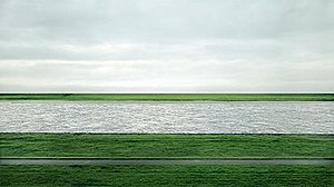
or here:
http://artobserved.com/artimages/2008/01/andreas-gursky-hong...

Disucussion:
http://en.wikipedia.org/wiki/Andreas_Gursky
[2] Assuming the pixel quality is up to par
These images do not look like Photoshop. The color gamut of the original negatives would probably be outside of the gamut of RGB. What has happened in post-processing is that the contrast and saturation have been exaggerated (is it too much, is that all you're really saying?). I've pulled some of these very same images into Photoshop and reconstituted them into color images.
What you've described in so many words is quite simple. These are three color channels, overlaid on each other (Photoshop makes auto-aligned layers very easy).
That's it. And basically that's what the three lens lantern projector that Prokudin-Gorsky used to present his images did.
The original source images, due to their being recorded on plates or film, probably have a wider gamut, due to the greater latitude of the analog medium, that most of the digital cameras produced today.
While we can't say for certain that this post-production has yielded an image of reality that corresponds exactly to the colors and lighting of those scenes 100+ years ago, grass is only so green, some historic dress survives, and there are archivists who study the deterioration of dyes, and while I don't know if the aspect of clothing has been studied in the production of these images, how can you say that these images are not an impressive reconstruction?
Basically, your argument boils down to this point. It's as if there were an ancient sculpture in three pieces. Researchers glued those three pieces together. You're bitching about the fact they used modern tools to put them together.
If you were to take these lantern slides and project them in the very same projector used by Prokudin-Gorsky onto a wall, I think you complain when a digital photograph was taken of them and displayed on the Internet. You are looking for things to nit-pick about.
What you haven't demonstrated an understanding of is how color film has always worked, since the very beginnings in experiments by Maxwell. There are layers of monochrome film, because that's what a sensitized silver emulsion is, is monochrome, there is none other. Above each of these layers of monochrome emulsion are dyes acting as filters, generally three, which filter all but 1/3 of the spectrum, giving us a red layer, a green layer and a blue layer. The film when processed removes the dyes which didn't get exposed (or did, depending on whether it's print or reversal film).
Digital cameras are the same, there is a light sensitive layer, which again, is entirely monochrome, sensitive to all frequencies of light. Above this layer is a layer of filters, called an Bayer array, which is two parts green, 1 part red, 1 part blue. Each light sensitive site has a filter of some color sitting over it. When the sensor is exposed and read out, the camera software processes it into a true color image by interpolating the color information onto adjacent pixels (demosaicing).
Finally, what you fail to demonstrate is why we should care where the color space and tonal separation come from. These images weren't shot on an overcast day, there's plenty of contrast present in most of these images, as they were shot on sunny days. Film emulsions in 1900 weren't very fast, the equivalent of ISO 25 or slower. You can get an idea of the duration of the exposure by looking at the silkiness of the water in the photos that were shot near water.
What I keep coming back to in my mind, is why you think that being produced in Photoshop diminishes or alters the reality of these scenes.
I too am sick of seeing candified images with off-the-charts color saturation, produced that way just because it can be, because colorfulness is compelling.
I don't think the images fit the definition of over-colorful. It would surprise me that the Library of Congress, whose mission is the archival of material, would make no allowance for the accuracy of the colors presented, however I see no allusion to the research, so perhaps these bear no resemblance to reality. These images come close enough that a contemporary viewer would be awed by them, and a modern viewer can better appreciate and understand the world which bore them. It takes true artistry to convey emotion with a monochrome image, so I'm glad we have these color images to convey more of the feeling of life in that era.
What you've described in so many words is quite simple. These are three color channels, overlaid on each other (Photoshop makes auto-aligned layers very easy).
That's it. And basically that's what the three lens lantern projector that Prokudin-Gorsky used to present his images did.
The original source images, due to their being recorded on plates or film, probably have a wider gamut, due to the greater latitude of the analog medium, that most of the digital cameras produced today.
While we can't say for certain that this post-production has yielded an image of reality that corresponds exactly to the colors and lighting of those scenes 100+ years ago, grass is only so green, some historic dress survives, and there are archivists who study the deterioration of dyes, and while I don't know if the aspect of clothing has been studied in the production of these images, how can you say that these images are not an impressive reconstruction?
Basically, your argument boils down to this point. It's as if there were an ancient sculpture in three pieces. Researchers glued those three pieces together. You're bitching about the fact they used modern tools to put them together.
If you were to take these lantern slides and project them in the very same projector used by Prokudin-Gorsky onto a wall, I think you complain when a digital photograph was taken of them and displayed on the Internet. You are looking for things to nit-pick about.
What you haven't demonstrated an understanding of is how color film has always worked, since the very beginnings in experiments by Maxwell. There are layers of monochrome film, because that's what a sensitized silver emulsion is, is monochrome, there is none other. Above each of these layers of monochrome emulsion are dyes acting as filters, generally three, which filter all but 1/3 of the spectrum, giving us a red layer, a green layer and a blue layer. The film when processed removes the dyes which didn't get exposed (or did, depending on whether it's print or reversal film).
Digital cameras are the same, there is a light sensitive layer, which again, is entirely monochrome, sensitive to all frequencies of light. Above this layer is a layer of filters, called an Bayer array, which is two parts green, 1 part red, 1 part blue. Each light sensitive site has a filter of some color sitting over it. When the sensor is exposed and read out, the camera software processes it into a true color image by interpolating the color information onto adjacent pixels (demosaicing).
Finally, what you fail to demonstrate is why we should care where the color space and tonal separation come from. These images weren't shot on an overcast day, there's plenty of contrast present in most of these images, as they were shot on sunny days. Film emulsions in 1900 weren't very fast, the equivalent of ISO 25 or slower. You can get an idea of the duration of the exposure by looking at the silkiness of the water in the photos that were shot near water.
What I keep coming back to in my mind, is why you think that being produced in Photoshop diminishes or alters the reality of these scenes.
I too am sick of seeing candified images with off-the-charts color saturation, produced that way just because it can be, because colorfulness is compelling.
I don't think the images fit the definition of over-colorful. It would surprise me that the Library of Congress, whose mission is the archival of material, would make no allowance for the accuracy of the colors presented, however I see no allusion to the research, so perhaps these bear no resemblance to reality. These images come close enough that a contemporary viewer would be awed by them, and a modern viewer can better appreciate and understand the world which bore them. It takes true artistry to convey emotion with a monochrome image, so I'm glad we have these color images to convey more of the feeling of life in that era.
[deleted]
These images do not look like Photoshop.
I don't think the images fit the definition of over-colorful.
You think that being produced in Photoshop diminishes or alters the reality of these scenes.
You fail to demonstrate is why we should care where the color space and tonal separation come from.
You haven't demonstrated an understanding of is how color film has always worked.
In all fairness, I think you wrote this while I was addressing most of this in a side-bar discussion upthread. But it makes sense to pull some of these ideas out together just to think about.
To start, take a look at this image: http://upload.wikimedia.org/wikipedia/en/thumb/a/aa/Rhein_II...
This is Rhein II, an image by [Andreas] Gursky, [which] fetched $4.3m (£2.7m) at Christie's, New York on November 8, 2011, becoming the most expensive photograph ever sold. [According to wikipedia.]
So, why look at this? Well, it adresses a couple of things. If you think you know what does and "does not look like photoshop" this will expand your data set. In particular, its not high contrast, or brightly colored or really in any way showing "photoshop". In fact, its not even a digital capture, its film. But the reason why this is the most expensive photograph in the world? Its a tour de-force of photoshop. Its so good, its invisible. Its full of mind-tricks. The space is completely unnatural, yet it looks perfectly normal. Etc.
But to a trained eye, this very much "looks like photoshop".
And it looks like alot of other images. Not all of which are so mind-bending, but in subtle and not so subtle ways may distort reality. Lots of PJ work has this color pallete and tonal range, but of course they aren't allowed all the fun that Gursky gets to have. And so often they just take their "visual look" and overall style from this school of Art.
The visual signature is very, very difficult if not impossible to pull off [in color] using modern analogue methods, not to mention more primitive. But MFA kids and the like can pull it off all the time, from just about and image input. Miracles of modern technology. =D
So, with that in mind, I'd direct you to more direct answers upthread:
http://news.ycombinator.com/item?id=4494818
http://news.ycombinator.com/item?id=4496128
In all fairness, I think you wrote this while I was addressing most of this in a side-bar discussion upthread. But it makes sense to pull some of these ideas out together just to think about.
To start, take a look at this image: http://upload.wikimedia.org/wikipedia/en/thumb/a/aa/Rhein_II...
This is Rhein II, an image by [Andreas] Gursky, [which] fetched $4.3m (£2.7m) at Christie's, New York on November 8, 2011, becoming the most expensive photograph ever sold. [According to wikipedia.]
So, why look at this? Well, it adresses a couple of things. If you think you know what does and "does not look like photoshop" this will expand your data set. In particular, its not high contrast, or brightly colored or really in any way showing "photoshop". In fact, its not even a digital capture, its film. But the reason why this is the most expensive photograph in the world? Its a tour de-force of photoshop. Its so good, its invisible. Its full of mind-tricks. The space is completely unnatural, yet it looks perfectly normal. Etc.
But to a trained eye, this very much "looks like photoshop".
And it looks like alot of other images. Not all of which are so mind-bending, but in subtle and not so subtle ways may distort reality. Lots of PJ work has this color pallete and tonal range, but of course they aren't allowed all the fun that Gursky gets to have. And so often they just take their "visual look" and overall style from this school of Art.
The visual signature is very, very difficult if not impossible to pull off [in color] using modern analogue methods, not to mention more primitive. But MFA kids and the like can pull it off all the time, from just about and image input. Miracles of modern technology. =D
So, with that in mind, I'd direct you to more direct answers upthread:
http://news.ycombinator.com/item?id=4494818
http://news.ycombinator.com/item?id=4496128
I gave this discussion some thought this morning. Basically the argument boils down to "it's not an old picture, it's modern, it's been post-processed in Photoshop, recently. What you're reacting to is a modern photograph" Correct me if I'm mistaken.
If that is the case, I still disagree. I'll bring the old saw from Ansel Adams that the negative is the score, and the print is the performance. He reprinted some of his most famous photographs throughout his lifetime, and some of these prints are arguably better than others. My point being, that since Prokudin-Gorksy isn't around to give us his performance, others have stepped up and created something they feel is analogous to the actual experience and perhaps amped it up a bit for our color-weary eyes.
There is no way for us to experience these images in the original without the three lens projector Prokudin-Gorsky used. With any method, you can claim that the colors and presentation are an artifact of the production process. If I see a beautiful image, sometimes it's apparent that Kodachrome or Velvia had been chosen specifically because of the way they enhance color or saturation. Would we even be having this discussion in these images had been captured on Kodachrome?
I have some idea of what is possible in Photoshop, and I can say with certainty that these images don't "reek" of Photoshop in the same way that those on the news stand do, with their plastic women and too-white teeth. What has been done is the most rudimentary work necessary to render both an image which is both colorful and complete by proper registration of the layers and by some manipulation of the contrast and saturation. I think that the technicians who put these images together have respected the work and the original intent of the artist (as far as I can suppose it), and have breathed new life into this artifact. What they have done is less invasive and less manipulative than the restoration of the Last Supper.
What puzzles me is this purism. This sense that Photoshop is so dominant over our visual senses that we cannot see past it and make statements about the work itself. That it has to be Photoshop that we find colorful, interesting, or worthy of note.
Not all viewers are equally naive. Some find tone-mapped HDR obtrusive, and the halos, contrast inversion and lack of shadows physically sickening. Some look at HDR and say gee wiz. I think readers on this site deserve more credit by default than the second category.
What I really want to know, is a suggest for fixing this alleged problem, of these images looking like Photoshop. What is the way to experience these images without that obtrusive technical monster in the way? What is the pure experience without some monkey at the keyboard interposing their vision on the work? How can I find myself enamored with the thing in itself, rather than a modern process or technique. Where is the original artwork, and how do you suggest I experience it?
As an aside, I'm very intrigued by your description of Gursky's photo being full of mind-bending and subtle tricks. What is unnatural about the space? I see what looks like compression, possibly by the use of a long lens. The lake should not be sunlit without the ground before and after being sunlit, unless there are some particularly rectangular clouds overhead. Some items have been cloned out, but I haven't been to the site or seen photographs of it to know what. Essentially, what is the visual signature that is present in this photo by Gurksy that is present in the Prokudin-Gorksy photos? I'm just not seeing it. I'd love to see a mockup in Photoshop that would simulate how you think the Prokudin-Gorsky images should look, or does the mere use of Photoshop somehow make it impossible to create an approximation of the ideal look of this work.
If that is the case, I still disagree. I'll bring the old saw from Ansel Adams that the negative is the score, and the print is the performance. He reprinted some of his most famous photographs throughout his lifetime, and some of these prints are arguably better than others. My point being, that since Prokudin-Gorksy isn't around to give us his performance, others have stepped up and created something they feel is analogous to the actual experience and perhaps amped it up a bit for our color-weary eyes.
There is no way for us to experience these images in the original without the three lens projector Prokudin-Gorsky used. With any method, you can claim that the colors and presentation are an artifact of the production process. If I see a beautiful image, sometimes it's apparent that Kodachrome or Velvia had been chosen specifically because of the way they enhance color or saturation. Would we even be having this discussion in these images had been captured on Kodachrome?
I have some idea of what is possible in Photoshop, and I can say with certainty that these images don't "reek" of Photoshop in the same way that those on the news stand do, with their plastic women and too-white teeth. What has been done is the most rudimentary work necessary to render both an image which is both colorful and complete by proper registration of the layers and by some manipulation of the contrast and saturation. I think that the technicians who put these images together have respected the work and the original intent of the artist (as far as I can suppose it), and have breathed new life into this artifact. What they have done is less invasive and less manipulative than the restoration of the Last Supper.
What puzzles me is this purism. This sense that Photoshop is so dominant over our visual senses that we cannot see past it and make statements about the work itself. That it has to be Photoshop that we find colorful, interesting, or worthy of note.
Not all viewers are equally naive. Some find tone-mapped HDR obtrusive, and the halos, contrast inversion and lack of shadows physically sickening. Some look at HDR and say gee wiz. I think readers on this site deserve more credit by default than the second category.
What I really want to know, is a suggest for fixing this alleged problem, of these images looking like Photoshop. What is the way to experience these images without that obtrusive technical monster in the way? What is the pure experience without some monkey at the keyboard interposing their vision on the work? How can I find myself enamored with the thing in itself, rather than a modern process or technique. Where is the original artwork, and how do you suggest I experience it?
As an aside, I'm very intrigued by your description of Gursky's photo being full of mind-bending and subtle tricks. What is unnatural about the space? I see what looks like compression, possibly by the use of a long lens. The lake should not be sunlit without the ground before and after being sunlit, unless there are some particularly rectangular clouds overhead. Some items have been cloned out, but I haven't been to the site or seen photographs of it to know what. Essentially, what is the visual signature that is present in this photo by Gurksy that is present in the Prokudin-Gorksy photos? I'm just not seeing it. I'd love to see a mockup in Photoshop that would simulate how you think the Prokudin-Gorsky images should look, or does the mere use of Photoshop somehow make it impossible to create an approximation of the ideal look of this work.
I think its worth backing up a bit. "What puzzles me is this purism." "Not all viewers are equally naive." "the original intent of the artist" "Where is the original artwork" "What I really want to know, is a suggest for fixing this alleged problem" "There is no way for us to experience these images in the original" "What you're reacting to is a modern photograph."
Nobody thinks like this anymore. These were debates from a long time ago. This is all strawman. These questions don't need to be answered. Digital post processing is the norm. It does not make an image worth anything. It does not ruin it. It is just a fact or not (and in these cases, we know its true).
Second, why does this even matter? Well, for (1), it opens up an entirely new realm of colours. Second (2), it allows for an entirely new realm of image-data-translations. So, we can assign point X a unique color, and then translate point X and all its neigbours to unique colors, without ruining the "image" information in the process. (3) It enables an entirely new rage of output colours, so what we see is and relate too is more/less similar based on 1x2x3. This is independent of the quality of the input image, but is magnified when these inputs are high-quality (because more translation can occurr with better tonality, et). Here is the intuition: Photoshop workin space vs Monitor output space.
http://www.luminous-landscape.com/Images32/17.jpg
Massive difference. Of course none of this has to do with what the image originally took in, this is just what we can do with it after we have it. We can do alot.
So, takeaway #1 is the actual color pallette of digital is unique. The acual image may be a tiny subset, and it may be designed such that it maps to an even tinier subset that is shared with C-print or whatever else you choose. But although I may end up in a <tiny> output space not blowing through the <working> space during my translations is critical. If I am workin in <tiny> space I am very constrained on translations. Ina <large> space, I can do lots of translations and then jam the output into <tiny> space at the end, wit a lot less damage.
The next question is: style and image composition. Is that unique to digital, and if so how? Why does it matter? Is it visible. etc. This is actually alot more important than the color range. The color range, we can (if we want to) keep "normal looking" pretty easily. But we need powerful tools to keep it normal looking, if we want to also have stong image tonal controls. Each time we dial up an RGB curve, it gives us more color in addition to more contrast. In chemistry, the paper controls the contrast level (for the most part). But the paper is the whole image, so a strong contrast and a punch color go together. the whole image has this "look". Kodachrome, Vevia etc for example is typical. But in digital, I can have a stong contrast and a muted color, because I can turn down the color for each turn up of contrast. So, even on a cloudy day, I can have stong contrast in the midtones, with no black shadows. I can add strong contrast to the light sky, without blown out highlights. I can have stong overal contrast from forground to background. I can have massive tonal seperations between a green grass and a grey river. etc.
This look is very "contemporary". To sum, its strong local contrast with muted to natural color. There are unnatural amounts of information present in all kinds of atypical relationships. Visual cues of depth and relative location do not act like normal. etc. Its more "interesting" to look at, because there is actually more information in the image.
What does this say about image quality? Nothing. This is true for good images and bad images. You can generate some of these effects on instagram. Its just more stuff to look at that is precisely tailored to the way your brain processes the images (ie, midtone=yes, shadows=no, etc). There are a whole host of subtle mind tricks, if you want to go there. Point of fact is ansel adams is using these techniques in many of his prints, just not in color. Its just that with PS this is all easier, faster, and far more widespread the understanding.
So, is some of this present in the images? Yes, it seems it is. These images are also interesting in their own right, this is not a critique. But for the many folks who are wondering "how it is possible" they are so lifelike and HD and cinematic and etc. This is in part the reason. In his day, they would have been nice BW prints. But the colour space of "lanterns" vs the color space of ProfotoRGB? is not comparable. lots more information extraction is possible in color today than 100 years ago, no doubt. And thats part of the reason for this "uncanney valley" of hyper-reality people seem to notice here. The extra information paired with the artifacts of glass plate images, and all that is almots-not-quite-perfect-but-still-very-cool.
So, is this insightful? I don't know. That's for you to decide, I was only sharing this for those who cared.
Not all viewers are equally naive...I think readers on this site deserve more credit by default
WEll, this may or may not be well known. My first few answers were thinking everyone knew this. But I hope you don't feel like this is talking down to you. This is also providing the foundation to understand Gursky. Its abit outside the scope of this discussion, but suffice it to say he is projecting freehand N-dimensional spaces, that are masked to appear normal. Consider a panaroma from the mars rover. But stiched together in an imaginary plane. But now consider that the rover is flying, not stationary. Its sort of a picasso in photoshop. But it looks "normal". Until you see how it doesnt. How it cant possibly be real. But then you step back, and it looks normal. you step up and can see every detail, perfect. The color is normal. The contrast is not extreme, etc. It looks "normal" but its not. .....
In a 2001 retrospective, New York's Museum of Modern Art described the artist's work, "a sophisticated art of unembellished observation. It is thanks to the artfulness of Gursky's fictions that we recognize his world as our own."[7] Gursky’s style is enigmatic and deadpan. There is little to no explanation or manipulation on the works. <His photography is straightforward>.[8]
.....
His photography is straightforward? But wait...
Camera position is the co-star of these pictures. Usually Gursky places his lens high above, far away, on cranes, or even on helicopters. His pictures often entail multiple views of the same subject, different subjects seamlessly spliced together, and digital manipulation.
Notice how little of this is explained in the catalog:
http://www.christies.com/LotFinder/lot_details.aspx?intObjec...
For more reading up on this, with explanations:
http://www.amazon.com/Why-Photography-Matters-Never-Before/d... [disregard the star rating]
Another Gursky that is more obviously mind-bending:
http://www.matthewmarks.com/new-york/artists/andreas-gursky/
Nobody thinks like this anymore. These were debates from a long time ago. This is all strawman. These questions don't need to be answered. Digital post processing is the norm. It does not make an image worth anything. It does not ruin it. It is just a fact or not (and in these cases, we know its true).
Second, why does this even matter? Well, for (1), it opens up an entirely new realm of colours. Second (2), it allows for an entirely new realm of image-data-translations. So, we can assign point X a unique color, and then translate point X and all its neigbours to unique colors, without ruining the "image" information in the process. (3) It enables an entirely new rage of output colours, so what we see is and relate too is more/less similar based on 1x2x3. This is independent of the quality of the input image, but is magnified when these inputs are high-quality (because more translation can occurr with better tonality, et). Here is the intuition: Photoshop workin space vs Monitor output space.
http://www.luminous-landscape.com/Images32/17.jpg

Massive difference. Of course none of this has to do with what the image originally took in, this is just what we can do with it after we have it. We can do alot.
So, takeaway #1 is the actual color pallette of digital is unique. The acual image may be a tiny subset, and it may be designed such that it maps to an even tinier subset that is shared with C-print or whatever else you choose. But although I may end up in a <tiny> output space not blowing through the <working> space during my translations is critical. If I am workin in <tiny> space I am very constrained on translations. Ina <large> space, I can do lots of translations and then jam the output into <tiny> space at the end, wit a lot less damage.
The next question is: style and image composition. Is that unique to digital, and if so how? Why does it matter? Is it visible. etc. This is actually alot more important than the color range. The color range, we can (if we want to) keep "normal looking" pretty easily. But we need powerful tools to keep it normal looking, if we want to also have stong image tonal controls. Each time we dial up an RGB curve, it gives us more color in addition to more contrast. In chemistry, the paper controls the contrast level (for the most part). But the paper is the whole image, so a strong contrast and a punch color go together. the whole image has this "look". Kodachrome, Vevia etc for example is typical. But in digital, I can have a stong contrast and a muted color, because I can turn down the color for each turn up of contrast. So, even on a cloudy day, I can have stong contrast in the midtones, with no black shadows. I can add strong contrast to the light sky, without blown out highlights. I can have stong overal contrast from forground to background. I can have massive tonal seperations between a green grass and a grey river. etc.
This look is very "contemporary". To sum, its strong local contrast with muted to natural color. There are unnatural amounts of information present in all kinds of atypical relationships. Visual cues of depth and relative location do not act like normal. etc. Its more "interesting" to look at, because there is actually more information in the image.
What does this say about image quality? Nothing. This is true for good images and bad images. You can generate some of these effects on instagram. Its just more stuff to look at that is precisely tailored to the way your brain processes the images (ie, midtone=yes, shadows=no, etc). There are a whole host of subtle mind tricks, if you want to go there. Point of fact is ansel adams is using these techniques in many of his prints, just not in color. Its just that with PS this is all easier, faster, and far more widespread the understanding.
So, is some of this present in the images? Yes, it seems it is. These images are also interesting in their own right, this is not a critique. But for the many folks who are wondering "how it is possible" they are so lifelike and HD and cinematic and etc. This is in part the reason. In his day, they would have been nice BW prints. But the colour space of "lanterns" vs the color space of ProfotoRGB? is not comparable. lots more information extraction is possible in color today than 100 years ago, no doubt. And thats part of the reason for this "uncanney valley" of hyper-reality people seem to notice here. The extra information paired with the artifacts of glass plate images, and all that is almots-not-quite-perfect-but-still-very-cool.
So, is this insightful? I don't know. That's for you to decide, I was only sharing this for those who cared.
Not all viewers are equally naive...I think readers on this site deserve more credit by default
WEll, this may or may not be well known. My first few answers were thinking everyone knew this. But I hope you don't feel like this is talking down to you. This is also providing the foundation to understand Gursky. Its abit outside the scope of this discussion, but suffice it to say he is projecting freehand N-dimensional spaces, that are masked to appear normal. Consider a panaroma from the mars rover. But stiched together in an imaginary plane. But now consider that the rover is flying, not stationary. Its sort of a picasso in photoshop. But it looks "normal". Until you see how it doesnt. How it cant possibly be real. But then you step back, and it looks normal. you step up and can see every detail, perfect. The color is normal. The contrast is not extreme, etc. It looks "normal" but its not. .....
In a 2001 retrospective, New York's Museum of Modern Art described the artist's work, "a sophisticated art of unembellished observation. It is thanks to the artfulness of Gursky's fictions that we recognize his world as our own."[7] Gursky’s style is enigmatic and deadpan. There is little to no explanation or manipulation on the works. <His photography is straightforward>.[8]
.....
His photography is straightforward? But wait...
Camera position is the co-star of these pictures. Usually Gursky places his lens high above, far away, on cranes, or even on helicopters. His pictures often entail multiple views of the same subject, different subjects seamlessly spliced together, and digital manipulation.
Notice how little of this is explained in the catalog:
http://www.christies.com/LotFinder/lot_details.aspx?intObjec...
For more reading up on this, with explanations:
http://www.amazon.com/Why-Photography-Matters-Never-Before/d... [disregard the star rating]
Another Gursky that is more obviously mind-bending:
http://www.matthewmarks.com/new-york/artists/andreas-gursky/
[deleted]
The are intensity recordings subject to filtering at specific frequencies of light.
There's no conceptual difference between this process and that of 3-color film photography, in which three monochrome silver-halide images subject to filtration are made, and the color is added in, during processing, chemically:
https://en.wikipedia.org/wiki/Color_photography#.22Modern.22...
Or NASA's various color photographs, most of which are created using three successive images through different filters (and that's for true-color images, rather than false-color images in which the finished color range is entirely an artifact based on EMR outside the human visual range).
Or for CCD-based color photography in which, again, intensity recording based on filtered sensors is presented by adding in the colors selected for by the filters.
So long as the recording and reproduction processes are faithful to the colors present in the original image, the colors are authentic. As authentic as anything that's a copy of an original impression can be.
There's no conceptual difference between this process and that of 3-color film photography, in which three monochrome silver-halide images subject to filtration are made, and the color is added in, during processing, chemically:
https://en.wikipedia.org/wiki/Color_photography#.22Modern.22...
Or NASA's various color photographs, most of which are created using three successive images through different filters (and that's for true-color images, rather than false-color images in which the finished color range is entirely an artifact based on EMR outside the human visual range).
Or for CCD-based color photography in which, again, intensity recording based on filtered sensors is presented by adding in the colors selected for by the filters.
So long as the recording and reproduction processes are faithful to the colors present in the original image, the colors are authentic. As authentic as anything that's a copy of an original impression can be.
So long as the recording and reproduction processes are faithful to the colors present in the original image
The faithfulnees is at the monochrome level. The recomposition, if done digitally, is impacted by the scanner, the working colour space, and the output colour space. color chemistry has unique set[1] properties (eg polaroid) while digital has far more flexibility [2]. From there is more a question of style than authenticty per-se.[3]
______________
[1] The colour is set once, and by the chemists. Kodachrome will not look like Velvia will not look like Polaroid, etc. You can digitally mimic these looks, however. As instagram has shown, to good effect.
[2] Non-destructive 16 bit editing, various colour spaces, etc etc.
[3] We have limited idea what colours look like on Mars, etc
The faithfulnees is at the monochrome level. The recomposition, if done digitally, is impacted by the scanner, the working colour space, and the output colour space. color chemistry has unique set[1] properties (eg polaroid) while digital has far more flexibility [2]. From there is more a question of style than authenticty per-se.[3]
______________
[1] The colour is set once, and by the chemists. Kodachrome will not look like Velvia will not look like Polaroid, etc. You can digitally mimic these looks, however. As instagram has shown, to good effect.
[2] Non-destructive 16 bit editing, various colour spaces, etc etc.
[3] We have limited idea what colours look like on Mars, etc
Same here except one thing is the same for me: the feeling of the photos or the "vibe" if you will. Because I've seen so many black and white or sepia photos of the past I have this weird image in my head that everything back before color photos was dark and dreary and even people living in that time, in color, saw everything as washed out and bleak. After seeing these in color, "true" color (as in not added after the fact), one thing stays the same. If you pay attention you'll notice that every shot with people in it feels dreary. No one is smiling. Everyone has the same almost depressed, somewhat emotionless expression on their faces. So while I have a hard time dealing with the fact that the world was in color back then the one thing I don't have to reconcile with my preconceived notions of the past is how gloomy the people all seem. I wonder why everyone in old photos states blankly like that. Is it because they're genuinely living a hard life? Could it be that smiling for photos wasn't customary back then? Both?
Also, photos from the 60's through the early 80's also seem to have a unique feel to them. I live in Chicago where some of the buildings have been around since just after the Chicago Fire and to see pictures taken of such places through the 20th century is so strange. I know intellectually that people saw the area in full color like I see it today but somehow older photos of the same streets and places I walk by feel like they're just not the same place. In an old photo a certain building or park will seem, well, old yet when I walk by it, it seems modern as ever even though the place hasnt physically changed much if it all since the early 1900's.
It's weird and I'm glad to know other people have that same sort of relation to older photos. I don't even quite know how to describe it but I did the best I could here.
Also, photos from the 60's through the early 80's also seem to have a unique feel to them. I live in Chicago where some of the buildings have been around since just after the Chicago Fire and to see pictures taken of such places through the 20th century is so strange. I know intellectually that people saw the area in full color like I see it today but somehow older photos of the same streets and places I walk by feel like they're just not the same place. In an old photo a certain building or park will seem, well, old yet when I walk by it, it seems modern as ever even though the place hasnt physically changed much if it all since the early 1900's.
It's weird and I'm glad to know other people have that same sort of relation to older photos. I don't even quite know how to describe it but I did the best I could here.
The cameras of the time required longer exposure times, so peoples expressions are (most often) natural. (Try genuinly smiling for a minute.)
I saw a hi-res version of this film two days ago http://www.youtube.com/watch?v=LeF4HXCq5z0. It was almost anachronical. Low res. jittery black and white movies makes everything look obsolete.
I come from the place where majority of these photos were taken (Ural mountains). Here is comparisons of landscapes on these old photos with current view — http://ufa.livejournal.com/2259613.html http://ufa.livejournal.com/2248707.html http://ufa.livejournal.com/2248073.html
Actually, in my opinion, not much have changed
I've always found it interesting that people's perception of history is coloured(couldn't resist) by having only seen it in black and white. You almost have to remember that the world wasn't actually in black and white 100 years ago. It's fascinating to see photos from that far back in colour, it somehow makes it easier to empathise with the people in the shots.
http://www.freewebs.com/calvin-hobbes-org/dadbandwandcolour....
Makes the world back then seem more modern, forces me to take it more seriously. The past is a different place, not stupider or more primitive, just different.

Makes the world back then seem more modern, forces me to take it more seriously. The past is a different place, not stupider or more primitive, just different.
Another good one is seeing ancient Greek and Roman statues in the colors they had and not just dull, white marble
http://www.smithsonianmag.com/multimedia/photos/?device=andr...
http://www.smithsonianmag.com/multimedia/photos/?device=andr...
These statues are painted afterwards and is probably not the "true" colors.
What amazes me the most is how good the quality is. These photos are better than those from my smartphone, and they're over a century old!
I do wonder how well he was able to view his own photos.
One thing that struck me was how much "nature" there is. The cities seems quite a bit smaller and more contained than they do today.
I do wonder how well he was able to view his own photos.
One thing that struck me was how much "nature" there is. The cities seems quite a bit smaller and more contained than they do today.
I'm sure he was able to view them well using a projector. Displays like that were the initial purpose of photography like this. Positives of these would have overlapped to make up the same images you see here.
By the way, I think it's sort of a shame to even compare smartphone digital photos to film photography. Of course they look better.
By the way, I think it's sort of a shame to even compare smartphone digital photos to film photography. Of course they look better.
Do you happen to have any insight into the processing of the film? I'm very curious as to how you'd process the plates into the specific colors needed for this to get anything close to life-like representations. I imagine these representations of the photos were taken from the raw negatives.
Judging by some of the artifacts i saw in the images i'm not even sure it was film. I think it may have been glass plates that were used for these. In a few there are areas where it looks like the substrate had flaked off of the negative when they made the positives.
Given that wikipedia says that film was starting to take over around this era I'd say that it's quite possible that it was all photographic plates since to do this well with something you'd have to have a good amount of experience with it and I wonder how much film and the processing would have reached Russia yet by then.
Given that wikipedia says that film was starting to take over around this era I'd say that it's quite possible that it was all photographic plates since to do this well with something you'd have to have a good amount of experience with it and I wonder how much film and the processing would have reached Russia yet by then.
They were black and whites taken with color filters over the lens (R, G, B).
Project each of the three in its corresponding color and overlap them to produce a full-color photo. Overlap them in that color in Photoshop to produce the digital images you see here.
Project each of the three in its corresponding color and overlap them to produce a full-color photo. Overlap them in that color in Photoshop to produce the digital images you see here.
How would you project them in their corresponding colors, though? I'd imagine you would have to produce prints in the colors. Only other thing I can think of is to project the negatives with R/G/B colored light behind them and make those projections line up.
> Of course they look better.
Why?
Why?
Three reasons that I can think of:
1. These images are likely captured on large-format glass plates, not tiny sensors. Therefore, the amount of magnification required is much less (these may be nearly 1:1 on a standard laptop display).
2. Chemical emulsions typically have much more dynamic range than digital sensors, allowing for more highlight and shadow detail.
3. Capturing colors in three separate exposures gets rid of the need for de-mosaicing.
1. These images are likely captured on large-format glass plates, not tiny sensors. Therefore, the amount of magnification required is much less (these may be nearly 1:1 on a standard laptop display).
2. Chemical emulsions typically have much more dynamic range than digital sensors, allowing for more highlight and shadow detail.
3. Capturing colors in three separate exposures gets rid of the need for de-mosaicing.
Because film captures details in molecules while a CCD sensor in your digital camera uses picture elements much, much, much larger than molecules.
Or, because it's analog. It's very similar to sound recordings. Whether magnetic or not (say, in vinyl) the resolution of the captured signal can approach the molecular. Digital has a discreet resolution limited by the capturing equipment; for example, CDs reproduce the volume in a sound recording only 44,100 times per second. But a magnetic tape has a resolution limited only by the number of molecules passing the recording head every second (the more [i.e. the faster the tape], the better.)
Or, because it's analog. It's very similar to sound recordings. Whether magnetic or not (say, in vinyl) the resolution of the captured signal can approach the molecular. Digital has a discreet resolution limited by the capturing equipment; for example, CDs reproduce the volume in a sound recording only 44,100 times per second. But a magnetic tape has a resolution limited only by the number of molecules passing the recording head every second (the more [i.e. the faster the tape], the better.)
The spacial resolution of analog photographs is not at the scale of individual molecules. It is limited by the "grain" of the film [1]. Other factors include distortions from lens shape imperfections in the lens material.
Audio tapes record their signal in magnetic domains. These are areas of tape the are large enough to be written and read. Much larger than anything approaching the scale of individual molecules.
Sound recordings on vinly are similarly limited by other factors. To "read" the signal from a record groove a needle is dragged a needle through a v shaped groove. This needle jiggles up and down and left and right, hence the two channels in stereo. The time resolution of the signal (max frequency) is limited by the physics of the jiggling head. It's inertia prevents it from reading signals over a certain limiting frequency. Again, well before the molecular level.
[1] http://en.wikipedia.org/wiki/Film_grain
[edit] - Changed momentum to inertia in the last paragraph.
Audio tapes record their signal in magnetic domains. These are areas of tape the are large enough to be written and read. Much larger than anything approaching the scale of individual molecules.
Sound recordings on vinly are similarly limited by other factors. To "read" the signal from a record groove a needle is dragged a needle through a v shaped groove. This needle jiggles up and down and left and right, hence the two channels in stereo. The time resolution of the signal (max frequency) is limited by the physics of the jiggling head. It's inertia prevents it from reading signals over a certain limiting frequency. Again, well before the molecular level.
[1] http://en.wikipedia.org/wiki/Film_grain
[edit] - Changed momentum to inertia in the last paragraph.
A couple points to add to that: with vinyl, the recording process itself (for which there are several techniques) also adds noise. The recording head (in whatever form) is also subject to physical laws. The materials used at each stage of the process are also not ideal substrates. Hell, vinyl is a polymer, which means it's a big tangle of chained molecules. Even if everything else were perfect, it would not be possible to write data at a molecular scale into such a medium.
I figured my layman explanation would suffice. While we're in the realm of correct details, it's also worth nothing that with each use of a needle dragged through a groove (or even with magnetic tape dragging across all the bits in the tape machine) the surface is degraded and the original recording along with it. Less fidelity, more noise ... hiss, pop, crack
Digital gives us error correction so that even when the physical media starts to degrade (taking the signal with it) our firmware and our software work out where the mistakes exist and attempt to correct them. Of course, once the signal has degraded beyond the point of recoverability, you "suddenly" have a catastrophic failure. (And this is why backups are important...)
Digital gives us error correction so that even when the physical media starts to degrade (taking the signal with it) our firmware and our software work out where the mistakes exist and attempt to correct them. Of course, once the signal has degraded beyond the point of recoverability, you "suddenly" have a catastrophic failure. (And this is why backups are important...)
We're actually approaching, if not have passed, the resolution of standard film with some higher end SLRs [1, 2]; at least in a total-usable-pixels perspective; but of course at the sub-pixel level, we're still very far off with only 14 bits per channel. There's also the question of how the total pixels are arranged, since each bit of the sensor is only absorbing one color, etc; but in time, at least as far as resolution is concerned, digital will or has surpassed analogue.
[1] http://www.mindspring.com/~lorqvonray/Sticker-5mp-Velvia.htm...
[2] http://www.clarkvision.com/imagedetail/film.vs.digital.summa...
Some ludicrous camera resolutions. Please not I'm trying to bring up cameras that are full-frame and have ludicrous sensor resolutions, so the arguments of "light doesn't work right at these densities" doesn't fly as easily, since the density is still relatively low:
http://imaging.nikon.com/lineup/dslr/d800/
http://www.usa.canon.com/cusa/consumer/products/cameras/slr_...
[1] http://www.mindspring.com/~lorqvonray/Sticker-5mp-Velvia.htm...
[2] http://www.clarkvision.com/imagedetail/film.vs.digital.summa...
Some ludicrous camera resolutions. Please not I'm trying to bring up cameras that are full-frame and have ludicrous sensor resolutions, so the arguments of "light doesn't work right at these densities" doesn't fly as easily, since the density is still relatively low:
http://imaging.nikon.com/lineup/dslr/d800/
http://www.usa.canon.com/cusa/consumer/products/cameras/slr_...
Ask any working professional photographer and they'll tell you we passed the practical resolution of film (35mm vs 35mm) years ago, and with the insanely low noise levels, we passed the dynamic range potential years ago too.
With the latest cameras in hand, you can capture sharper and cleaner photographs than the best 35mm film could ever manage, and you can do it with a tiny fraction of the light (1/16th the amount, or 4 stops, or 100 ISO film < 1600 ISO digital).
What you're seeing with the latest crop of pro cameras are 35mm sensors that are competitive with the best medium format film.
With the latest cameras in hand, you can capture sharper and cleaner photographs than the best 35mm film could ever manage, and you can do it with a tiny fraction of the light (1/16th the amount, or 4 stops, or 100 ISO film < 1600 ISO digital).
What you're seeing with the latest crop of pro cameras are 35mm sensors that are competitive with the best medium format film.
Maybe 35mm, but I'm still not sure have we passed the quality of medium and large film sizes. An old Hasselblad can still take pretty good pictures.
I didn't say it had passed, I said it was competitive... there may be some edge case scenarios where medium format film is still justifiable.
But when you factor in the convenience and availability of products like the D800, 5D3 and 1Dx, and combine that with the cost and quality of compatible glass, medium format starts to look like a marginal call indeed.
(Bear in mind, medium format DIGITAL is another thing altogether. That stuff kicks the pants off any of the pathetic baby toys made by Canon and Nikon.)
But when you factor in the convenience and availability of products like the D800, 5D3 and 1Dx, and combine that with the cost and quality of compatible glass, medium format starts to look like a marginal call indeed.
(Bear in mind, medium format DIGITAL is another thing altogether. That stuff kicks the pants off any of the pathetic baby toys made by Canon and Nikon.)
I probably mostly hear from purists and those people that don't want to look at the facts because "records are better than CD's" and similar arguments. I didn't know they were competing with medium format film now. That's .. saying something. o.o
Which is so funny because when music is produced digitally (99% of the recordings in the past decade) a CD can be a bit-perfect copy of the original mastering.
A vinyl record is a stamp of a stamp of a stamp of a scraping of the original master. Better than a CD? Evidence of complete mental breakdown, more like.
A vinyl record is a stamp of a stamp of a stamp of a scraping of the original master. Better than a CD? Evidence of complete mental breakdown, more like.
This always makes me wonder whether there isn't something about the imperfections from these analog copies (not to mention various analog playback mechanisms) that 'adds' to the richness/perceived value of the music...
Perhaps on some level some percentage of us prefer to know that we have a copy of a copy, or some level of imperfection, in our version that we play, vs a straight up 100% clone
That's completely fine.
What I object to is the unqualified use of 'better'. You can't claim that vinyl is somehow 'better' when what you mean is that vinyl is perhaps more 'satisfying' on a personal level.
I personally disagree; vinyl's imperfections irritate me just as much as a low bitrate MP3 does.
To me vinyl's upsides are the large cover artwork, and the lack of an easy 'skip' button. Less exiting is the knowledge that every subsequent play will sound worse than the last, even if by a tiny bit.
What I object to is the unqualified use of 'better'. You can't claim that vinyl is somehow 'better' when what you mean is that vinyl is perhaps more 'satisfying' on a personal level.
I personally disagree; vinyl's imperfections irritate me just as much as a low bitrate MP3 does.
To me vinyl's upsides are the large cover artwork, and the lack of an easy 'skip' button. Less exiting is the knowledge that every subsequent play will sound worse than the last, even if by a tiny bit.
i agree with you about unqualified use of better - I think it applies to lots of areas of technology, and even areas of culture, etc...
It would be nice if people were more understanding that a person's opinion on something is in fact influenced by all of their various value judgements and an enormous level of subjectivity; of course given that people in similar networks will have similar experiences and likely hold similar value judgements this leads to the tendency to 'circle jerk' on an issue, and then something becomes 'better'.. The first time they meet someone who doesn't share these judgements a flame war errupts
This is nonsense, analog also has a resolution. The stated resolution for the best audio cassettes i seen were 70us, correspondent (according to Niquist formula) to 28kHz digitalization, 1.5 worse than CDs. Most were worse, and it was just the resolution of the tape itself, telling nothing about ability of the recorder head to write them or read.
Same goes to photo film: image consists not of molecules, but of silver granules on film which are about a micron size, and either black or white. Actual resolution (which depends on contrast) is indicated on a film roll (for quality films), as a chart lp/mm vs contrast. While high resolution (and low-sensitive) film beats CCDs in this regard, reaching and somewhat exceeding 100 lp/mm which is equivalent to 2.5 microns per pixel, remember about Bayer pattern on chips to make color photos, vs about 5 microns per pixel in CCDs on DSLRs, this only comes with low sensitivity and other issues. General purpose photo films in most common shooting conditions are normally about same resolution as a good DSLR (full-frame because otherwise you have to apply a crop factor), and even than is an overshoot because most lenses does not provide that resolution, see MTF chart for most of them, the 'resolution' line is typically drawn measured at 30 lp/mm equivalent!
I am not even talking about such a fundamental effect as diffraction. It will block any further increase in image quality, whatever the lens and film is, long before you get down to 'molecules' (in fact, diffraction is in fact a limiting factor for resolution in many shooting conditions).
How important is the diffraction? Let's take practical best and worst case.
Best case: Full frame 20mpix DSLR, 6.5u pixels. Canon EF 50mm F/1.2L fixed focal length lens, resulting in about 41.6mm aperture. Resolution at peak sensitivity of 0.55 microns for this lens means that diffraction disk diameter will be 1.22 * 0.55/41666=1.61E-05 rad, which will be seen from 50mm distance (focal length, i.e. distance to film) as having 0.8u diameter - 8 times less than the pixel. So diffraction has no meaning here.
But, it is easy to see that there is a direct relationship between focal ratio and Airy disk diameter, so when diaphragm closes to 1.2*6.5/0.8 = ~f/9.7, Airy disk becomes as big as the pixel - making smaller pixel useless. This is not an extreme value - doing outdoor shooting in all-auto mode normally results in images done at f/8 or f/11 diaphragm. So, making pixels much smaller than they are now is all but useless even in a perfect optical system (which does not exist). Of course, same equally applies to film.
Same goes to photo film: image consists not of molecules, but of silver granules on film which are about a micron size, and either black or white. Actual resolution (which depends on contrast) is indicated on a film roll (for quality films), as a chart lp/mm vs contrast. While high resolution (and low-sensitive) film beats CCDs in this regard, reaching and somewhat exceeding 100 lp/mm which is equivalent to 2.5 microns per pixel, remember about Bayer pattern on chips to make color photos, vs about 5 microns per pixel in CCDs on DSLRs, this only comes with low sensitivity and other issues. General purpose photo films in most common shooting conditions are normally about same resolution as a good DSLR (full-frame because otherwise you have to apply a crop factor), and even than is an overshoot because most lenses does not provide that resolution, see MTF chart for most of them, the 'resolution' line is typically drawn measured at 30 lp/mm equivalent!
I am not even talking about such a fundamental effect as diffraction. It will block any further increase in image quality, whatever the lens and film is, long before you get down to 'molecules' (in fact, diffraction is in fact a limiting factor for resolution in many shooting conditions).
How important is the diffraction? Let's take practical best and worst case.
Best case: Full frame 20mpix DSLR, 6.5u pixels. Canon EF 50mm F/1.2L fixed focal length lens, resulting in about 41.6mm aperture. Resolution at peak sensitivity of 0.55 microns for this lens means that diffraction disk diameter will be 1.22 * 0.55/41666=1.61E-05 rad, which will be seen from 50mm distance (focal length, i.e. distance to film) as having 0.8u diameter - 8 times less than the pixel. So diffraction has no meaning here.
But, it is easy to see that there is a direct relationship between focal ratio and Airy disk diameter, so when diaphragm closes to 1.2*6.5/0.8 = ~f/9.7, Airy disk becomes as big as the pixel - making smaller pixel useless. This is not an extreme value - doing outdoor shooting in all-auto mode normally results in images done at f/8 or f/11 diaphragm. So, making pixels much smaller than they are now is all but useless even in a perfect optical system (which does not exist). Of course, same equally applies to film.
You say "only 44,100 times per second" as if it were somehow deficient. It's not, assuming the purpose of the sampling is to be heard by a human ear.
In fact, you'd be hard-pressed to make a legitimate, evidence-based argument justifying a significantly higher rate, for consumer music distribution purposes.
http://drewdaniels.com/audible.pdf
In fact, you'd be hard-pressed to make a legitimate, evidence-based argument justifying a significantly higher rate, for consumer music distribution purposes.
http://drewdaniels.com/audible.pdf
If film captures details at a molecular level, why are my old 400 ASA APS snaps so much grainier and lower-detailed than my cell phone snaps?
Exactly
> CDs reproduce the volume in a sound recording only 44,100 times per second.
Because humans can't hear sounds higher than 22 kHz, so with a 44.1 kHz sampling rate you're guaranteed to capture everything humans can hear.
Besides, tape has wow and flutter and records invariably have scratches and dust, not to mention limits in dynamic range.
http://rationalwiki.org/wiki/Audio_woo
Because humans can't hear sounds higher than 22 kHz, so with a 44.1 kHz sampling rate you're guaranteed to capture everything humans can hear.
Besides, tape has wow and flutter and records invariably have scratches and dust, not to mention limits in dynamic range.
http://rationalwiki.org/wiki/Audio_woo
The analogous concept here is the product of sampling rate and bit-depth, the number of bits per sample i.e the precision of the recording
Part of the reason is because the glass plates the images were photographed on are relatively large. The glass plate was 3inches by 9inches, meaning each image was approximately 3x3. This is somewhat larger (about 80% more area 9 sq in vs 5 sq in) than medium format film and about 8 times the size of 35mm film. While it's generally accepted that 35mm is "dead", it's still being debated whether digital has surpassed medium format.
Take a look at shorpy http://www.shorpy.com/ sometime. They have medium-res scans of full glass plates (8x10, 80 sq inches) and you can see the level of detail that a large negative captures. A full scan of the plate, capturing every transition between dark and light (line pair) would surely be in the hundreds of megapixels.
In fact you can see that many of these images are limited not by the resolution of the plate, but the lens technology (the corners of the images are often blurred, and lens imperfection called coma)
Take a look at shorpy http://www.shorpy.com/ sometime. They have medium-res scans of full glass plates (8x10, 80 sq inches) and you can see the level of detail that a large negative captures. A full scan of the plate, capturing every transition between dark and light (line pair) would surely be in the hundreds of megapixels.
In fact you can see that many of these images are limited not by the resolution of the plate, but the lens technology (the corners of the images are often blurred, and lens imperfection called coma)
Surprisingly good quality, considering his method. You get the best sense of his method when it goes a bit wrong, in photo 27:
http://www.boston.com/bigpicture/2010/08/russia_in_color_a_c...
My favorite picture is #15, the cathedral: http://www.boston.com/bigpicture/2010/08/russia_in_color_a_c...
My favorite picture is #15, the cathedral: http://www.boston.com/bigpicture/2010/08/russia_in_color_a_c...
What's most interesting to me, personally, is the water in these photos. Because the water is constantly moving, capturing the filtered images repeatedly won't work -- you end up capturing different images for RGB. That's what gives you that really neat rainbow effect; it looks like oil in a rainpuddle.
Edit: You can see some of this in photo 18 where the stems of the flowers were presumably moving very slightly: http://www.boston.com/bigpicture/2010/08/russia_in_color_a_c...
Edit #2: I just realized that I've used the same exact "effect" in demo code. I had a function in a shader that would generate a pixel color given a time value; I ran it three times for each pixel with a slightly different time value and then grabbed an R/G/B from each of them. You ended up with the same exact rainbow effect that was subtle when motion was limited and extreme when high speed motion was occurring. Not that that adds a ton to this thread, but I got a kick out of it.
Edit: You can see some of this in photo 18 where the stems of the flowers were presumably moving very slightly: http://www.boston.com/bigpicture/2010/08/russia_in_color_a_c...
Edit #2: I just realized that I've used the same exact "effect" in demo code. I had a function in a shader that would generate a pixel color given a time value; I ran it three times for each pixel with a slightly different time value and then grabbed an R/G/B from each of them. You ended up with the same exact rainbow effect that was subtle when motion was limited and extreme when high speed motion was occurring. Not that that adds a ton to this thread, but I got a kick out of it.
>Because the water is constantly moving, capturing the filtered images repeatedly won't work -- you end up capturing different images for RGB.
You're right, of course. But don't forget that the shutter speed was very low on these images. It would have harmed if the shutter speed was high : short exposure time of quickly moving water would have given very different water images for RGB. When exposing longer, motion blur makes the water seem to flow, becoming soft and blurry.
You're right, of course. But don't forget that the shutter speed was very low on these images. It would have harmed if the shutter speed was high : short exposure time of quickly moving water would have given very different water images for RGB. When exposing longer, motion blur makes the water seem to flow, becoming soft and blurry.
I was first amazed at the quality, then surprised that these were taken more recently than I expected, in 1910. Then, I realized that, duh, that was 102 years ago. It's strange how even 100+ years ago is getting more and more recent. (Obviously, that's how it works. But perception lags quite a bit.)
> It's strange how even 100+ years ago is getting more and more recent.
I think you are absolutely right with this. As the rate of change increases (and it has been rapidly increasing for the last 150 years) it makes sense that history would compress too. Fascinating!
I think you are absolutely right with this. As the rate of change increases (and it has been rapidly increasing for the last 150 years) it makes sense that history would compress too. Fascinating!
I don't think the rate of change increases. In just a few years after these pictures Russia will be involved in WWI, then revolution and civil war. After than Stalin, then WWII. Millions and millions of people will have their lives changed and shattered by these enormous changes.
Sure, today we get a new cell phone model each year, but I don't think this kind of change is as bag as e.g. revolution and world war.
Sure, today we get a new cell phone model each year, but I don't think this kind of change is as bag as e.g. revolution and world war.
I used to always think the 80's were 20 years ago.
If you enjoyed those and don't know who Albert Kahn is, you should also check out:
http://www.albertkahn.co.uk/photos.html
http://www.albertkahn.co.uk/about.html
There's a small museum in Paris dedicated to his work (situated on the grounds of Kahn's old estate no less) which is a wonderful experience if you're ever in Paris and looking for something cultural to do that's a bit off the beaten track. It's on the end of the metro line and is an oasis of calm compared to the typical Louvre pandemonium :)
Edit: found the link to the museum: http://albert-kahn.hauts-de-seine.net/english/
http://www.albertkahn.co.uk/photos.html
http://www.albertkahn.co.uk/about.html
There's a small museum in Paris dedicated to his work (situated on the grounds of Kahn's old estate no less) which is a wonderful experience if you're ever in Paris and looking for something cultural to do that's a bit off the beaten track. It's on the end of the metro line and is an oasis of calm compared to the typical Louvre pandemonium :)
Edit: found the link to the museum: http://albert-kahn.hauts-de-seine.net/english/
CS129 (Computational Photography) at Brown actually has students reconstruct these same photos as its first assignment. It's not too hard, and a good introduction to image alignment. Check out the assignment at http://www.cs.brown.edu/courses/cs129/asgn/proj1/
No one is smiling. Not even the kids. Maybe the woman in #20 is, who knows? I know in general 'old time' photos didn't have people smiling much - very posed pictures and stoic expressions. I wonder if they had any idea how much this would color our impression of them 100+ years later?
I think smiling for a photograph must be some sort of social training that humans either take to or don't.
I, for example, still find it very difficult and unnatural to smile for photographs unless I am already smiling about something else and the picture is just a candid moment caught at that time.
I would imagine that this old picture taking process (3 separate pictures with different filters each time) took quite a bit of time and subjects had to be posed for a a longer period of time. It would be very difficult to hold a smile for that long, and especially in those early photography days when the smiling-for-pictures convention still hasn't been established.
I, for example, still find it very difficult and unnatural to smile for photographs unless I am already smiling about something else and the picture is just a candid moment caught at that time.
I would imagine that this old picture taking process (3 separate pictures with different filters each time) took quite a bit of time and subjects had to be posed for a a longer period of time. It would be very difficult to hold a smile for that long, and especially in those early photography days when the smiling-for-pictures convention still hasn't been established.
Some of the pictures would have been impossible if the camera wasn't automatically swapping the filters very quickly. You can actually see the distortion is things moved around in the images and the colors separated, and there's even a sense of how fast they were moving. It seems to me that the pictures were taken in rapid succession indeed.
Quoth Wikipedia: "The exposure time of the frames is likely to have varied, even if the developed negatives were later on similar glass plates. In a letter to Leo Tolstoy requesting a photo session, Prokudin-Gorsky described each photo as taking one to three seconds, but, when recollecting his time with Tolstoy, he described a six-second exposure on a sunny day. Blaise Agüera y Arcas estimated the exposure of a 1909 photo taken in broad daylight to have had combined exposures of over a minute, using the movement of the moon as comparison."
It is probably a strange thing to say (i.e. common knowledge for others), but it only recently occurred to me that people develop a standard pose for photos. If you look at a family album or say Facebook or Flickr, and scroll through historic photos, the most "photogenic" people look almost identical. Those people will face in a certain direction with the same shape of smile and posture, it's almost freaky how identical they are! So it's obviously a practised/fake thing, that some learn to do while others remain oblivious. Back then, this concept would not have existed.
Early photos had very long exposures, with clamps used to hold people still. That may have set the expected look for a long time later.
reminds me of the story (not sure if it is true or not) of how the telephone revolutionised the world - prior to that, you had to be introduced to someone by a third party before you could speak to them; subsequent to the telephone the word 'hello' was invented.
Or so the story goes
That's interesting, I never thought about that. It must've taken a great deal of willpower to not want to know everything about every new person you would talk to on other end of the line.
I imagine this would've been my first conversation with a random receptionist that's just trying to patch my call through: "Hello! We are speaking on the telephone! How's the weather over there!?"
Following that train of thought, I don't really remember my first time using the telephone, although I'm sure I was yelling the whole time.
I imagine this would've been my first conversation with a random receptionist that's just trying to patch my call through: "Hello! We are speaking on the telephone! How's the weather over there!?"
Following that train of thought, I don't really remember my first time using the telephone, although I'm sure I was yelling the whole time.
Thanks for the link. Would have been nifty if 'Ahoy!' had of caught on!
This is the reference which backs up my point, however it makes it slightly more eloquently- saying that 'Hello' was a way to cut across Social barriers which were much more rigid before the invention:
http://books.google.com.au/books?id=AgLDhOySfMgC&lpg=PA3...
Ps apologies for the mess
This is the reference which backs up my point, however it makes it slightly more eloquently- saying that 'Hello' was a way to cut across Social barriers which were much more rigid before the invention:
http://books.google.com.au/books?id=AgLDhOySfMgC&lpg=PA3...
Ps apologies for the mess
It's not so much social training as it is the exposure time (which you also mentioned).
Exposure time was so long that it was nearly impossible to smile in pictures. See for example the picture of the photographer himself at the stream - the running water in the river is a blur.
I'm surprised the exposure time isn't that high in these pictures though. The shot of the workmen in the woodshop is distinctly modern by showing 'action'.
Photos required a very long exposure back then and a smile is hard to keep for what amounted to minutes. Keeping a neutral expression minimized movement and consequently blur resulting in an expensive re-shoot.
http://www.csmonitor.com/Innovation/Horizons/2011/1118/Louis...
http://www.csmonitor.com/Innovation/Horizons/2011/1118/Louis...
> No one is smiling
Don't forget, this was an official photographer mission, sponsored by the Tzar.
I think most people on the photos were stressed enough to be asked to pose in front of unknown equipment, probably with some local officials present on the shoot.
EDIT: actually, there are nice smiling faces on http://www.boston.com/bigpicture/2010/08/russia_in_color_a_c... , where people are not posing.
Don't forget, this was an official photographer mission, sponsored by the Tzar.
I think most people on the photos were stressed enough to be asked to pose in front of unknown equipment, probably with some local officials present on the shoot.
EDIT: actually, there are nice smiling faces on http://www.boston.com/bigpicture/2010/08/russia_in_color_a_c... , where people are not posing.
The amount of smiling varies a lot between cultures, you can't correlate smiling with levels of happiness. Russians are known for not being big on smiling http://blog.properrussian.com/2011/05/why-russians-are-not-s.... From that article:
>> There is a popular Russian saying, “A laughter without a reason is a sign of stupidity”
>> There is a popular Russian saying, “A laughter without a reason is a sign of stupidity”
There is a popular Russian saying, “A laughter without a reason is a sign of stupidity”
I'd read this, and spent a couple weeks in Russia last fall, and noticed the lack of smiling a lot when I was there. The thing that struck me about that mindset, and particularly that phrase (and others like it) is that it presumes the person looking at me knows if I have a reason to smile/laugh or not.
There's no doubt a lot of layers in the thinking that produced that (and similar) phrases which I can't unravel or fathom, but it's still strange all the same. To presume someone is stupid if you see them laughing is certain a cultural thing. Here (US) we'd probably just assume they were happy.
I'd read this, and spent a couple weeks in Russia last fall, and noticed the lack of smiling a lot when I was there. The thing that struck me about that mindset, and particularly that phrase (and others like it) is that it presumes the person looking at me knows if I have a reason to smile/laugh or not.
There's no doubt a lot of layers in the thinking that produced that (and similar) phrases which I can't unravel or fathom, but it's still strange all the same. To presume someone is stupid if you see them laughing is certain a cultural thing. Here (US) we'd probably just assume they were happy.
This is probably not to do with photography but portraiture in general. Think about all the drawn and painted portraits you've ever seen.
Tolstoy's and Dostoyevsky's legacy lies heavy on our minds as well as perpetual hangover and bone ache from dancing with bears. ;)
There is a huge difference between smiling and laughing. Yeah, laughing out loud with no reason will seem stupid to anybody.
Joining the dots a little bit for you, here's another quote leading up to this point.
>> Russians need a particular reason to smile. You've heard good news and you smile to show that you consider this news as good.
>> Russians need a particular reason to smile. You've heard good news and you smile to show that you consider this news as good.
It's very difficult to hold a smile very, very precisely. Any movement would've meant the colors would smudge. Not necessarily the reason why they're not smiling, but it's a possibility, I believe.
That's exactly it. The exposures were much longer then than now. It's also the same reason the bodies of water have the rainbow effect on their surfaces.
That chromatic effect is specifically the result of different intensities of light tracing different paths across a highly variable reflective surface (water) to the slightly different locations of each of the three separately filtered lenses of Prokudin-Gorskii's apparatus. It's an effect of space, not time.
Agreed, but holding any pose is a challenge - kids sitting on the hill - they'd fidget and move. The water moves. The sun moves if you wait long enough. I wonder how many 'bad' photos there are from the early days of photos where people tried smiling and they had smudged faces.
I see a ghost in the smallest kid apart from the others in the hill. Changed positions between filters.
I read somewhere that getting a photograph in those times was considered of great importance. The closest that you had back then to something like this was commissioning an artist to draw a portrait of yourself, very expensive and out of reach for common people. These are pictures mostly of rural folks, and even the ones with some kind of position like the emir were probably very poor. Therefore when somebody comes along and wants to take your photograph, you put on your best clothes, sit in a dignified pose and take it seriously, because it is a big deal.
And then, there's always some folks who like to deviate from the norm:
http://www.retronaut.co/2010/06/smiling-victorians/
I dare ya to scowl at these cheshires.
http://www.retronaut.co/2010/06/smiling-victorians/
I dare ya to scowl at these cheshires.
Russians don't walk around smiling, unless something good happens to smile about. In fact, smiling Americans look stupid grinning all the time.
As an American, the only time I see Americans grinning all the time is in stock photos. IRL we don't sit around eating salad and laughing all day.
You might find this interesting: http://news.ycombinator.com/item?id=2375633
Two reasons:
1. Smiling for a camera is something you do because you want to be remembered that way (happy) -- it is like positive propaganda of yourself via media. Now, figuring out a way to spread a positive image of yourself via the photographic medium is actually a culturally sophisticated trick that we learn by imitating a social habit -- but someone sometime had to invent that habit first. What you are looking at are photos of people taken before that trick was invented (and even if the trick was already invented, the people portrayed wouldn't know about it because they likely had never seen a photo in their life).
2. Even if people knew that they will be remembered more positively if they smile, it took about three minutes to take the kind of photos Prokudin took, and they had to hold absolutely still. It is hard to hold a grin on your face for three minutes without changing it and thus ruining your portrait.
1. Smiling for a camera is something you do because you want to be remembered that way (happy) -- it is like positive propaganda of yourself via media. Now, figuring out a way to spread a positive image of yourself via the photographic medium is actually a culturally sophisticated trick that we learn by imitating a social habit -- but someone sometime had to invent that habit first. What you are looking at are photos of people taken before that trick was invented (and even if the trick was already invented, the people portrayed wouldn't know about it because they likely had never seen a photo in their life).
2. Even if people knew that they will be remembered more positively if they smile, it took about three minutes to take the kind of photos Prokudin took, and they had to hold absolutely still. It is hard to hold a grin on your face for three minutes without changing it and thus ruining your portrait.
I'm not familiar enough with Russia specifically, but isn't smiling in photographs viewed as a weakness in some cultures?
Not just on Russian photographs. Dig up your grand-grand-parent photos and have a look - same expressions. It probably stems from the need to pose for photographs in daguerreotype times, back when they sat you in a chair and hold your head with a clamp, all because of an insanely long exposure that was required. Do that for 20-30 years and a somber expression on the photograms becomes a social norm, even if the technology moves forward.
At least one reason that smiling didn't persist for people of a certain time was that dental care wasn't the greatest, and people were reluctant to be captured with their poor teeth showing. Having had the opportunity to sort through thousands of studio photographs spanning most of the 20th century, I could almost date the age of the subject independent of the time the photograph was taken by seeing whether they were smiling or not.
[deleted]
In #22 you can see some people smiling. The one with the hat is certainly smiling.
Normally people are not smiling unless they are meeting someone or seeing something funny.
Previously seen 749 days ago: http://news.ycombinator.com/item?id=1621517
Looking at these feels like time travel.
It's funny, I got the exact same impression. Normally when you think of the past, you think of black & white, or faded color. But if you took a ride in a time machine, of course the past would look as vibrant as anything you currently see.
As a side note, I've noticed that when TV programs show a film clip from 30 years ago (say the early 80's), such as old sporting event clips, they add a false color fade to make the clip look old -- even though most of the film clips (and any non-film based storage) from that time would not have suffered such degradation.
Exactly. These don't look "old", there is no retro feel to them, especially with the landscapes. Messes with your head.
One question - was the artist himself capable of reassembling the monochrome frames into a color picture, or did he just take the pictures and stick them in an archive until someone could develop them properly?
EDIT: Answered my own question - apparently, the slides were originally intended to be projected together (with differently-colored lights) onto a wall, as color prints were too expensive.
EDIT: Answered my own question - apparently, the slides were originally intended to be projected together (with differently-colored lights) onto a wall, as color prints were too expensive.
I love the fact that these photos capture a landscape without cars. It is especially striking in the shots of cities. Imagine what it would look like if a photo of the same locations were taken now -- more pavement and cars, fewer trees.
Actually, you might be surprised about the tree part. Take a look at Tbilisi then and now, and you'll see more trees now.
I did see that, in 2010. And the title misslead me to think of something new. Could we please tag titles appropriately? ie. (2010)
The locations of these photos are pretty significant to the etymologies of many groups of people, spanning from modern day Turks, Koreans, Japanese, and even Native Americans.
(at least some people have proposed this). http://en.wikipedia.org/wiki/Altaic_languages
(at least some people have proposed this). http://en.wikipedia.org/wiki/Altaic_languages
Can you be more clear? Because I see a lot of photos from caucasus, urals, middle east and not much Siberia.
Can any one post a link to the equipment details - design/description, anything? Thanks.
Picture #30: Clicking the Google Map link shows three bridges that cross the river today. The center bridge appears to be the one from the photograph.
Those stone piers are beautiful and my guess, still fully functional 100 years later.
Those stone piers are beautiful and my guess, still fully functional 100 years later.
This makes me realized how amazing it will be having tools like Instagram, having captured millions of photos, in around 100 years from now.
I have mixed feelings about that.
Millions of recent GPS tagged photographs floating around in the cloud have some incredibly cool technical potential when combined with something like PhotoSynth, but culturally I think ubiquitous photos actually weaken the historical impact.
To loosely stick with the Russian theme, a peek into a single moment in the life one person 100 years ago is fascinating, but a million peeks into a single moment in the life of a million people 100 years ago is just data.
Millions of recent GPS tagged photographs floating around in the cloud have some incredibly cool technical potential when combined with something like PhotoSynth, but culturally I think ubiquitous photos actually weaken the historical impact.
To loosely stick with the Russian theme, a peek into a single moment in the life one person 100 years ago is fascinating, but a million peeks into a single moment in the life of a million people 100 years ago is just data.
Will all these Instagram pictures be there in 100 years? What happens if Instagram shuts down?
Wonderful !
Wonder how many of these historical remains are still present in Russia? Would love to visit the country once.
Wonder how many of these historical remains are still present in Russia? Would love to visit the country once.
Just think: in 50-100 years, the phrase "100 years ago" won't mean that much, in terms of technology.
Really? Why do you suppose? In 50-100 years, I can easily see us having a permanent presence on another planet, fully automated vehicles and a Terminator like military comprised completely of robots. That world (if true), technologically, would look amazingly different than how we live today.
Another planet in our solar system? Sure. But even the nearest planet beyond our Solar system is about 11 light years away. And getting there anytime soon is an unfeasible goal according to Physics. Perhaps the Earth would be different 50 to 100 from now, but I wouldn't bet too much on any exciting activity going on outside of our planet.
Okay, maybe a better word choice would have been "certain" technologies. Seeing photographs of the 50s in 2050 won't seem all that amazing.
Unless we figure out how to create realistic full-color 3D holograms, or at least highly-improved glasses-free stereographic displays. In that case, anything pre-stereography will look very "flat", and the relatively few stereographic photos taken today could have the same impact as these color photos from the article
Sci-fi has trained us to expect all the things you mention so when they arrive we probably won't feel that anything much has changed.
Really? I think it will mean more than it does now. The pace at which technology advances seems to be increasing exponentially, at least that's my perception.
I can't imagine what will change even in the next 10 years, let alone the next 50-100 years.
I can't imagine what will change even in the next 10 years, let alone the next 50-100 years.
Old - this was already linked on HN a while ago I believe. But if you haven't seen it, it's nice.
So, apparently smiling in pictures is a relatively new trend?
I don't know if this was the case here, but in other pictures of the time people didn't smile so much in photos as the slow shutter speed meant they were more likely to blur, as a smile is harder to maintain than a neutral expression.
How can I vote a news down? Because this isn't "news". I've seen it two years ago. Really great pictures, but no news ...
Looking at their faces, no one seems happy. Not a single smile in any photo including those of kids. Kinda depressing.
Well, they have to maintain their pose and expression for 3 consecutive shots.
If you look at old daguerreotypes people have really weird expressions in them as well, because they had to be still for long time.
If you look at old daguerreotypes people have really weird expressions in them as well, because they had to be still for long time.
This is not Russia!
This had been in the "news" for the past 5 years if not longer. How many times can it makes the frontage? ;)
http://www.loc.gov/exhibits/empire/
http://www.loc.gov/exhibits/empire/
I've probably seen this set of images half a dozen times. I still find myself scrolling through the whole set every time it pops up. It's really a stunning set of images, and absolutely worth enjoying more than once.
As many times as we're happy to recall the impressive technical feat of the original artist, or as long as we're fascinated by what life looked like a hundred years ago. The max of those two.