Ridiculous User Interfaces In Film, and the Man Who Designs Them(gizmodo.com)
gizmodo.com
Ridiculous User Interfaces In Film, and the Man Who Designs Them
http://gizmodo.com/5418342/ridiculous-user-interfaces-in-film-and-the-man-who-designs-them
23 comments
I often think that UI's for some real software should be closer to film depictions, not the other way around.
If you want an overly complicated and busy (with no regard to usability) UI, just go for Enlightenment ;)
In other regards, I like the choice of Ulrich Schnauss on his film reel. Big fan. Good coding 'tunes.
In other regards, I like the choice of Ulrich Schnauss on his film reel. Big fan. Good coding 'tunes.
I love Enlightenment. Used to show it off to friends during presentations just for kicks. ;)
Other than that it's pretty usable, though takes a while getting used to.
Other than that it's pretty usable, though takes a while getting used to.
The real portfolio url was on HN two days ago.
http://news.ycombinator.com/item?id=971844 and the link:
http://blog.coleran.com/category/portfolio/screendesign
And a post was up on rockpapershotgun this monday: http://www.rockpapershotgun.com/2009/11/30/tapitty-tapitty-t...
Who started all this one may wonder.
Who started all this one may wonder.
I think he did an AMA on reddit two months ago: http://www.reddit.com/r/IAmA/comments/9lsp2/i_create_those_f...
Funny. The German in the Bourne Identity UIs is full of errors and fake words. Then again, it is still a lot better than the "German" spoken by Nazis in Hollywood movies.
ACHTUNG!
ALLES TURISTEN UND NONTEKNISCHEN LOOKENPEEPERS! DAS KOMPUTERMASCHINE IST NICHT FÜR DER GEFINGERPOKEN UND MITTENGRABEN! ODERWISE IST EASY TO SCHNAPPEN DER SPRINGENWERK, BLOWENFUSEN UND POPPENCORKEN MIT SPITZENSPARKSEN. IST NICHT FÜR GEWERKEN BEI DUMMKOPFEN. DER RUBBERNECKEN SIGHTSEEREN KEEPEN DAS COTTONPICKEN HÄNDER IN DAS POCKETS MUSS. ZO RELAXEN UND WATSCHEN DER BLINKENLICHTEN.
http://en.wikipedia.org/wiki/Blinkenlights
ALLES TURISTEN UND NONTEKNISCHEN LOOKENPEEPERS! DAS KOMPUTERMASCHINE IST NICHT FÜR DER GEFINGERPOKEN UND MITTENGRABEN! ODERWISE IST EASY TO SCHNAPPEN DER SPRINGENWERK, BLOWENFUSEN UND POPPENCORKEN MIT SPITZENSPARKSEN. IST NICHT FÜR GEWERKEN BEI DUMMKOPFEN. DER RUBBERNECKEN SIGHTSEEREN KEEPEN DAS COTTONPICKEN HÄNDER IN DAS POCKETS MUSS. ZO RELAXEN UND WATSCHEN DER BLINKENLICHTEN.
http://en.wikipedia.org/wiki/Blinkenlights
[deleted]
There's something that always amuses me in movies and series: something happened/is about to happen, a taskforce is created and they're running software very specific to that thing right away, with graphics, simulations, etc.
Who writes all that? No one ever mentions the programmers that save the day.
Who writes all that? No one ever mentions the programmers that save the day.
I have to disagree on the ridiculous part. They are all busy and dense, but they are not ridiculous per se when detached from the movie they came from.
Sometimes, you have to convey a very large amount of information in a very confined space. The glass-cockpits in planes are a good example - very dense displays that require some training to use.
And, once it works, there is little reason not to make it look cool.
Sometimes, you have to convey a very large amount of information in a very confined space. The glass-cockpits in planes are a good example - very dense displays that require some training to use.
And, once it works, there is little reason not to make it look cool.
Some of the best interfaces I have written have been in good old-fashioned curses. If you need a "dashboard" for a complex system for a skilled operator, you can convey an awful lot of information in a maximized xterm on a 1280x1024 screen, it's dense but it's not "cluttered" if you lay it out and use colour intelligently.
Sure, bit it's useful to convey some information in graphical form. Many of the constructs he employs (progress circles, use of color gradients to indicate data age) are really good.
The main point being, complex data doesn't have to look ugly.
The main point being, complex data doesn't have to look ugly.
ridiculous as in technically absurd. I don't think he meant the design was ridiculous. at least that's my interpretation.
[deleted]
Did this guy do an IAmA on Reddit: http://www.reddit.com/r/IAmA/comments/9lsp2/i_create_those_f... ?
The guy who made the interface for Minority Report is actually commercializing it. http://vimeo.com/user922585
However, the user interface of the Sentry Gun the marines used in Aliens II was very realistic: http://www.inetres.com/gp/sf/aliens/sentry02.jpg
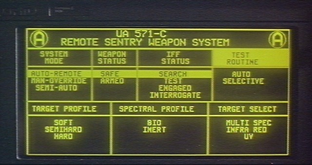
Dead link...
Really? For me it still works.
Anyway, I've made a mirror copy:
ftp://motoom.net/pictures/alien-sentry02.jpg
Anyway, I've made a mirror copy:
ftp://motoom.net/pictures/alien-sentry02.jpg
A much more interesting user interface used in a movie was developed by Oblong (see John Underkoffler). I am talking about Minority Report ;) They are making it into a real UI.
Check it out : www.oblong.com
Check it out : www.oblong.com
I'm looking forward to Iron Man 2. Teaser: http://mahoski.s3.amazonaws.com/ironman-big.jpg

I really enjoyed the UI stuff in Ironman. It was futuristic to be sure, but a lot of it struck me as interfaces that, given the technology, a brilliant inventor might actually use. And I'm pretty sure there was an implementation of tabs, pads, and boards (http://design.cca.edu/graduate/uploads/pdf/IA_PARC_Ubicomp.p...) going on there.