Red, Yellow, and Blue(daveeddy.com)
daveeddy.com
Red, Yellow, and Blue
http://www.daveeddy.com/2014/07/01/red-yellow-and-blue/
40 comments
> Neat article, but I found it surprising that the author didn't go into a bit more detail about why RGB is used and where it's used. Saying that it's just how computers or televisions deal with it because of monitors only offers a bit of information.
It's our eyes. Our eyes are (roughly) RGB, therefore a RGB monitor is a best spectrum match for our eyes, therefore it's how computers and printers deal with it (CMY/K/ is just the inverse of RGB).
For many animals, even our best high end lifelike wide-spectrum display cuts out or inaccurately represents portions of the spectrum they can see.
It's our eyes. Our eyes are (roughly) RGB, therefore a RGB monitor is a best spectrum match for our eyes, therefore it's how computers and printers deal with it (CMY/K/ is just the inverse of RGB).
For many animals, even our best high end lifelike wide-spectrum display cuts out or inaccurately represents portions of the spectrum they can see.
> For example, while the L cones have been referred to simply as red receptors, microspectrophotometry has shown that their peak sensitivity is in the greenish-yellow region of the spectrum. Similarly, the S- and M-cones do not directly correspond to blue and green, although they are often depicted as such. It is important to note that the RGB color model is merely a convenient means for representing color, and is not directly based on the types of cones in the human eye.
It's not that easy though
http://en.wikipedia.org/wiki/Color_vision
> The cones are conventionally labeled according to the ordering of the wavelengths of the peaks of their spectral sensitivities: short (S), medium (M), and long (L) cone types. These three types do not correspond well to particular colors as we know them. Rather, the perception of color is achieved by a complex process that starts with the differential output of these cells in the retina and it will be finalized in the visual cortex and associative areas of the brain.
> For example, while the L cones have been referred to simply as red receptors, microspectrophotometry has shown that their peak sensitivity is in the greenish-yellow region of the spectrum. Similarly, the S- and M-cones do not directly correspond to blue and green, although they are often depicted as such. It is important to note that the RGB color model is merely a convenient means for representing color, and is not directly based on the types of cones in the human eye.
Also there are alternative color spaces like YUV: http://en.wikipedia.org/wiki/YUV
It's not that easy though
http://en.wikipedia.org/wiki/Color_vision
> The cones are conventionally labeled according to the ordering of the wavelengths of the peaks of their spectral sensitivities: short (S), medium (M), and long (L) cone types. These three types do not correspond well to particular colors as we know them. Rather, the perception of color is achieved by a complex process that starts with the differential output of these cells in the retina and it will be finalized in the visual cortex and associative areas of the brain.
> For example, while the L cones have been referred to simply as red receptors, microspectrophotometry has shown that their peak sensitivity is in the greenish-yellow region of the spectrum. Similarly, the S- and M-cones do not directly correspond to blue and green, although they are often depicted as such. It is important to note that the RGB color model is merely a convenient means for representing color, and is not directly based on the types of cones in the human eye.
Also there are alternative color spaces like YUV: http://en.wikipedia.org/wiki/YUV
To elaborate on why the RGB color model is convenient for representing color...
The choices of RGB in trichromatic reproduction systems are such that the individual contribution of each minimizes the cross-cone activation in the eye, allowing greater fidelity (widest gamut) in color reproduction with only three sensors at input and three emissive colors at output. In other words, if you're going to use analog electronics and passive filters, it helps to make the selected primary frequencies as functionally orthogonal and isolated as possible.
Consider the quality of an absorptive filter and/or response profile of a pixel on CMOS sensor; so long as a it has a strong peak at the primary frequency, then we're not too concerned about leakage from other frequencies into it; nor are we too concerned that nearby colors could leak a little into the other two channels because this will mostly be correlated with overall luminance, which makes it very hard for the eye to discern upon reproduction (it looks a little more washed out).
This is why Young and Helmholtz initially identified red, green and blue as primary colors way back in the early 19th century. They tried to identify three specific color frequencies that could be used to mimic other pure frequencies through re-combination in test subjects, based on a theory about how the eyes worked. While these colors do not correspond to sensory peaks for each cone cell type, it turns out the retina/visual cortex's post processing (the "opponent-process" discovered by Ewald Hering) derives hue from the combined activation ratios, and is thus bypassed by using combinations of RGB to create hues as opposed to direct spectral activation.
The choices of RGB in trichromatic reproduction systems are such that the individual contribution of each minimizes the cross-cone activation in the eye, allowing greater fidelity (widest gamut) in color reproduction with only three sensors at input and three emissive colors at output. In other words, if you're going to use analog electronics and passive filters, it helps to make the selected primary frequencies as functionally orthogonal and isolated as possible.
Consider the quality of an absorptive filter and/or response profile of a pixel on CMOS sensor; so long as a it has a strong peak at the primary frequency, then we're not too concerned about leakage from other frequencies into it; nor are we too concerned that nearby colors could leak a little into the other two channels because this will mostly be correlated with overall luminance, which makes it very hard for the eye to discern upon reproduction (it looks a little more washed out).
This is why Young and Helmholtz initially identified red, green and blue as primary colors way back in the early 19th century. They tried to identify three specific color frequencies that could be used to mimic other pure frequencies through re-combination in test subjects, based on a theory about how the eyes worked. While these colors do not correspond to sensory peaks for each cone cell type, it turns out the retina/visual cortex's post processing (the "opponent-process" discovered by Ewald Hering) derives hue from the combined activation ratios, and is thus bypassed by using combinations of RGB to create hues as opposed to direct spectral activation.
[deleted](4)
I think don't even understand the point of the author.
For one, I learnt in school that the primary colours where red, green and blue, and later that the substractive primary colours where cyan, magenta and yellow. So nothing different from the RGB/CMYK colour wheels everyone uses.
Second, well nobody will ever be able to create all colours from mixing red, yellow and blue, plain and simple. Unless your red is actually magenta and your blue is actually cyan.
At this point, you have just created a colour picker that uses cyan, magenta and yellow with no easy way to change lightness (without the K scale, you will have to manually change every colour level to match the global lightness you want).
But his implementation has a brightness slider and uses "real" red instead of magenta, and "real" blue instead of cyan, which makes it a BMYK color wheel, and which prevents it from reproducing all colours. Even just setting brightness to the minimum gives a dark brown instead of black, because he's mixing colors from different models.
For one, I learnt in school that the primary colours where red, green and blue, and later that the substractive primary colours where cyan, magenta and yellow. So nothing different from the RGB/CMYK colour wheels everyone uses.
Second, well nobody will ever be able to create all colours from mixing red, yellow and blue, plain and simple. Unless your red is actually magenta and your blue is actually cyan.
At this point, you have just created a colour picker that uses cyan, magenta and yellow with no easy way to change lightness (without the K scale, you will have to manually change every colour level to match the global lightness you want).
But his implementation has a brightness slider and uses "real" red instead of magenta, and "real" blue instead of cyan, which makes it a BMYK color wheel, and which prevents it from reproducing all colours. Even just setting brightness to the minimum gives a dark brown instead of black, because he's mixing colors from different models.
> For one, I learnt in school that the primary colours where red, green and blue, and later that the substractive primary colours where cyan, magenta and yellow. So nothing different from the RGB/CMYK colour wheels everyone uses.
I thought I was going insane for a moment, because (though it's been years) I swore I was taught the same thing. Perhaps it's an artifact of having grown up in a "modern" world where additive and subtractive palettes are important, but thinking back on it, I remember the science classes and the "light experiment" of using different colored flashlights to produce white (from red, green, and blue--though not perfect because of the colors of cellophane used, and kids generally don't care).
While I realize art has a long history (and I appreciate the contributions it has made to society at large), scientific discovery has arguably made more important inroads on the why and how of colors. Interestingly, the Wikipedia article [1] on the subject links to the "four psychological primary colors" [2] of red, green, yellow, and blue. Yes, the RYB model is interesting (at least historically) and important to painters, but even prior to modern science what constituted "primary colors" seems to have been more inclusive than just a three color system.
I don't wish to seem ungrateful: I do appreciate the work the author put into the article (and appreciate the dissemination of the paper linked to on the RYB system), and I admit (not being an artist) that it's difficult for me to understand what seems like fairly superficial complaints relayed through him from his artist friend. It almost seems like it's being dismissive of what we know about our visual physiology for no other reason than "this is how they used to do it."
Interesting nevertheless, but like you, it's difficult for me to see the point: So there's a niche need for artists who don't like the existing color system? Okay, great. Give them what they want and move on.
[1] http://en.wikipedia.org/wiki/Primary_colors
[2] http://en.wikipedia.org/wiki/Opponent_process#History
I thought I was going insane for a moment, because (though it's been years) I swore I was taught the same thing. Perhaps it's an artifact of having grown up in a "modern" world where additive and subtractive palettes are important, but thinking back on it, I remember the science classes and the "light experiment" of using different colored flashlights to produce white (from red, green, and blue--though not perfect because of the colors of cellophane used, and kids generally don't care).
While I realize art has a long history (and I appreciate the contributions it has made to society at large), scientific discovery has arguably made more important inroads on the why and how of colors. Interestingly, the Wikipedia article [1] on the subject links to the "four psychological primary colors" [2] of red, green, yellow, and blue. Yes, the RYB model is interesting (at least historically) and important to painters, but even prior to modern science what constituted "primary colors" seems to have been more inclusive than just a three color system.
I don't wish to seem ungrateful: I do appreciate the work the author put into the article (and appreciate the dissemination of the paper linked to on the RYB system), and I admit (not being an artist) that it's difficult for me to understand what seems like fairly superficial complaints relayed through him from his artist friend. It almost seems like it's being dismissive of what we know about our visual physiology for no other reason than "this is how they used to do it."
Interesting nevertheless, but like you, it's difficult for me to see the point: So there's a niche need for artists who don't like the existing color system? Okay, great. Give them what they want and move on.
[1] http://en.wikipedia.org/wiki/Primary_colors
[2] http://en.wikipedia.org/wiki/Opponent_process#History
Maybe a color picker that includes all colors isn't the goal?
When people first start learning digital painting (painting in Photoshop, Gimp, etc), a lot of them draw landscapes with chartreuse grass, because they used the greenest green on the color picker. Artists in other mediums don't usually have this problem, because rarely-useful colors like #00FF00 aren't included in the typical pigment set.
It really depends on your priorities for the use case. Sometimes you want to give as many options as possible, sometimes it's more important to make it really easy to get something that looks ok and hard to accidentally get something overly neon.
When people first start learning digital painting (painting in Photoshop, Gimp, etc), a lot of them draw landscapes with chartreuse grass, because they used the greenest green on the color picker. Artists in other mediums don't usually have this problem, because rarely-useful colors like #00FF00 aren't included in the typical pigment set.
It really depends on your priorities for the use case. Sometimes you want to give as many options as possible, sometimes it's more important to make it really easy to get something that looks ok and hard to accidentally get something overly neon.
I imagine it has to do with how long ago you went to school. I remember learning that red, yellow, and blue were the primary colors, but that was back when TVs were black-and-white.
For me the RYB model just seems more intuitive. It just feels natural that green would be a bluish-yellow. It still seems odd that red and green can be combined at all, much less produce a pure yellow.
For me the RYB model just seems more intuitive. It just feels natural that green would be a bluish-yellow. It still seems odd that red and green can be combined at all, much less produce a pure yellow.
> For me the RYB model just seems more intuitive. It just feels natural that green would be a bluish-yellow. It still seems odd that red and green can be combined at all, much less produce a pure yellow.
But that's just what the CMY(K) model says. The CMY(K) model is the meaningful one in everyday life. In actual reality, with human eyes observing physical light filtered by pigments, blue is just cyan with a little magenta in it, and red is just magenta with a little yellow in it. The truth is, in the real world, you will never be able to make cyan or magenta if all you have is yellow, red and blue paint. But you will be able to make red or blue if you have yellow, magenta and cyan paint.
I think this might just be a case of people insisting to use less precise but more familiar names for colours, maybe. Maybe in English "cyan" and "magenta" sound like strange colours while blue and red sound more familiar and comforting. But insisting on using blue instead of cyan actually restricts your ability to draw colours.
But that's just what the CMY(K) model says. The CMY(K) model is the meaningful one in everyday life. In actual reality, with human eyes observing physical light filtered by pigments, blue is just cyan with a little magenta in it, and red is just magenta with a little yellow in it. The truth is, in the real world, you will never be able to make cyan or magenta if all you have is yellow, red and blue paint. But you will be able to make red or blue if you have yellow, magenta and cyan paint.
I think this might just be a case of people insisting to use less precise but more familiar names for colours, maybe. Maybe in English "cyan" and "magenta" sound like strange colours while blue and red sound more familiar and comforting. But insisting on using blue instead of cyan actually restricts your ability to draw colours.
The point of the author is basically "I wanted to make a color wheel that mirrors the behavior of the color gamut my friend is used to working with when she uses real-world paints".
So not being able to get the luridly luminous magenta and cyan you can get on a screen is a feature, not a bug.
So not being able to get the luridly luminous magenta and cyan you can get on a screen is a feature, not a bug.
I couldn't take the article seriously after the suggestion that he was producing colours that are not seen on a natural rainbow and that the rainbow is wrong. The spectra for sunlight is almost complete in the visible region apart from a few small gaps where various elements absorb the light. If you look at a proper spectrum for sunlight you can clearly see the colours he claims are missing.
Natural rainbows are INCOMPLETE because a prism splits light into SINGLE isolated wavelengths. Can you name the wavelength of magenta in nanometers?
Colors arise from the presence (and absence) of 1...N simultaneous wavelengths triggering a suite of inexact biosensors.
If you ever see magenta in a natural rainbow, it's only because there are two-or-more spectrums are overlapping in a messy and inexact manner.
TLDR: "Color" is to "wavelength" as "taste" is to "chemical".
Colors arise from the presence (and absence) of 1...N simultaneous wavelengths triggering a suite of inexact biosensors.
If you ever see magenta in a natural rainbow, it's only because there are two-or-more spectrums are overlapping in a messy and inexact manner.
TLDR: "Color" is to "wavelength" as "taste" is to "chemical".
Purple (distinct from violet) does not appear on natural rainbows.
This reminds me of the scuffle about pink. I can't find the original article linked to from HN, but a quick search yields some interesting disputes:
http://newsfeed.time.com/2012/03/07/does-the-color-pink-exis...
http://gizmodo.com/if-the-color-pink-doesnt-scientifically-e...
http://blogs.scientificamerican.com/observations/2012/03/05/...
If there's one saving grace, I suppose it's that we're not tetrachromatics, right? ;)
http://newsfeed.time.com/2012/03/07/does-the-color-pink-exis...
http://gizmodo.com/if-the-color-pink-doesnt-scientifically-e...
http://blogs.scientificamerican.com/observations/2012/03/05/...
If there's one saving grace, I suppose it's that we're not tetrachromatics, right? ;)
But some women are...
http://discovermagazine.com/2012/jul-aug/06-humans-with-supe...
http://discovermagazine.com/2012/jul-aug/06-humans-with-supe...
Do be aware that it looks like it's an area that needs further study (and apparently the "fourth" cell may detect light between red and green). On average, humans are (generally) not tetrachromats. Poking around on a cursory search suggests that only one subject in that 2012 study expressed attributes that were definitive evidence of the existence of tetrachromacy in humans. Apparently there's some ongoing discussion as to whether or not the optic nerve is capable of funnelling an extra color channel to the brain, so that'll be of interest to follow.
Importantly, I was thinking along the lines of some insects and spiders that are capable of seeing into the UV spectrum for sexual signalling or locating food sources (e.g. flowers). Which reminds me that there's been some evidence that suggests those who've had cataract surgery may be able to see deeper into the violet spectrum without a UV-filtering obstacle in place. But that's likely just the function of the blue-sensitive cells.
Importantly, I was thinking along the lines of some insects and spiders that are capable of seeing into the UV spectrum for sexual signalling or locating food sources (e.g. flowers). Which reminds me that there's been some evidence that suggests those who've had cataract surgery may be able to see deeper into the violet spectrum without a UV-filtering obstacle in place. But that's likely just the function of the blue-sensitive cells.
I believe Red, Green, and Blue are the colors of light and Cyan, Magenta, and Yellow are the colors of pigment.
Apparently the common color wheels, Red Yellow and Blue, are based on Newton’s prism experiments [1].
[1] http://learn.leighcotnoir.com/artspeak/elements-color/primar...
Apparently the common color wheels, Red Yellow and Blue, are based on Newton’s prism experiments [1].
[1] http://learn.leighcotnoir.com/artspeak/elements-color/primar...
> I believe Red, Green, and Blue are the colors of light and Cyan, Magenta, and Yellow are the colors of pigment.
Yes, because physiologically, that's how we're wired. We have receptors for red, green, and blue wavelength light. Everything else is just a matter of how they get excited.
Yes, because physiologically, that's how we're wired. We have receptors for red, green, and blue wavelength light. Everything else is just a matter of how they get excited.
This is a rather restrictive approach to the problem of 'I want to choose from a more aesthetically appealing subset of the colors computers can reproduce' (where 'aesthetically appealing' is valid for some definition rooted primarily in experience with physical paints, stubborn adherence to school artroom dogma, and nostalgia). You could achieve the same effect with a color picker that only includes the colors traditionally produced by Crayola.
>You could achieve the same effect with a color picker that only includes the colors traditionally produced by Crayola.
Apple tried this, kind of.
http://lowendmac.com/thomas/06/art1025/cpicker.gif
Apple tried this, kind of.
http://lowendmac.com/thomas/06/art1025/cpicker.gif
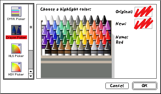
It's still there in the latest OS X: http://i.imgur.com/40DGTXo.png

If you want to go down a reading rabbit hole about color theory for a while, check out http://www.handprint.com/HP/WCL/wcolor.html
I stopped thinking in terms of the RYB "color wheel" shortly after middle school art class. RGB and CYMK seem natural to me.
If you're interested in a color wheel for a picker design that has perceptual evenness, check the Munsell CS (http://en.wikipedia.org/wiki/Munsell_color_system) ... in a color picker it might be cool to select via projections of CIELAB as the refined version of same.
If you're interested in a color wheel for a picker design that has perceptual evenness, check the Munsell CS (http://en.wikipedia.org/wiki/Munsell_color_system) ... in a color picker it might be cool to select via projections of CIELAB as the refined version of same.
What I always found fascinating which is not addressed here, is how the visible light spectrum is a straight line with other "colors" at its ends, yet somehow our brains cut out that segment of the EM spectrum, and manage to bend it into a circle, so that color "wheels" make sense to us and flow nicely, when in fact red and violet are quite separate on the EM spectrum. It's our brains that play a little trick
I've heard two explanations for this. The first is that the longer wavelength "red"-ish receptors in our eyes are also excited by the frequencies of light at the other end of the visible spectrum, so shorter wavelengths than blue start to appear red again. Unfortunately the graph produced to back this up is usually that of the CIE colour matching functions, which do indeed have an obvious lump around purple, but are not derived from measurements. That lump was added to create a three-primary space which didn't require negative numbers to encode completely pure single-wavelength colours. That's a problem which otherwise crops up when you use three primaries based directly on measurements of the eye, because the three pigments in our eyes are not selective enough that a single wavelength only activates one receptor. Real measurements of the pigments don't really back up the idea of extra sensitivity to purple in the long-wavelength cones.
The second explanation (or suggestion, at least) is more psychological. In the distant past our eyes had only two colour receptors, and our brains measured the relative difference between the two, so we percieved colour on a one-dimensional line - e.g. more "warm" long wavelengths or more "cool" short wavelengths. At some point we evolved a third receptor, and our brains began processing this extra input as another perceptual axis orthogonal to the existing one, which could be described as purple/green against the original red/blue. Exploring this new 2D space results in a continuous rainbow around the edges.
The second explanation (or suggestion, at least) is more psychological. In the distant past our eyes had only two colour receptors, and our brains measured the relative difference between the two, so we percieved colour on a one-dimensional line - e.g. more "warm" long wavelengths or more "cool" short wavelengths. At some point we evolved a third receptor, and our brains began processing this extra input as another perceptual axis orthogonal to the existing one, which could be described as purple/green against the original red/blue. Exploring this new 2D space results in a continuous rainbow around the edges.
I find it interesting that red and violet are almost an octave apart.
The RYB color model is fine for third graders and cosmeticians but if you want to understand how color works you need to understand RGB. And yes that goes painters too. Mixing paint is more complicated than just using a color pick on your monitor because there is a volumetric/dilutional component and the paints is rarely a pure color (i.e. red paint is 256,0,0). It is galling that their are still university level art professor who persist in RYB color wheel malarky. Nothing irritates me more than the phrase, "we are mixing paint, not color". You are mixing both!
Cool article! I've understood the difference between additive and subtractive for a while, but hadn't thought about the discrepancy between RYB and CMY.
I also recommend watching this short video on the origin of ROYGBIV, and why Indigo probably doesn't really deserve it's own letter - but it got one, because of European music notation: http://www.theatlantic.com/video/archive/2014/01/why-roygbiv...
I also recommend watching this short video on the origin of ROYGBIV, and why Indigo probably doesn't really deserve it's own letter - but it got one, because of European music notation: http://www.theatlantic.com/video/archive/2014/01/why-roygbiv...
Anyone considering Newton's methods as 'mystical' (implied 'unscientific') gives modern institutionalized science much too much credit, and proper exploratory science much too little.
There is no RGB value for the cavernous void reaching deep into a cliff, into which a dark crack gives you a glimpse, which gobbles the burning light of the noonday sun, or your brightest flashlight, and gives back nothing.
RGB is just 3 pixels of different intensities, next to each other and sitting on your desk.
RGB is just 3 pixels of different intensities, next to each other and sitting on your desk.
> the real color wheel below, in all of its glory, showing colors you will never see on a rainbow produced in nature.
Magenta? sure, everyone agrees is a bastard color- but cyan is on the rainbow in the spot labeled 'blue', and _your_ blue is labeled 'indigo'.
CAN'T PROVE ME WRONG IMMA COLOR EXPERT
Magenta? sure, everyone agrees is a bastard color- but cyan is on the rainbow in the spot labeled 'blue', and _your_ blue is labeled 'indigo'.
CAN'T PROVE ME WRONG IMMA COLOR EXPERT
Two semi-popular color picker extensions for Photoshop that already include RYB modes:
http://www.coolorus.com/
http://anastasiy.com/colorwheel
http://www.coolorus.com/
http://anastasiy.com/colorwheel
[deleted]
While the explanation of additive and reductive color combining was interesting, I think it's important to note that it's because you're dealing with waves of light being absorbed or reflected.
I learned more about color theory and light in stage lighting classes than anywhere else. Teaching your brain how to combine colors correctly to get the exact shades you're looking for on the stage is hard. You really do have to forget a lot of what you learned in art classes to be effective. Understanding how colored light is absorbed, reflected, or otherwise changed on makeup, furniture, fabrics, and other surfaces added a whole different level of complexity not found in typical art classes.
Searching Google for "stage lighting color wheel" reveals more wheels similar to the one that you see at the author's really cool implementation[0].
[0] - http://bahamas10.github.io/ryb/