New Arc Logo(arclanguage.org)
arclanguage.org
New Arc Logo
http://www.arclanguage.org/item?id=9438
14 comments
First, it's encouraging that Arc now has a logo/graphical representation. However, in my opinion, it's not really that good. It looks like it was designed to be a favicon and doesn't scale that well when enlarged, and when it's small it's difficult to impossible to see the "a" shape.
I'm sure there are members of the Arc community and here on HN that are willing and capable of designing a much better logo if given the chance.
I'm sure there are members of the Arc community and here on HN that are willing and capable of designing a much better logo if given the chance.
To get the ball rolling: http://drop.io/arclogo/asset/arc-1-png
The drop is open for uploads.
[Cross posted at arclanguage.org as well]
The drop is open for uploads.
[Cross posted at arclanguage.org as well]
Link doesn't work for me; it's asking for a guest/admin password.
Ah whoops - thanks for pointing that out. It should work now.
A square logo for a language called Arc; you've got to be kidding.
Another attempt. Feel free to improve it or build on the idea.
http://www.headrun.ulg.ac.be/arclogo.png
http://www.headrun.ulg.ac.be/arclogo2.png
http://www.headrun.ulg.ac.be/arclogo3.png
http://www.headrun.ulg.ac.be/arclogo4.png <== addressing some criticism form the Arc forum.
http://www.headrun.ulg.ac.be/arclogo.png

http://www.headrun.ulg.ac.be/arclogo2.png
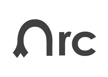
http://www.headrun.ulg.ac.be/arclogo3.png

http://www.headrun.ulg.ac.be/arclogo4.png <== addressing some criticism form the Arc forum.

Is it only me who sees an abstract representation of a penis and testicles there? :/
It would be quite a trump!
I'm sure it could be amended to remove that impression, but I don't have the time to look into that now.
I'm sure it could be amended to remove that impression, but I don't have the time to look into that now.
[deleted]
It looks as though the logo was designed by a programmer. I, for one, would not hire a designer to program. I don't see why it ought to work so much better the other way around.
Hmm...not sure if you're looking for feedback, but if you are, I'd go with a lighter shade of blue. It's hard to differentiate it from the black when the image is scaled down.
I would also add that at least for me the white and the black steal the focus. This makes it very hard to see the 'a' without looking for it.
Yeah was about to say that.
Otherwise it's okay.
Otherwise it's okay.
Wouldn't a simple two-color arch (or a geometrical arc) make a better logo?
Very Mondrian.
Does this logo hint that Arc is the product of De Stijl philosophy applied to computational expression?
Does this logo hint that Arc is the product of De Stijl philosophy applied to computational expression?
pg can correct me, but methinks you're reading too much into it.
Here's one. I'll probably come back to it during the day too. Don't know if PG is asking for submissions but he's more than welcome to any I do in any colour scheme he needs. All feedback welcome.
http://img4.imageshack.us/img4/7305/arcdph.jpg


I didn't realise what it was until I read the comments on the arc fourm, which is proberly a bad thing! After having it explained I like it, especially the concept but I agree with comments that it doesn't scale well.
I also prefer the blue colour scheme on the arclanguage site too!
I also prefer the blue colour scheme on the arclanguage site too!
IMO, it immediately strikes as a metaphor for generational garbage collector, each region depicting the generation of objects: red => new, blue => long-lived, black => garbage collected, whiteness => (??) the programmer doesn't have to worry about those details. While the rectangular shapes denote perfect building blocks, it would have been better to mix them with curves, as an expression of finesse, and/or surgical precision.
Later, pg's comment at arclanguage.org says that it's "a." May be the lack of curves is intentional, to caution that abstractions are often somewhat approximate? :)
Later, pg's comment at arclanguage.org says that it's "a." May be the lack of curves is intentional, to caution that abstractions are often somewhat approximate? :)
The red and blue jammed together remind me of this page I stumbled upon: http://www.wired.com/wired/scenarios/
Larger version : http://ycombinator.com/arc/arclogo.html
i like it.
Tropical surface anal? Doesn't sound pleasant.
I get the whole Hundred Year Language thing, but you don't need to start with a logo that looks like it's a hundred years old.
[edit]
I feel bad sounding like such a jerk about it, but I just don't have anything positive to say about that logo. It's difficult to even be constructive because it doesn't have a single redeeming quality. Even the color scheme is a poor choice because of the low contrast. I think this is one of those "back to the drawing board" moments.