And Here It Is: The New Google Reader Revealed(techcrunch.com)
techcrunch.com
And Here It Is: The New Google Reader Revealed
http://techcrunch.com/2011/10/31/and-here-it-is-the-new-google-reader-revealed/
38 comments
You assume that skimming is a primary use case. That is not how i use google reader (if there is a feed that i consistently do not want to read i unsubscribe). Maybe they were optimizing for my use case, where you read everything (or close to it).
For example, I have Hacker News in my rss feeds. I certainly never read everything or even close to that. As a fellow HN user, surely you are not interested in every article here?
Why are you using an RSS reader (even worse, one that tracks unread counts), then?
Because it is a very good aggregation of almost everything on the internet I care about. I can have feeds for tumblr accounts, youtube accounts, twitter accounts and whole subreddits and without actually having an account in any one of them or actually having to go to them everyday.
This ties in with my complaint with Reader removing social features. I don't want to go to G+ everyday to see my friends' shares when previously I could stay in the only ``social'' network I care about.
This ties in with my complaint with Reader removing social features. I don't want to go to G+ everyday to see my friends' shares when previously I could stay in the only ``social'' network I care about.
Because nearly every site has an RSS/Atom feed and therefore, I can visit dozens of sites at once without ever leaving Google Reader. Not just blog posts and news sites, but anything with an RSS/Atom feed like Facebook status updates, tweets, etc. It's efficient web surfing.
So the only way to share something privately is to first publicly +1 it?
Ah, apparently you can click "share" in the black bar at the top and it will let you directly share the currently selected item in reader with specific circles. That's not very discoverable.
Ah, apparently you can click "share" in the black bar at the top and it will let you directly share the currently selected item in reader with specific circles. That's not very discoverable.
I agree, that is a poor choice to have as the only way to share something. An easy fix would be to add a link on each item as a kind of synonym for the Share button in the G+ bar. That said, the problem is a pretty minor one given the extent of the redesign. I'm rather happy with the new Reader myself.
And it can't be done with the keyboard. I used to use 'l' to like and 'S' to share. Both shortcuts are gone.
try perhaps sendto?
The new UI seems to waste a lot of the screen with whitespace, to the point where I feel like it is an unintended bug (this is in the 'Expanded' view)...and it seems like you can no longer resize anything on the page?
Contrary to most people here, I really like the new layout. I'm trying to move to web-apps for most of my daily needs, and I specifically decided that the old Google Reader wasn't good enough.
This feels much more like a native app, rather than something that 1999 forgot. Form may not equal function, but it sure influences function.
This feels much more like a native app, rather than something that 1999 forgot. Form may not equal function, but it sure influences function.
[deleted]
im sorry but: fuck everything about this.
google reader was the site where i've learned the most in the internet by sharing and reading other people's comments and notes. it was a truly content based social network
it was fun
it was great
it is gone
google reader was the site where i've learned the most in the internet by sharing and reading other people's comments and notes. it was a truly content based social network
it was fun
it was great
it is gone
I totally disagree. The old social functions were totally opaque, irrational, and hard to control.
The new system allows you to share with select groups, or publicly, in a very granular way.
Just because you got used to an old, broken way of doing things doesn't mean that it was better. I can't believe the amount of collective bitching about this long-overdue overhaul.
The new system allows you to share with select groups, or publicly, in a very granular way.
Just because you got used to an old, broken way of doing things doesn't mean that it was better. I can't believe the amount of collective bitching about this long-overdue overhaul.
> The old social functions were totally opaque, irrational, and hard to control.
They were not. I've been using them (with a group of +100 people, almost of all of them "Computer Illiterate") for 4 to 5 years.
They were not. I've been using them (with a group of +100 people, almost of all of them "Computer Illiterate") for 4 to 5 years.
While being able to share to particular groups is nice, this just adds a new site that I need to check everyday (ie. G+) which goes against everything a feed aggregator should be.
It would be nice if there was an interface to G+ from reader where you can share, view and comment from inside Reader.
It would be nice if there was an interface to G+ from reader where you can share, view and comment from inside Reader.
I never used their old social features at all, but loved how easy it was to skim long lists of RSS items in the old reader. I'll probably switch to a self-hosted web rss thing or a local client instead, now.
Indeed. Google is starting to show signs of Yahooizing itself. And that's really sad.
I don't know. (Disclaimer: I never used Google Reader's social functions, they seemed too complicated to me)
Is having a clear focus Yahooizing? What Yahoo is doing is having tens of various and sometimes overlapping services. Google doesn't want to go this road and is cutting the services so they are clearly defined and don't overlap.
Now I have reservations about google plus (or "We can do Facebook, too!"), but that's on another post.
Is having a clear focus Yahooizing? What Yahoo is doing is having tens of various and sometimes overlapping services. Google doesn't want to go this road and is cutting the services so they are clearly defined and don't overlap.
Now I have reservations about google plus (or "We can do Facebook, too!"), but that's on another post.
They sacrificed usability to make a lot of GReader users use G+ begrudgingly. Now, instead of being able to see a nice feed counter for friends' shares, I would have to go to G+ in another tab to do what I was previously able to in the very same tab.
Reader integrating into G+? Why is this relationship not mutual?
Edit: And the concept of "+1" being to "give it your stamp of approval" does not exactly suit the majority of my shares...
For one, I shared a particular article called "New in Reader: a fresh design, and Google+ sharing".
Reader integrating into G+? Why is this relationship not mutual?
Edit: And the concept of "+1" being to "give it your stamp of approval" does not exactly suit the majority of my shares...
For one, I shared a particular article called "New in Reader: a fresh design, and Google+ sharing".
I dislike how there is no visual difference between read and unread items.
But there is a visual difference. Unread items have a bold title and a white background.
It's horrible...
Removal of sharing completely fucks up the workflow I use to send things to pinboard
Removal of sharing completely fucks up the workflow I use to send things to pinboard
Well, from Google's point of view, that is a feature :)
I wonder if you can add a custom sharing link from Google Reader's settings page and leverage the Pinboard API:
http://pinboard.in/api/#posts_add
http://pinboard.in/api/#posts_add
If for a few days I've been nervous that my free Apps account still does not have Google+, now I'm glad. Because that means, that I won't get new Google Reader, since it is useless (and probably won't work) without Google+.
Oh, wait. They could switch my reader to new version, and then it wouldn't work, because I don't have Google+. Oh. Waiting.
Or I'm just giving in to mass of people, who are not glad with the product, which is not yet shipped.
Update: I have new version of Reader. And no social stuff. http://laacz.lv/tmp/oops-google-reader.png. Sweet, Google...
Oh, wait. They could switch my reader to new version, and then it wouldn't work, because I don't have Google+. Oh. Waiting.
Or I'm just giving in to mass of people, who are not glad with the product, which is not yet shipped.
Update: I have new version of Reader. And no social stuff. http://laacz.lv/tmp/oops-google-reader.png. Sweet, Google...
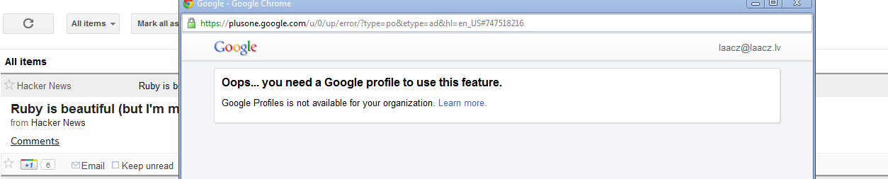
The New Google Reader is ugly and has fewer features. Hardly what I would call an upgrade.
what is this all about, tablet and smartphone again? maybe this 20px space is more handy with phone, but i'm very confused about pc.
I can't use this with a laptop, can I?
I can't use this with a laptop, can I?
The worst thing about these new designs is - they are LESS USABLE on Android tablet than before!
I wanted to write an article about how all the new interfaces (Google Groups, Google Docs, Google Translate) work LESS on Android tablet than the old ones, but I have no time for that.
Plus, I feel like I am the only person in the world with an Android tablet anyway.
I wanted to write an article about how all the new interfaces (Google Groups, Google Docs, Google Translate) work LESS on Android tablet than the old ones, but I have no time for that.
Plus, I feel like I am the only person in the world with an Android tablet anyway.
why don't you just use the app?
Which app do you mean?
Plus, I personally dislike having a separate app for every second service, when I have a browser.
In an ideal world, that would be all I need.
Plus, I personally dislike having a separate app for every second service, when I have a browser.
In an ideal world, that would be all I need.
I meant the Google Reader app: https://market.android.com/details?id=com.google.android.app...
Is there a way to get your old shared items back? I'm feeling a betrayed having all those interesting links and comments taken away from me.
You can get your shared items (and a few other things) as JSON here:
http://www.google.com/reader/settings?display=import
This isn't very useful to the average user, but I'm sure any HN reader can handle this.
This isn't very useful to the average user, but I'm sure any HN reader can handle this.
sigh. I'm now looking at http://tt-rss.org/
ok nice looking and all but still not API T_T
Can any UI people provide a good reason for this change? (More white space = faster skimming/more comprehension?)